
1 line
333 KiB
JSON
1 line
333 KiB
JSON
{"success":true,"data":{"web":[{"url":"https://www.awwwards.com/websites/typography/","title":"Best Examples of Typography in Web Design | Inspiration - Awwwards","description":"# Typography\n- [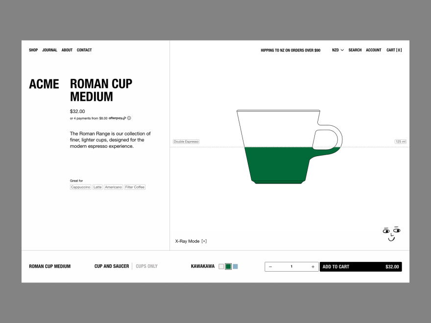](https://www.awwwards.com/sites/acme-1)\n\n[VOTE NOW](https://www.awwwards.com/sites/acme-1)\n\n[**Studio Almond** PRO](https://www.awwwards.com/studioalmond/)\n\n- [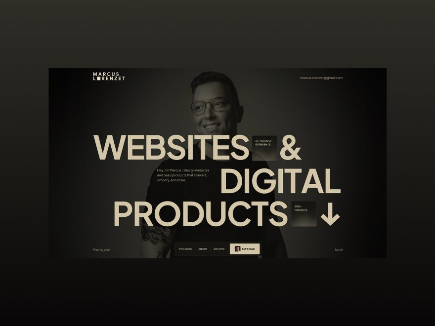](https://www.awwwards.com/sites/marcus-lorenzet-portfolio)\n\n[VOTE NOW](https://www.awwwards.com/sites/partnership-brand-management)\n\n[**GPollack**](https://www.awwwards.com/GPollack/)\n\n- [](https://www.awwwards.com/sites/little-website-co-1)\n\nLittle Website Co.\n\n[**Little Website Co.**](https://www.awwwards.com/littlewebsiteco/)\n\n[**QUOITWORKS Inc.**](https://www.awwwards.com/quoitworks/)\n\n[**jeff-sibal**](https://www.awwwards.com/jeff-sibal/)","position":1,"markdown":"[Courses](https://www.awwwards.com/academy-plan?utm_source=alert)\n\n**The Creative Pass** Watch all courses for just €11.50/month\n\n**The Creative Pass** Watch all courses for just €11.50/month\n\n**The Creative Pass** Watch all courses for just €11.50/month\n\n**The Creative Pass** Watch all courses for just €11.50/month\n\n**The Creative Pass** Watch all courses for just €11.50/month\n\n**The Creative Pass** Watch all courses for just €11.50/month\n\n**The Creative Pass** Watch all courses for just €11.50/month\n\n**The Creative Pass** Watch all courses for just €11.50/month\n\n**The Creative Pass** Watch all courses for just €11.50/month\n\n**The Creative Pass** Watch all courses for just €11.50/month\n\n**The Creative Pass** Watch all courses for just €11.50/month\n\n- [Websites](https://www.awwwards.com/websites/)\n\n# Typography\n\nBest selection of **Typography Website** examples for your inspiration...Read more\n\nTypography is the art and technique of arranging type. It involves the thoughtful and deliberate selection of typefaces, point size, line length, leading, tracking, kerning, color and any element that can affect a design. Readability is primarily the concern of the typographer or information designer. In websites, consistency is key in the use of typography.\n\nWe've come a long way since the start of the internet. **For a long time typography has been overlooked by web designers, but it has gained recognition as an important part of web design** **Digitization opened up typography to new generations of designers**. Only a few type fonts could be used safely in websites, assuring that every viewer would see them as the designer intended, but services **like @font-face & Typekit have been developed to allow designers to use a wider variety of fonts in web design**.\n\nExternal Links: [100 greatest free fonts collection](http://www.awwwards.com/100-greatest-free-fonts-collection.html) \\| [Typography courses](https://www.awwwards.com/academy/courses/typography) \\| [I love Typography Blog](http://ilovetypography.com/)\n\n- [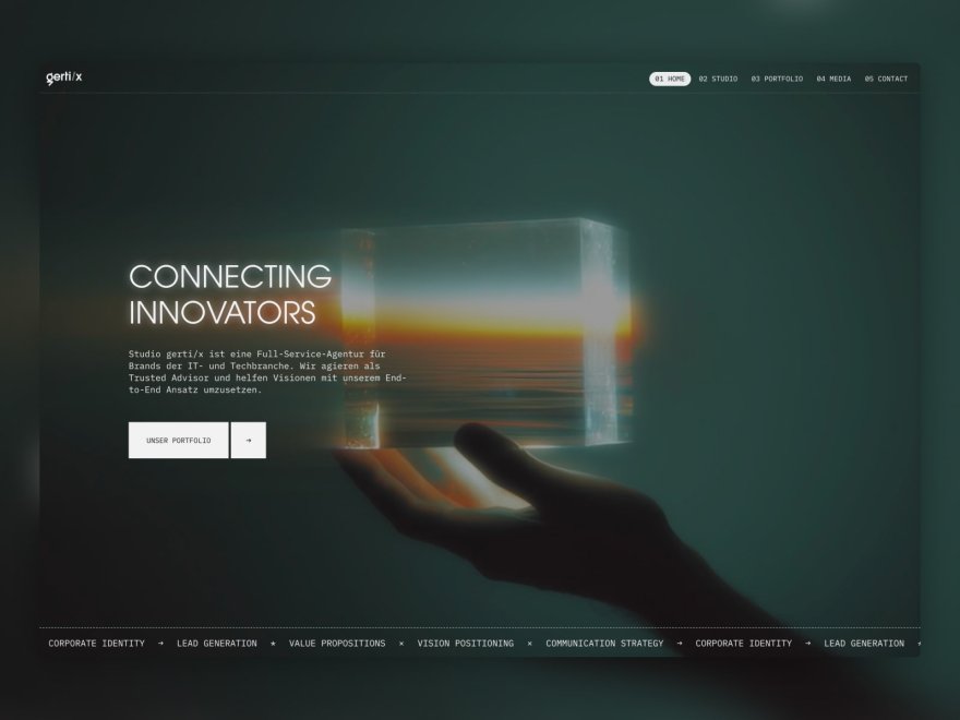](https://www.awwwards.com/sites/studio-gerti-x)\n\n\n\n\n\nWEBSITE\n\n\n\n\nStudio gerti/x\n\n\n\n\n\n[VOTE NOW](https://www.awwwards.com/sites/studio-gerti-x)\n\n\n\n\n\n\n\n\n\n\n\n\n\n\n\n\n\n\n\n[**Sascha Ulreich** PRO](https://www.awwwards.com/SaschaUlreich/)\n\n- [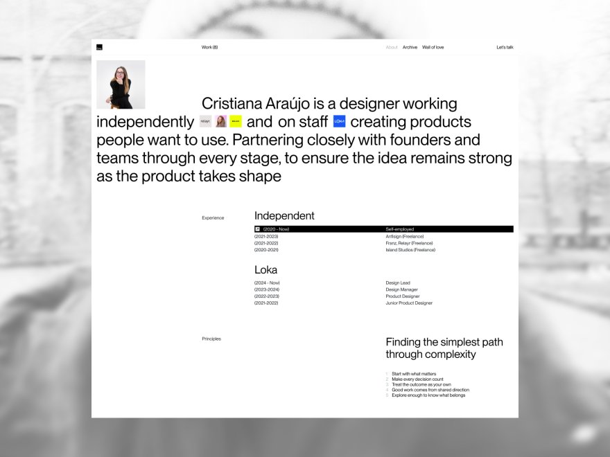](https://www.awwwards.com/sites/cristiana-araujo-portfolio)\n\n\n\n\n\nWEBSITE\n\n\n\n\nCristiana Araújo (Portfolio)\n\n\n\n\n\n[VOTE NOW](https://www.awwwards.com/sites/cristiana-araujo-portfolio)\n\n\n\n\n\n\n\n\n\n\n\n\n\n\n\n\n\n\n\n[**Cristiana Araújo** PRO](https://www.awwwards.com/cristiana-araujo/)\n\n- [](https://www.awwwards.com/sites/acme-1)\n\n\n\n\n\nWEBSITE\n\n\n\n\nACME\n\n\n\n\n\n[VOTE NOW](https://www.awwwards.com/sites/acme-1)\n\n\n\n\n\n\n\n\n\n\n\n\n\n\n\n\n\n\n\n[**Studio Almond** PRO](https://www.awwwards.com/studioalmond/)\n\n- [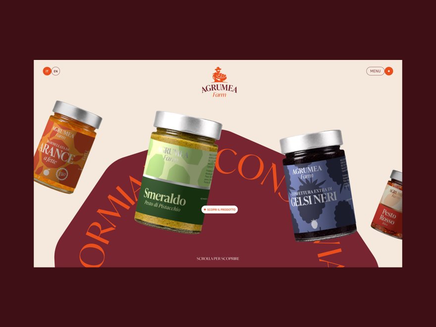](https://www.awwwards.com/sites/agrumea-farm)\n\n\n\n\n\nWEBSITE\n\n\n\n\nAgrumea Farm\n\n\n\n\n\n[VOTE NOW](https://www.awwwards.com/sites/agrumea-farm)\n\n\n\n\n\n\n\n\n\n\n\n\n\n\n\n\n\n\n\n[**Studio K95**](https://www.awwwards.com/studio_k95/)\n\n- [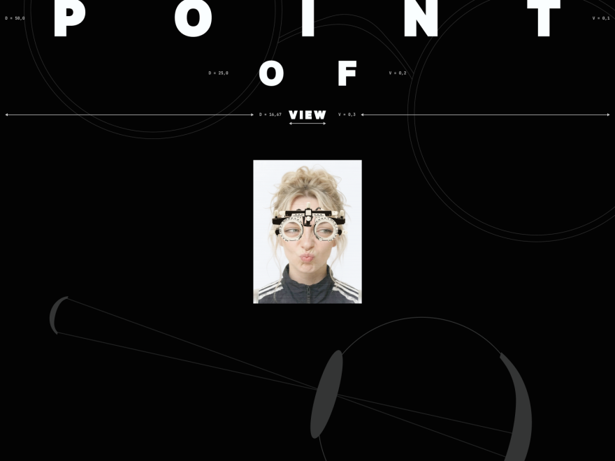](https://www.awwwards.com/sites/point-of-view)\n\n\n\n\n\nWEBSITE\n\n\n\n\nPoint Of View\n\n\n\n\n\n[VOTE NOW](https://www.awwwards.com/sites/point-of-view)\n\n\n\n\n\n\n\n\n\n\n\n\n\n\n\n\n\n\n\n[**hodarkovskaya**](https://www.awwwards.com/hodarkovskaya/)\n\n- [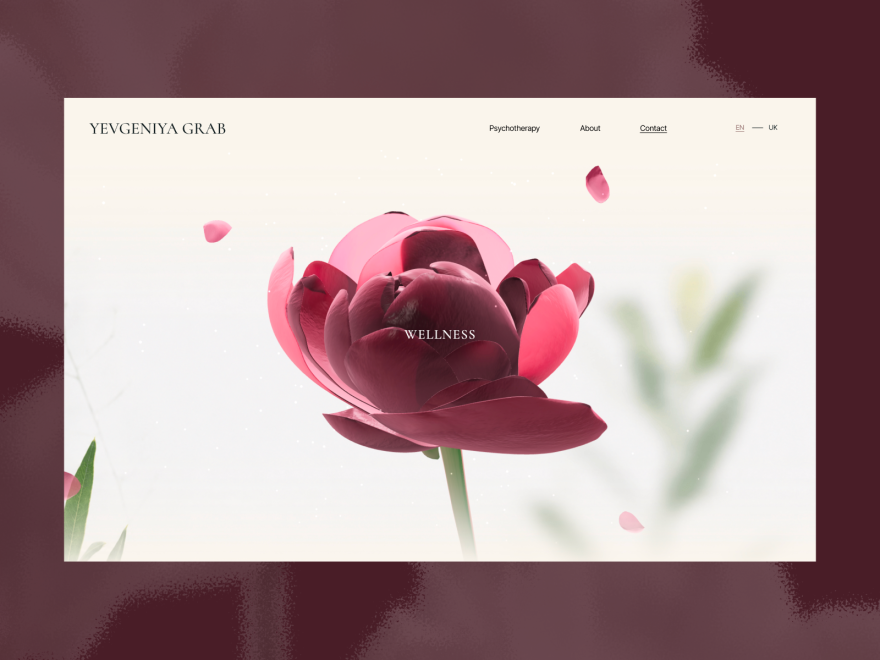](https://www.awwwards.com/sites/yevgeniya-grab)\n\n\n\n\n\nWEBSITE\n\n\n\n\nYEVGENIYA GRAB\n\n\n\n\n\n[VOTE NOW](https://www.awwwards.com/sites/yevgeniya-grab)\n\n\n\n\n\n\n\n\n\n\n\n\n\n\n\n\n\n\n\n[**Olha Lazarieva** PRO](https://www.awwwards.com/OlhaDesign_0304/)\n\n- [](https://go.streamlinehq.com/sharp-icons)\n\n\n\n\n\n\n\n\n\nPROMOTED\n\n- [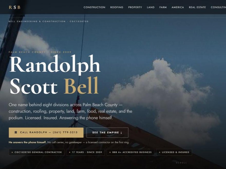](https://www.awwwards.com/sites/randolph-scott-bell-ai-built-contractor-hub)\n\n\n\n\n\nWEBSITE\n\n\n\n\nRandolph Scott Bell — AI-Built Contractor Hub\n\n\n\n\n\n[VOTE NOW](https://www.awwwards.com/sites/randolph-scott-bell-ai-built-contractor-hub)\n\n\n\n\n\n\n\n\n\n\n\n\n\n\n\n\n\n\n\n[**randolph-bell**](https://www.awwwards.com/randolph-bell/)\n\n- [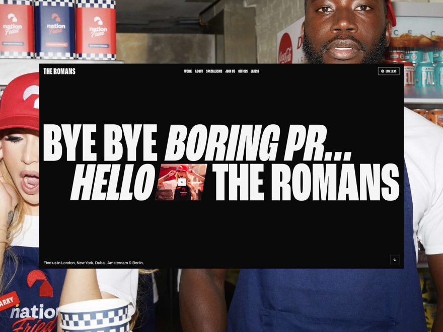](https://www.awwwards.com/sites/the-romans)\n\n\n\n\n\nWEBSITE\n\n\n\n\nThe Romans\n\n\n\n\n\n[VOTE NOW](https://www.awwwards.com/sites/the-romans)\n\n\n\n\n\n\n\n\n\n\n\n\n\n\n\n\n\n\n\n[**Neutral Studio** PRO](https://www.awwwards.com/neutralstudio/)\n\n- [](https://www.awwwards.com/sites/archive-for-hans-sleutelaar)\n\n\n\n\n\nWEBSITE\n\n\n\n\nArchive for Hans Sleutelaar\n\n\n\n\n\n[VOTE NOW](https://www.awwwards.com/sites/archive-for-hans-sleutelaar)\n\n\n\n\n\n\n\n\n\n\n\n\n\n\n\n\n\n\n\n[**Ilias Salvatore Sleutelaar** PRO](https://www.awwwards.com/sleutelaar/)\n\n- [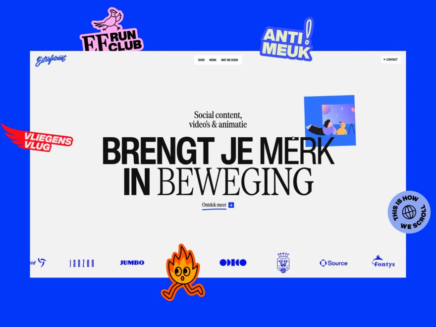](https://www.awwwards.com/sites/extrafazant)\n\n\n\n\n\nWEBSITE\n\n\n\n\nExtrafazant\n\n\n\n\n\n[VOTE NOW](https://www.awwwards.com/sites/extrafazant)\n\n\n\n\n\n\n\n\n\n\n\n\n\n\n\n\n\n\n\n[**Dylan Brouwer** PRO](https://www.awwwards.com/dylanbrouwer/)\n\n- [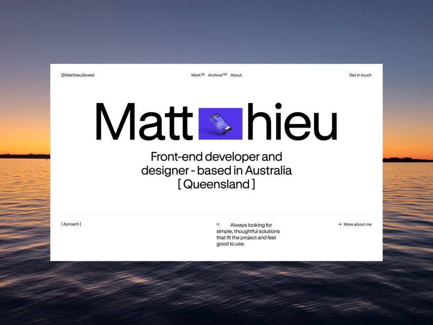](https://www.awwwards.com/sites/matthieugivelet-com)\n\n\n\n\n\nWEBSITE\n\n\n\n\nmatthieugivelet.com\n\n\n\n\n\n[VOTE NOW](https://www.awwwards.com/sites/matthieugivelet-com)\n\n\n\n\n\n\n\n\n\n\n\n\n\n\n\n\n\n\n\n[**matthieu-givelet**](https://www.awwwards.com/matthieu-givelet/)\n\n- [](https://www.awwwards.com/sites/marcus-lorenzet-portfolio)\n\n\n\n\n\nWEBSITE\n\n\n\n\nMarcus Lorenzet Portfolio\n\n\n\n\n\n[VOTE NOW](https://www.awwwards.com/sites/marcus-lorenzet-portfolio)\n\n\n\n\n\n\n\n\n\n\n\n\n\n\n\n\n\n\n\n[**Marcus Lorenzet**](https://www.awwwards.com/marcuslorenzet/)\n\n- [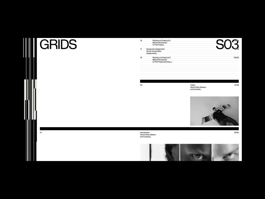](https://www.awwwards.com/sites/grids-1)\n\n\n\n\n\nWEBSITE\n\n\n\n\nGrids\n\n\n\n\n\n[VOTE NOW](https://www.awwwards.com/sites/grids-1)\n\n\n\n\n\n\n\n\n\n\n\n\n\n\n\n\n\n\n\n[**Obys** PRO](https://www.awwwards.com/obys/)\n\n- [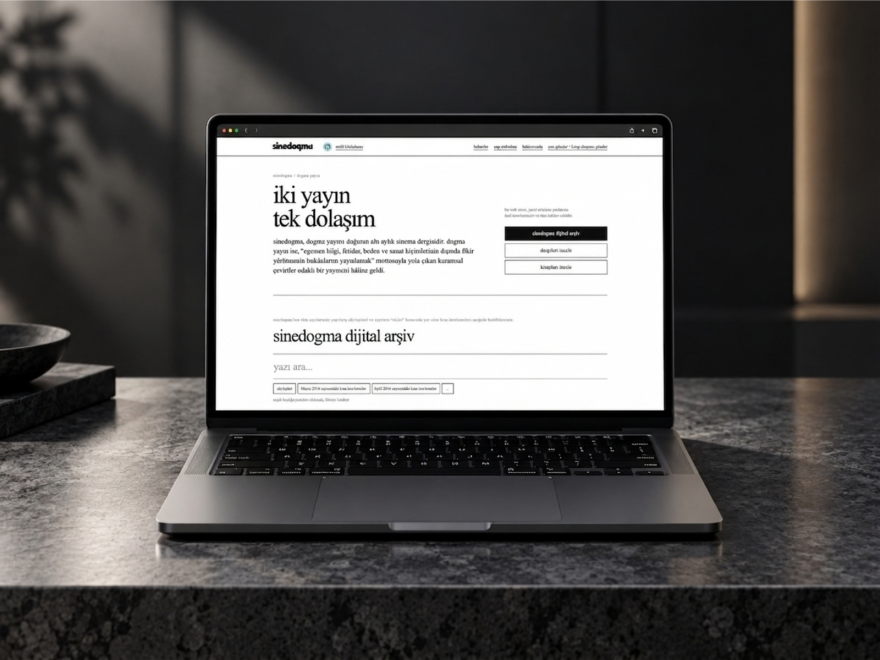](https://www.awwwards.com/sites/sinedogma-dogma-yayin)\n\n\n\n\n\nWEBSITE\n\n\n\n\nSinedogma / Dogma Yayın\n\n\n\n\n\n[VOTE NOW](https://www.awwwards.com/sites/sinedogma-dogma-yayin)\n\n\n\n\n\n\n\n\n\n\n\n\n\n\n\n\n\n\n\n[**Yusuf Gürfidan**](https://www.awwwards.com/ecc83kt77/)\n\n- [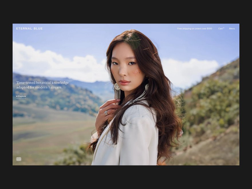](https://www.awwwards.com/sites/eternal-blue)\n\n\n\n\n\nWEBSITE\n\n\n\n\nEternal Blue\n\n\n\n\n\n[VOTE NOW](https://www.awwwards.com/sites/eternal-blue)\n\n\n\n\n\n\n\n\n\n\n\n\n\n\n\n\n\n\n\n[**Studio Almond** PRO](https://www.awwwards.com/studioalmond/)\n\n- [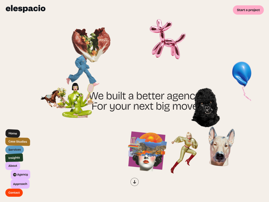](https://www.awwwards.com/sites/elespacio-3)\n\n\n\n\n\nWEBSITE\n\n\n\n\nElespacio\n\n\n\n\n\n[VOTE NOW](https://www.awwwards.com/sites/elespacio-3)\n\n\n\n\n\n\n\n\n\n\n\n\n\n\n\n\n\n\n\n[**elespacio**](https://www.awwwards.com/elespacio/)\n\n- [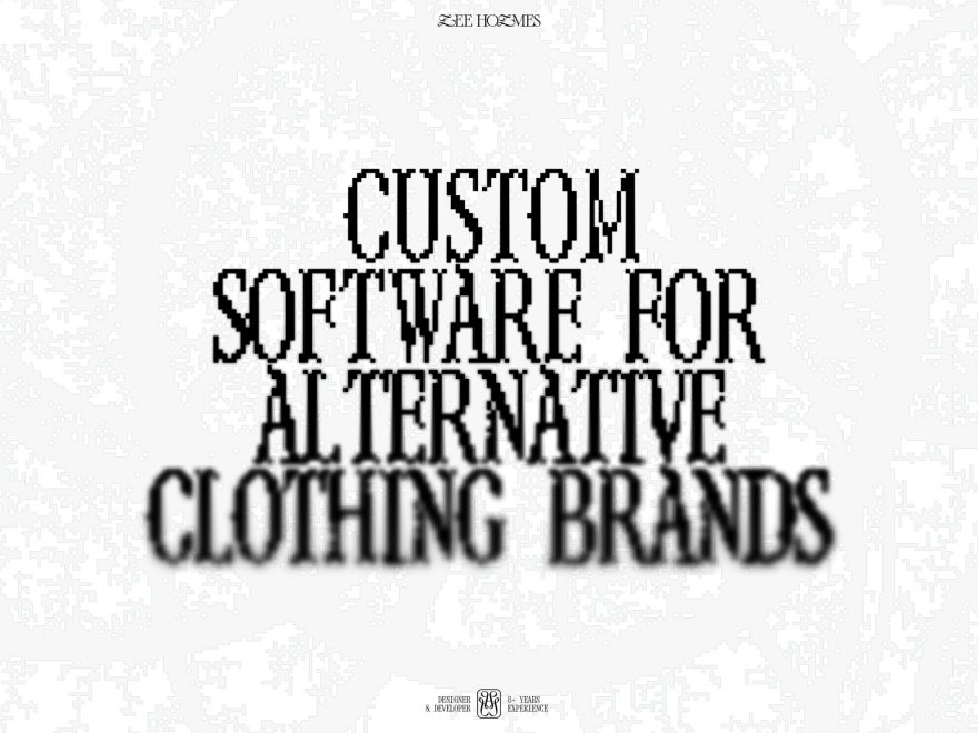](https://www.awwwards.com/sites/lee-holmes-2)\n\n\n\n\n\nWEBSITE\n\n\n\n\nLee Holmes\n\n\n\n\n\n[VOTE NOW](https://www.awwwards.com/sites/lee-holmes-2)\n\n\n\n\n\n\n\n\n\n\n\n\n\n\n\n\n\n\n\n[**Lee Holmes**](https://www.awwwards.com/byleeholmes/)\n\n- [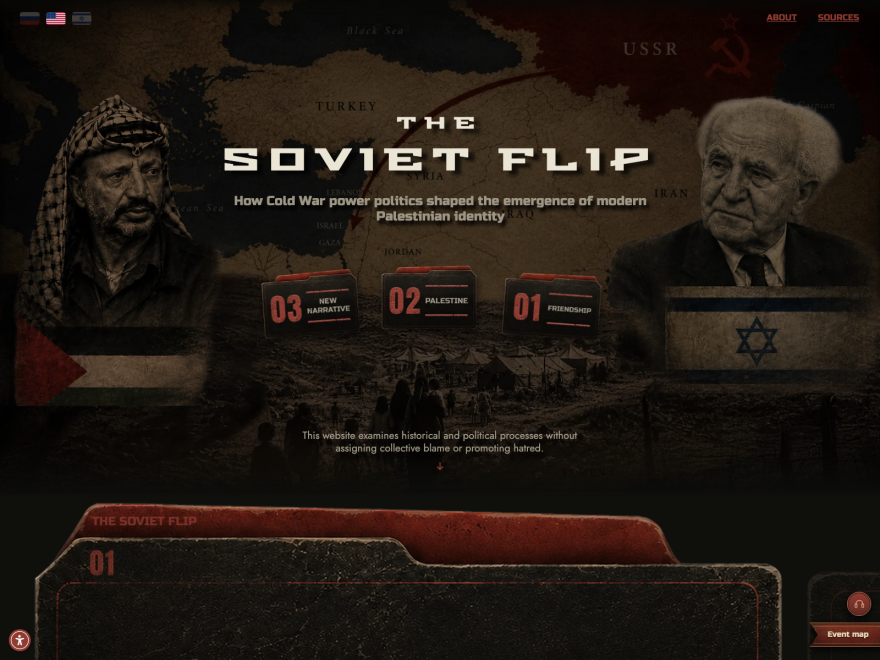](https://www.awwwards.com/sites/the-soviet-flip)\n\n\n\n\n\nWEBSITE\n\n\n\n\nThe Soviet Flip\n\n\n\n\n\n[VOTE NOW](https://www.awwwards.com/sites/the-soviet-flip)\n\n\n\n\n\n\n\n\n\n\n\n\n\n\n\n\n\n\n\n[**lusil blek**](https://www.awwwards.com/lusilblek/)\n\n- [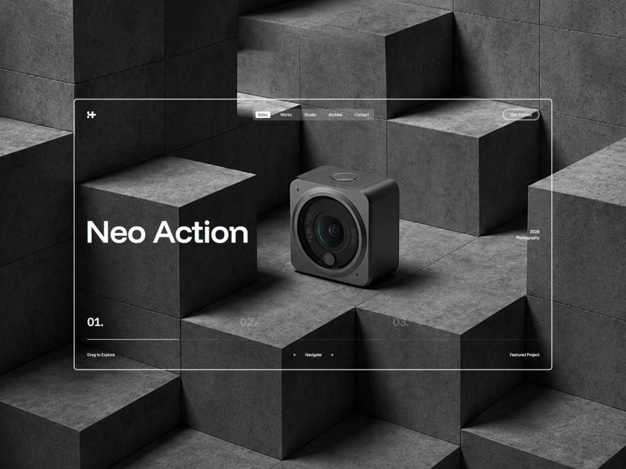](https://www.awwwards.com/sites/hayler-studio)\n\n\n\n\n\nWEBSITE\n\n\n\n\nHayler Studio\n\n\n\n\n\n[VOTE NOW](https://www.awwwards.com/sites/hayler-studio)\n\n\n\n\n\n\n\n\n\n\n\n\n\n\n\n\n\n\n\n[**ClaPat** PRO](https://www.awwwards.com/ClaPatStudio/)\n\n- [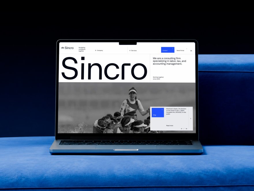](https://www.awwwards.com/sites/sincro)\n\n\n\n\n\nWEBSITE\n\n\n\n\nSincro\n\n\n\n\n\n[VOTE NOW](https://www.awwwards.com/sites/sincro)\n\n\n\n\n\n\n\n\n\n\n\n\n\n\n\n\n\n\n\n[**Cocota** PRO](https://www.awwwards.com/CocotaStudio/)\n\n- [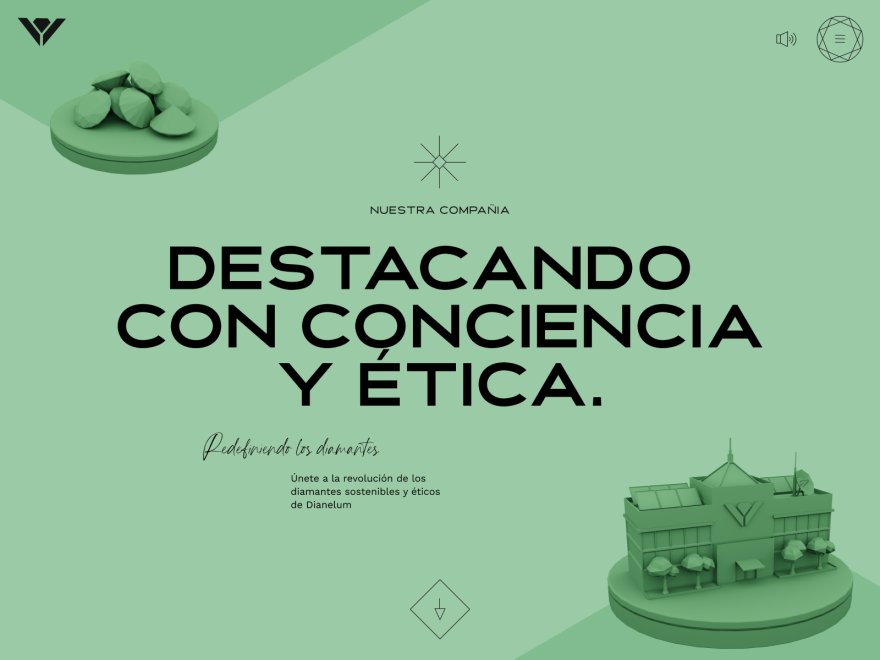](https://www.awwwards.com/sites/dianelum)\n\n\n\n\n\nWEBSITE\n\n\n\n\nDIANELUM\n\n\n\n\n\n[VOTE NOW](https://www.awwwards.com/sites/dianelum)\n\n\n\n\n\n\n\n\n\n\n\n\n\n\n\n\n\n\n\n[**LaNegrita** PRO](https://www.awwwards.com/LaNegrita/)\n\n- [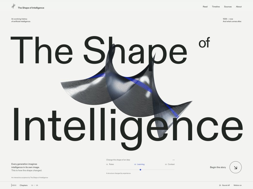](https://www.awwwards.com/sites/the-shape-of-intelligence)\n\n\n\n\n\nWEBSITE\n\n\n\n\nThe Shape of Intelligence\n\n\n\n\n\n[VOTE NOW](https://www.awwwards.com/sites/the-shape-of-intelligence)\n\n\n\n\n\n\n\n\n\n\n\n\n\n\n\n\n\n\n\n[**Jamie McKaye** PRO](https://www.awwwards.com/JamieMcKaye/)\n\n- [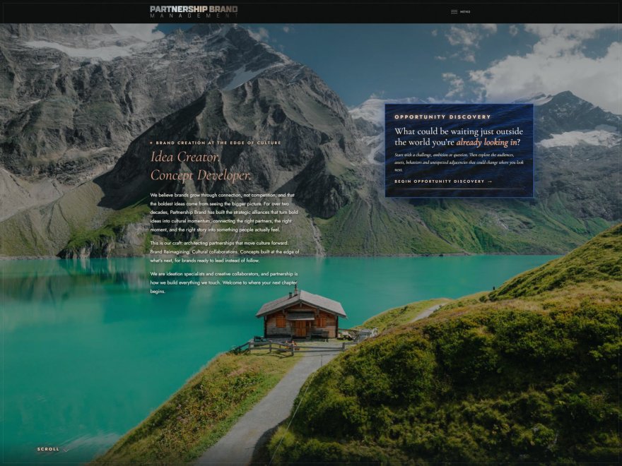](https://www.awwwards.com/sites/partnership-brand-management)\n\n\n\n\n\nWEBSITE\n\n\n\n\nPartnership Brand Management\n\n\n\n\n\n[VOTE NOW](https://www.awwwards.com/sites/partnership-brand-management)\n\n\n\n\n\n\n\n\n\n\n\n\n\n\n\n\n\n\n\n[**GPollack**](https://www.awwwards.com/GPollack/)\n\n- [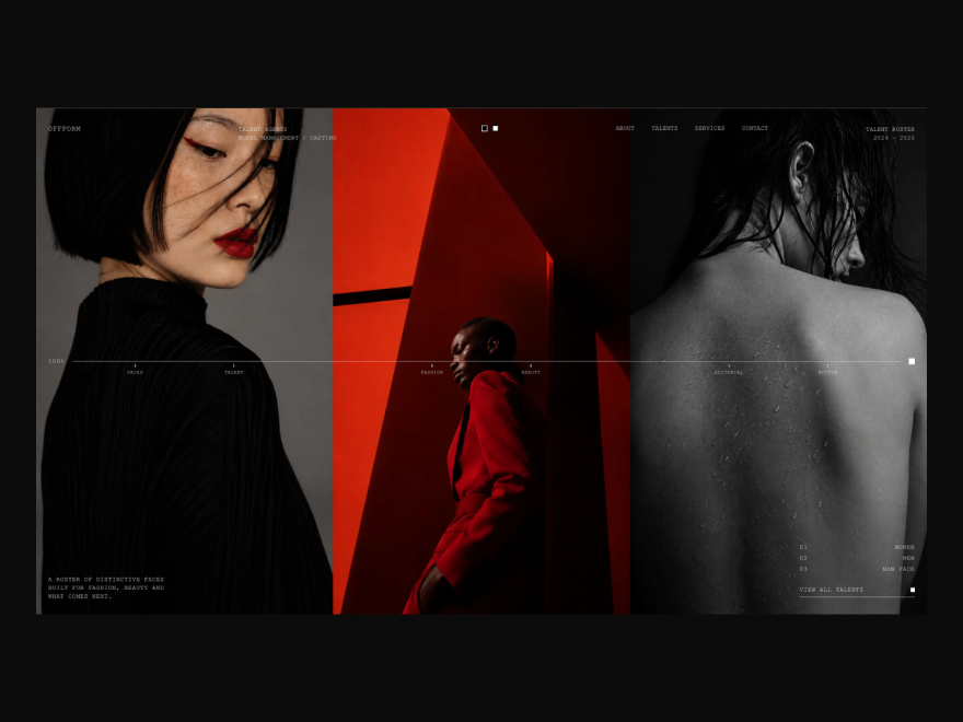](https://www.awwwards.com/sites/offform)\n\n\n\n\n\nWEBSITE\n\n\n\n\nOFFFORM\n\n\n\n\n\n\n\n\n\n\n\n\n\n\n\n\n\n\n\n\n\n[**NUUNI**](https://www.awwwards.com/NUUNI/)\n\n- [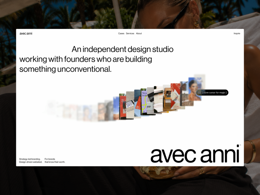](https://www.awwwards.com/sites/avec-anni)\n\n\n\n\n\nWEBSITE\n\n\n\n\nAvec Anni\n\n\n\n\n\n\n\n\n\n\n\n\n\n\n\n\n\n\n\n\n\n[**avecanni**](https://www.awwwards.com/avecanni/)\n\n- [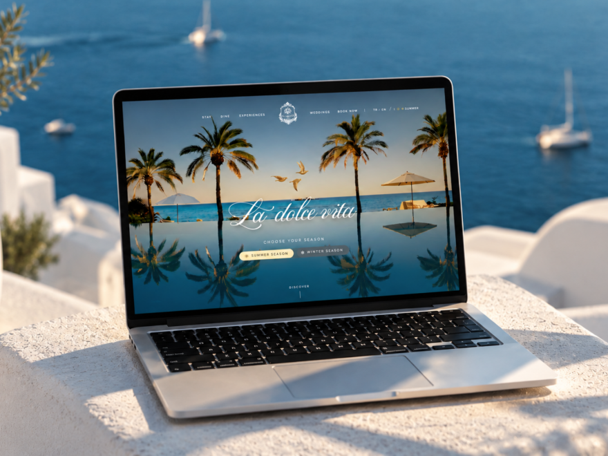](https://www.awwwards.com/sites/villa-aurelia)\n\n\n\n\n\nWEBSITE\n\n\n\n\nVilla Aurelia\n\n\n\n\n\n\n\n\n\n\n\n\n\n\n\n\n\n\n\n\n\n[**MadeByCat** PRO](https://www.awwwards.com/eray-akbaba/)\n\n- [](https://www.awwwards.com/sites/little-website-co-1)\n\n\n\n\n\nWEBSITE\n\n\n\n\nLittle Website Co.\n\n\n\n\n\n\n\n\n\n\n\n\n\n\n\n\n\n\n\n\n\n[**Little Website Co.**](https://www.awwwards.com/littlewebsiteco/)\n\n- [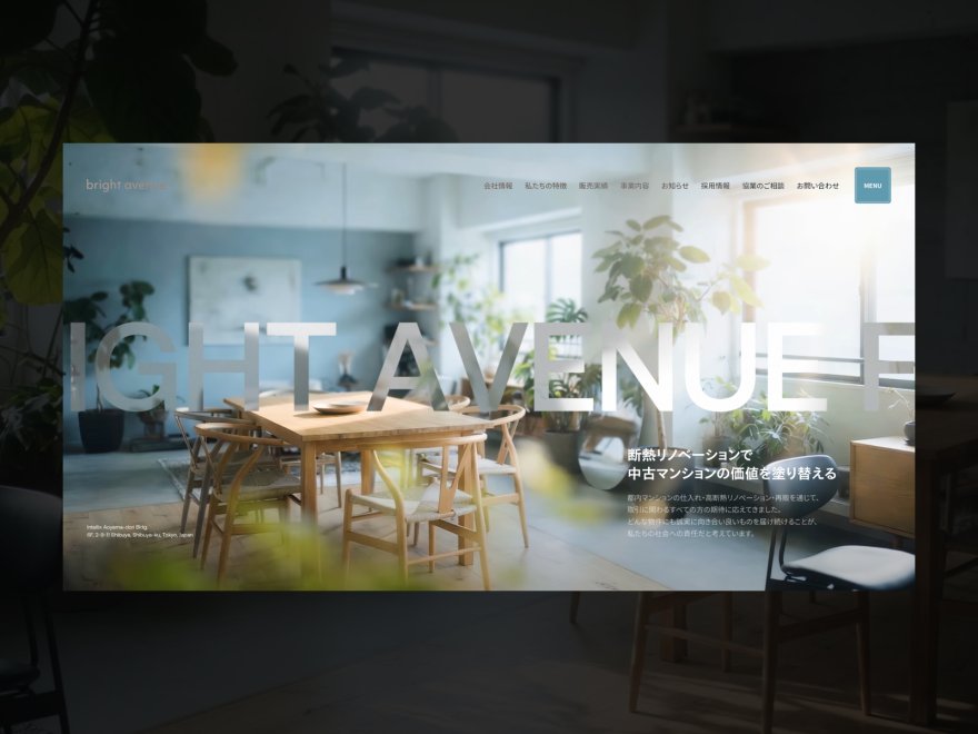](https://www.awwwards.com/sites/bright-avenue)\n\n\n\n\n\nWEBSITE\n\n\n\n\nbright avenue\n\n\n\n\n\n\n\n\n\n\n\n\n\n\n\n\n\n\n\n\n\n[**QUOITWORKS Inc.**](https://www.awwwards.com/quoitworks/)\n\n- [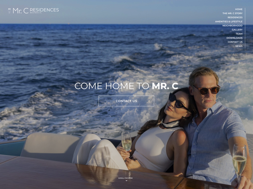](https://www.awwwards.com/sites/mr-c-residences-boca-raton)\n\n\n\n\n\nWEBSITE\n\n\n\n\nMr. C Residences Boca Raton\n\n\n\n\n\n\n\n\n\n\n\n\n\n\n\n\n\n\n\n\n\n[**Pedja Zdravkovic** PRO](https://www.awwwards.com/pedjazdravkovic/)\n\n- [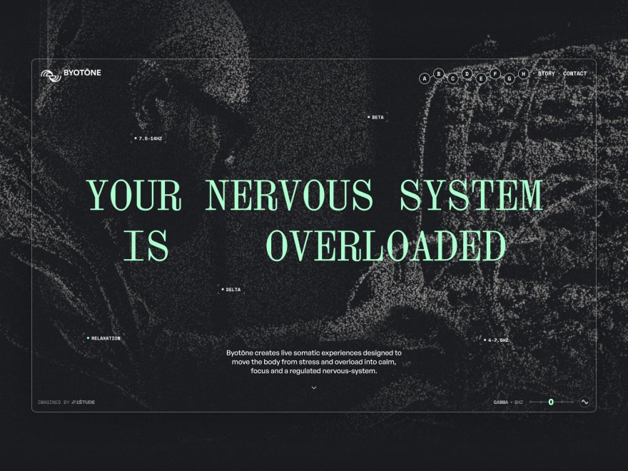](https://www.awwwards.com/sites/byotone)\n\n\n\n\n\nWEBSITE\n\n\n\n\nByotōne\n\n\n\n\n\n\n\n\n\n\n\n\n\n\n\n\n\n\n\n\n\n[**L'Étude**](https://www.awwwards.com/letude/)\n\n- [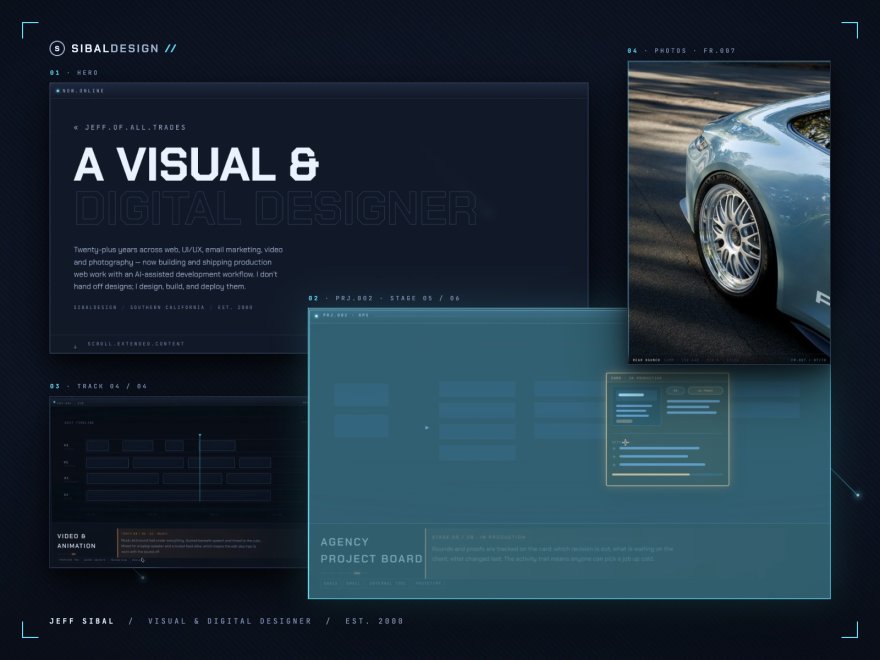](https://www.awwwards.com/sites/sibaldesign)\n\n\n\n\n\nWEBSITE\n\n\n\n\nsibaldesign\n\n\n\n\n\n\n\n\n\n\n\n\n\n\n\n\n\n\n\n\n\n[**jeff-sibal**](https://www.awwwards.com/jeff-sibal/)\n\n\n1 [2](https://www.awwwards.com/websites/typography/?ads=1&page=2) [3](https://www.awwwards.com/websites/typography/?ads=1&page=3) [4](https://www.awwwards.com/websites/typography/?ads=1&page=4) [5](https://www.awwwards.com/websites/typography/?ads=1&page=5) [Next](https://www.awwwards.com/websites/typography/?ads=1&page=2)\n\nreCAPTCHA\n\nRecaptcha requires verification.\n\nprotected by **reCAPTCHA**","metadata":{"twitter:card":"summary","referrer":"origin-when-cross-origin","viewport":"width=device-width, initial-scale=1.0","title":"Best Examples of Typography in Web Design | Inspiration","ogImage":"https://assets.awwwards.com/assets/images/share/awwwards.jpg","twitter:url":"https://www.awwwards.com/websites/typography/","twitter:title":"Best Examples of Typography in Web Design | Inspiration","twitter:site":"@awwwards","description":" Fantastic Typography Website Designs for Inspiration. Selection of Awwwards winning typography websites. Typography involves the thoughtful and deliberate selection of typefaces, point size, line length, leading, tracking, kerning, color and other element\n ","twitter:description":"Fantastic Typography Website Designs for Inspiration. Selection of Awwwards winning typography websites. Typography involves the thoughtful and deliberate selection of typefaces, point size, line length, leading, tracking, kerning, color and other element","theme-color":"#3ea094","twitter:creator":"@awwwards","og:image":"https://assets.awwwards.com/assets/images/share/awwwards.jpg","twitter:image":"https://assets.awwwards.com/assets/images/share/awwwards.jpg","language":"en","favicon":"https://assets.awwwards.com/assets/images/favicon.svg","scrapeId":"01a10841-f509-75fc-a34a-ebf80f4f1b50","sourceURL":"https://www.awwwards.com/websites/typography/","url":"https://www.awwwards.com/websites/typography/","statusCode":200,"contentType":"text/html; charset=UTF-8","proxyUsed":"basic","cacheState":"hit","cachedAt":"2026-10-02T21:35:05.932Z","creditsUsed":1}},{"url":"https://dribbble.com/search/textile-web-design","title":"textile web design - Dribbble","description":"# textile web design\n488k","position":2,"markdown":"[Dribbble: the community for graphic design](https://dribbble.com/)\n\nShots\n\nShots\nDesigners\nServices\n\n[Sign up](https://dribbble.com/signups/new) [Log in](https://dribbble.com/session/new)\n\n\n\nGet 20% off your first payment for design and development services on Dribbble. Use code WELCOME20 🎉\n\n[Get Started](https://dribbble.com/instantmatch)\n\n\n\n# textile web design\n\nBeautiful, modern textile web design work, designs, illustrations, and graphic elements\n\n- Related:\n- [fabric](https://dribbble.com/search/fabric)\n- [website](https://dribbble.com/search/website)\n- [ux](https://dribbble.com/search/ux)\n- [seamless](https://dribbble.com/search/seamless)\n- [seamless pattern](https://dribbble.com/search/seamless-pattern)\n- [ui](https://dribbble.com/search/ui)\n\n[Popular](https://dribbble.com/search/textile-web-design#)\n\n- [Popular](https://dribbble.com/search/shots/popular?q=textile-web-design)\n- [New & Noteworthy](https://dribbble.com/search/shots/recent?q=textile-web-design)\n\n- [Discover](https://dribbble.com/search/shots/popular/?q=textile-web-design \"Discover\")\n- [Animation](https://dribbble.com/search/shots/popular/animation?q=textile-web-design \"Animation\")\n- [Branding](https://dribbble.com/search/shots/popular/branding?q=textile-web-design \"Branding\")\n- [Illustration](https://dribbble.com/search/shots/popular/illustration?q=textile-web-design \"Illustration\")\n- [Mobile](https://dribbble.com/search/shots/popular/mobile?q=textile-web-design \"Mobile\")\n- [Print](https://dribbble.com/search/shots/popular/print?q=textile-web-design \"Print\")\n- [Product Design](https://dribbble.com/search/shots/popular/product-design?q=textile-web-design \"Product Design\")\n- [Typography](https://dribbble.com/search/shots/popular/typography?q=textile-web-design \"Typography\")\n- [Web Design](https://dribbble.com/search/shots/popular/web-design?q=textile-web-design \"Web Design\")\n\n[Filters](https://dribbble.com/search/textile-web-design#)\n\n[Clear](https://dribbble.com/search/shots/filters?q=textile-web-design) Tags\n\n[Clear](https://dribbble.com/search/shots/filters?q=textile-web-design) Color\n\n- [#faddd1](https://dribbble.com/search/textile-web-design?color=faddd1)\n- [#fad3d1](https://dribbble.com/search/textile-web-design?color=fad3d1)\n- [#fad1e6](https://dribbble.com/search/textile-web-design?color=fad1e6)\n- [#e5d1fa](https://dribbble.com/search/textile-web-design?color=e5d1fa)\n- [#d4d1fa](https://dribbble.com/search/textile-web-design?color=d4d1fa)\n- [#d1e3fa](https://dribbble.com/search/textile-web-design?color=d1e3fa)\n- [#d1f3fa](https://dribbble.com/search/textile-web-design?color=d1f3fa)\n- [#d1faf0](https://dribbble.com/search/textile-web-design?color=d1faf0)\n- [#d1fad7](https://dribbble.com/search/textile-web-design?color=d1fad7)\n- [#ebfad1](https://dribbble.com/search/textile-web-design?color=ebfad1)\n- [#faf9d1](https://dribbble.com/search/textile-web-design?color=faf9d1)\n- [#faefd1](https://dribbble.com/search/textile-web-design?color=faefd1)\n- [#fae6d1](https://dribbble.com/search/textile-web-design?color=fae6d1)\n- [#f2e2d9](https://dribbble.com/search/textile-web-design?color=f2e2d9)\n- [#ffffff](https://dribbble.com/search/textile-web-design?color=ffffff)\n- [#f4b69c](https://dribbble.com/search/textile-web-design?color=f4b69c)\n- [#f4a09c](https://dribbble.com/search/textile-web-design?color=f4a09c)\n- [#f49cc8](https://dribbble.com/search/textile-web-design?color=f49cc8)\n- [#c69cf4](https://dribbble.com/search/textile-web-design?color=c69cf4)\n- [#a39cf4](https://dribbble.com/search/textile-web-design?color=a39cf4)\n- [#9cc2f4](https://dribbble.com/search/textile-web-design?color=9cc2f4)\n- [#9ce5f4](https://dribbble.com/search/textile-web-design?color=9ce5f4)\n- [#9cf4df](https://dribbble.com/search/textile-web-design?color=9cf4df)\n- [#9cf4a7](https://dribbble.com/search/textile-web-design?color=9cf4a7)\n- [#d4f49c](https://dribbble.com/search/textile-web-design?color=d4f49c)\n- [#f4f19c](https://dribbble.com/search/textile-web-design?color=f4f19c)\n- [#f4dc9c](https://dribbble.com/search/textile-web-design?color=f4dc9c)\n- [#f4c89c](https://dribbble.com/search/textile-web-design?color=f4c89c)\n- [#e3c0ac](https://dribbble.com/search/textile-web-design?color=e3c0ac)\n- [#e4e4e4](https://dribbble.com/search/textile-web-design?color=e4e4e4)\n- [#ee8f66](https://dribbble.com/search/textile-web-design?color=ee8f66)\n- [#ee6d66](https://dribbble.com/search/textile-web-design?color=ee6d66)\n- [#ee66aa](https://dribbble.com/search/textile-web-design?color=ee66aa)\n- [#a866ee](https://dribbble.com/search/textile-web-design?color=a866ee)\n- [#7166ee](https://dribbble.com/search/textile-web-design?color=7166ee)\n- [#66a1ee](https://dribbble.com/search/textile-web-design?color=66a1ee)\n- [#66d7ee](https://dribbble.com/search/textile-web-design?color=66d7ee)\n- [#66eece](https://dribbble.com/search/textile-web-design?color=66eece)\n- [#66ee78](https://dribbble.com/search/textile-web-design?color=66ee78)\n- [#bcee66](https://dribbble.com/search/textile-web-design?color=bcee66)\n- [#eee966](https://dribbble.com/search/textile-web-design?color=eee966)\n- [#eeca66](https://dribbble.com/search/textile-web-design?color=eeca66)\n- [#eeaa66](https://dribbble.com/search/textile-web-design?color=eeaa66)\n- [#d59f80](https://dribbble.com/search/textile-web-design?color=d59f80)\n- [#b4b4b4](https://dribbble.com/search/textile-web-design?color=b4b4b4)\n- [#e86830](https://dribbble.com/search/textile-web-design?color=e86830)\n- [#e83a30](https://dribbble.com/search/textile-web-design?color=e83a30)\n- [#e8308c](https://dribbble.com/search/textile-web-design?color=e8308c)\n- [#8930e8](https://dribbble.com/search/textile-web-design?color=8930e8)\n- [#4030e8](https://dribbble.com/search/textile-web-design?color=4030e8)\n- [#3080e8](https://dribbble.com/search/textile-web-design?color=3080e8)\n- [#30c9e8](https://dribbble.com/search/textile-web-design?color=30c9e8)\n- [#30e8bd](https://dribbble.com/search/textile-web-design?color=30e8bd)\n- [#30e849](https://dribbble.com/search/textile-web-design?color=30e849)\n- [#a5e830](https://dribbble.com/search/textile-web-design?color=a5e830)\n- [#e8e230](https://dribbble.com/search/textile-web-design?color=e8e230)\n- [#e8b730](https://dribbble.com/search/textile-web-design?color=e8b730)\n- [#e88c30](https://dribbble.com/search/textile-web-design?color=e88c30)\n- [#c67d53](https://dribbble.com/search/textile-web-design?color=c67d53)\n- [#848484](https://dribbble.com/search/textile-web-design?color=848484)\n- [#c74b16](https://dribbble.com/search/textile-web-design?color=c74b16)\n- [#c71f16](https://dribbble.com/search/textile-web-design?color=c71f16)\n- [#c7166f](https://dribbble.com/search/textile-web-design?color=c7166f)\n- [#6c16c7](https://dribbble.com/search/textile-web-design?color=6c16c7)\n- [#2516c7](https://dribbble.com/search/textile-web-design?color=2516c7)\n- [#1663c7](https://dribbble.com/search/textile-web-design?color=1663c7)\n- [#16a9c7](https://dribbble.com/search/textile-web-design?color=16a9c7)\n- [#16c79e](https://dribbble.com/search/textile-web-design?color=16c79e)\n- [#16c72e](https://dribbble.com/search/textile-web-design?color=16c72e)\n- [#86c716](https://dribbble.com/search/textile-web-design?color=86c716)\n- [#c7c116](https://dribbble.com/search/textile-web-design?color=c7c116)\n- [#c79816](https://dribbble.com/search/textile-web-design?color=c79816)\n- [#c76f16](https://dribbble.com/search/textile-web-design?color=c76f16)\n- [#a66037](https://dribbble.com/search/textile-web-design?color=a66037)\n- [#545454](https://dribbble.com/search/textile-web-design?color=545454)\n- [#913710](https://dribbble.com/search/textile-web-design?color=913710)\n- [#911710](https://dribbble.com/search/textile-web-design?color=911710)\n- [#911051](https://dribbble.com/search/textile-web-design?color=911051)\n- [#4f1091](https://dribbble.com/search/textile-web-design?color=4f1091)\n- [#1b1091](https://dribbble.com/search/textile-web-design?color=1b1091)\n- [#104891](https://dribbble.com/search/textile-web-design?color=104891)\n- [#107c91](https://dribbble.com/search/textile-web-design?color=107c91)\n- [#109173](https://dribbble.com/search/textile-web-design?color=109173)\n- [#109121](https://dribbble.com/search/textile-web-design?color=109121)\n- [#629110](https://dribbble.com/search/textile-web-design?color=629110)\n- [#918d10](https://dribbble.com/search/textile-web-design?color=918d10)\n- [#916f10](https://dribbble.com/search/textile-web-design?color=916f10)\n- [#915110](https://dribbble.com/search/textile-web-design?color=915110)\n- [#794628](https://dribbble.com/search/textile-web-design?color=794628)\n- [#242424](https://dribbble.com/search/textile-web-design?color=242424)\n- [#5c230a](https://dribbble.com/search/textile-web-design?color=5c230a)\n- [#5c0e0a](https://dribbble.com/search/textile-web-design?color=5c0e0a)\n- [#5c0a33](https://dribbble.com/search/textile-web-design?color=5c0a33)\n- [#320a5c](https://dribbble.com/search/textile-web-design?color=320a5c)\n- [#110a5c](https://dribbble.com/search/textile-web-design?color=110a5c)\n- [#0a2e5c](https://dribbble.com/search/textile-web-design?color=0a2e5c)\n- [#0a4e5c](https://dribbble.com/search/textile-web-design?color=0a4e5c)\n- [#0a5c49](https://dribbble.com/search/textile-web-design?color=0a5c49)\n- [#0a5c15](https://dribbble.com/search/textile-web-design?color=0a5c15)\n- [#3e5c0a](https://dribbble.com/search/textile-web-design?color=3e5c0a)\n- [#5c590a](https://dribbble.com/search/textile-web-design?color=5c590a)\n- [#5c460a](https://dribbble.com/search/textile-web-design?color=5c460a)\n- [#5c330a](https://dribbble.com/search/textile-web-design?color=5c330a)\n- [#4d2c19](https://dribbble.com/search/textile-web-design?color=4d2c19)\n- [#000000](https://dribbble.com/search/textile-web-design?color=000000)\n\n[Clear](https://dribbble.com/search/shots/filters?q=textile-web-design) Timeframe[Select a Timeframe](https://dribbble.com/search/textile-web-design#)\n\n- [Select a Timeframe](https://dribbble.com/search/textile-web-design?timeframe=)\n- [This Past Week](https://dribbble.com/search/textile-web-design?timeframe=week)\n- [This Past Month](https://dribbble.com/search/textile-web-design?timeframe=month)\n- [This Past Year](https://dribbble.com/search/textile-web-design?timeframe=year)\n- [All Time](https://dribbble.com/search/textile-web-design?timeframe=ever)\n- [Now](https://dribbble.com/search/textile-web-design?timeframe=now)\n\n01. \n\n\n\n [View Solid Textile Website](https://dribbble.com/shots/7710113-Solid-Textile-Website)\n\n\n\n\n\n\n Solid Textile Website\n\n\n\n\n - [Get in touch](https://dribbble.com/signups/new \"Get in touch\")\n - [Save shot](https://dribbble.com/signups/new \"Save shot\")\n\n[HALO LAB](https://dribbble.com/halolab)[PRO\\\\\n\\\\\n+](https://dribbble.com/pro)\n\n481\n\n\n95.2k\n\n\n02. \n\n\n\n\n\n\n\n\n\n [Shot Link](https://dribbble.com/shots/27522234-Industrial-Manufacturing-Website-Design)\n\n [View Industrial Manufacturing Website Design](https://dribbble.com/shots/27522234-Industrial-Manufacturing-Website-Design)\n\n\n\n\n\n\n Industrial Manufacturing Website Design\n\n\n\n\n - [Get in touch](https://dribbble.com/signups/new \"Get in touch\")\n - [Save shot](https://dribbble.com/signups/new \"Save shot\")\n\n[Zajno](https://dribbble.com/zajno)[PRO\\\\\n\\\\\n+](https://dribbble.com/pro)\n\n187\n\n\n92.4k\n\n\n03. \n\n\n\n [View Auralee - Bold Fashion Campaign Ads Marketing Website Design](https://dribbble.com/shots/26263541-Auralee-Bold-Fashion-Campaign-Ads-Marketing-Website-Design)\n\n\n\n\n\n\n Auralee - Bold Fashion Campaign Ads Marketing Website Design\n\n\n\n\n - [Get in touch](https://dribbble.com/signups/new \"Get in touch\")\n - [Save shot](https://dribbble.com/signups/new \"Save shot\")\n\n[LAIN](https://dribbble.com/laingroup)[PRO](https://dribbble.com/pro)\n\n475\n\n\n138k\n\n\n04. \n\n\n\n [View Auralee - Modern Fashion Company Profile Website - About Page](https://dribbble.com/shots/26240656-Auralee-Modern-Fashion-Company-Profile-Website-About-Page)\n\n\n\n\n\n\n Auralee - Modern Fashion Company Profile Website - About Page\n\n\n\n\n - [Get in touch](https://dribbble.com/signups/new \"Get in touch\")\n - [Save shot](https://dribbble.com/signups/new \"Save shot\")\n\n[LAIN](https://dribbble.com/laingroup)[PRO](https://dribbble.com/pro)\n\n382\n\n\n150k\n\n\n05. \n\n\n\n [View Marketplace Web Storefront](https://dribbble.com/shots/27455419-Marketplace-Web-Storefront)\n\n\n\n\n\n\n Marketplace Web Storefront\n\n\n\n\n - [Get in touch](https://dribbble.com/signups/new \"Get in touch\")\n - [Save shot](https://dribbble.com/signups/new \"Save shot\")\n\n[Ronas IT \\| UI/UX Team](https://dribbble.com/ronasit)[PRO\\\\\n\\\\\n+](https://dribbble.com/pro)\n\n252\n\n\n46.5k\n\n\n06. \n\n\n\n [View Auralee - Luxury Bold Fashion Ecommerce Website Home Page Design](https://dribbble.com/shots/26236050-Auralee-Luxury-Bold-Fashion-Ecommerce-Website-Home-Page-Design)\n\n\n\n\n\n\n Auralee - Luxury Bold Fashion Ecommerce Website Home Page Design\n\n\n\n\n - [Get in touch](https://dribbble.com/signups/new \"Get in touch\")\n - [Save shot](https://dribbble.com/signups/new \"Save shot\")\n\n[LAIN](https://dribbble.com/laingroup)[PRO](https://dribbble.com/pro)\n\n504\n\n\n179k\n\n\n07. \n\n\n\n [View Auralee - Mobile Fashion Ecommerce App Website Responsive Design](https://dribbble.com/shots/26260914-Auralee-Mobile-Fashion-Ecommerce-App-Website-Responsive-Design)\n\n\n\n\n\n\n Auralee - Mobile Fashion Ecommerce App Website Responsive Design\n\n\n\n\n - [Get in touch](https://dribbble.com/signups/new \"Get in touch\")\n - [Save shot](https://dribbble.com/signups/new \"Save shot\")\n\n[LAIN](https://dribbble.com/laingroup)[PRO](https://dribbble.com/pro)\n\n391\n\n\n67.2k\n\n\n08. \n\n\n\n [View Seport - Shoes e-Commerce Landingpage](https://dribbble.com/shots/27711647-Seport-Shoes-e-Commerce-Landingpage)\n\n\n\n\n\n\n Seport - Shoes e-Commerce Landingpage\n\n\n\n\n - [Get in touch](https://dribbble.com/signups/new \"Get in touch\")\n - [Save shot](https://dribbble.com/signups/new \"Save shot\")\n\n[Panda Design 🐼](https://dribbble.com/designbyrefly)\n\n48\n\n\n3.3k\n\n\n09. \n\n\n\n [View Loro Piana - Italian Luxury Brand Website Landing Page](https://dribbble.com/shots/24108694-Loro-Piana-Italian-Luxury-Brand-Website-Landing-Page)\n\n\n\n\n\n\n Loro Piana - Italian Luxury Brand Website Landing Page\n\n\n\n\n - [Get in touch](https://dribbble.com/signups/new \"Get in touch\")\n - [Save shot](https://dribbble.com/signups/new \"Save shot\")\n\n[LAIN](https://dribbble.com/laingroup)[PRO](https://dribbble.com/pro)\n\n113\n\n\n38.4k\n\n\n10. \n\n\n\n [View Abstract geometric print](https://dribbble.com/shots/27516640-Abstract-geometric-print)\n\n\n\n\n\n\n Abstract geometric print\n\n\n\n\n - [Get in touch](https://dribbble.com/signups/new \"Get in touch\")\n - [Save shot](https://dribbble.com/signups/new \"Save shot\")\n\n[Viktoria Lutsan](https://dribbble.com/vlutsan)\n\n10\n\n\n8.6k\n\n\n11. \n\n\n\n [View E-commerce Marketplace](https://dribbble.com/shots/22233461-E-commerce-Marketplace)\n\n\n\n\n\n\n E-commerce Marketplace\n\n\n\n\n - [Get in touch](https://dribbble.com/signups/new \"Get in touch\")\n - [Save shot](https://dribbble.com/signups/new \"Save shot\")\n\n[QClay](https://dribbble.com/qclay)[PRO\\\\\n\\\\\n+](https://dribbble.com/pro)\n\n358\n\n\n79.1k\n\n\n12. \n\n\n\n [View HSG — official campus store of the University of St.Gallen](https://dribbble.com/shots/26059747-HSG-official-campus-store-of-the-University-of-St-Gallen)\n\n\n\n\n\n\n HSG — official campus store of the University of St.Gallen\n\n\n\n\n - [Get in touch](https://dribbble.com/signups/new \"Get in touch\")\n - [Save shot](https://dribbble.com/signups/new \"Save shot\")\n\n[Maxim — UX/UI & Web Design](https://dribbble.com/maxkir)\n\n6\n\n\n2.7k\n\n\n13. \n\n\n\n [View HSG — official campus store of the University of St.Gallen.](https://dribbble.com/shots/26059705-HSG-official-campus-store-of-the-University-of-St-Gallen)\n\n\n\n\n\n\n HSG — official campus store of the University of St.Gallen.\n\n\n\n\n - [Get in touch](https://dribbble.com/signups/new \"Get in touch\")\n - [Save shot](https://dribbble.com/signups/new \"Save shot\")\n\n[Maxim — UX/UI & Web Design](https://dribbble.com/maxkir)\n\n9\n\n\n5.2k\n\n\n14. \n\n\n\n [View Farmhouse Style Branding - Active Living Community](https://dribbble.com/shots/27220182-Farmhouse-Style-Branding-Active-Living-Community)\n\n\n\n\n\n\n Farmhouse Style Branding - Active Living Community\n\n\n\n\n - [Get in touch](https://dribbble.com/signups/new \"Get in touch\")\n - [Save shot](https://dribbble.com/signups/new \"Save shot\")\n\n[Gregory Grigoriou](https://dribbble.com/Greg_Grigoriou)[PRO\\\\\n\\\\\n+](https://dribbble.com/pro)\n\n68\n\n\n15.6k\n\n\n15. \n\n\n\n [View Textile Technology Dashboard](https://dribbble.com/shots/27308980-Textile-Technology-Dashboard)\n\n\n\n\n\n\n Textile Technology Dashboard\n\n\n\n\n - [Get in touch](https://dribbble.com/signups/new \"Get in touch\")\n - [Save shot](https://dribbble.com/signups/new \"Save shot\")\n\n[NexUX Lab](https://dribbble.com/nexuxlab)[PRO](https://dribbble.com/pro)\n\n78\n\n\n4.7k\n\n\n16. \n\n\n\n [View Anora Hotel / Branding](https://dribbble.com/shots/26812452-Anora-Hotel-Branding)\n\n\n\n\n\n\n Anora Hotel / Branding\n\n\n\n\n - [Get in touch](https://dribbble.com/signups/new \"Get in touch\")\n - [Save shot](https://dribbble.com/signups/new \"Save shot\")\n\n[Mike \\| Creative Mints](https://dribbble.com/creativemints)[PRO](https://dribbble.com/pro)\n\n209\n\n\n59.6k\n\n\n17. \n\n\n\n [View Algorithmics Branded Merch](https://dribbble.com/shots/27499417-Algorithmics-Branded-Merch)\n\n\n\n\n\n\n Algorithmics Branded Merch\n\n\n\n\n - [Get in touch](https://dribbble.com/signups/new \"Get in touch\")\n - [Save shot](https://dribbble.com/signups/new \"Save shot\")\n\n[Motka Design Team](https://dribbble.com/motkadesign)[PRO](https://dribbble.com/pro)\n\n91\n\n\n6k\n\n\n18. \n\n\n\n\n\n\n\n\n\n [Shot Link](https://dribbble.com/shots/27286980-Web-Design-for-an-Enterprise-ERP-Platform)\n\n [View Web Design for an Enterprise ERP Platform](https://dribbble.com/shots/27286980-Web-Design-for-an-Enterprise-ERP-Platform)\n\n\n\n\n\n\n Web Design for an Enterprise ERP Platform\n\n\n\n\n - [Get in touch](https://dribbble.com/signups/new \"Get in touch\")\n - [Save shot](https://dribbble.com/signups/new \"Save shot\")\n\n[Zajno](https://dribbble.com/zajno)[PRO\\\\\n\\\\\n+](https://dribbble.com/pro)\n\n259\n\n\n159k\n\n\n19. \n\n\n\n\n\n\n\n\n\n [Shot Link](https://dribbble.com/shots/27542226-Recruitment-Platform-Web-Design-part-2)\n\n [View Recruitment Platform Web Design part 2](https://dribbble.com/shots/27542226-Recruitment-Platform-Web-Design-part-2)\n\n\n\n\n\n\n Recruitment Platform Web Design part 2\n\n\n\n\n - [Get in touch](https://dribbble.com/signups/new \"Get in touch\")\n - [Save shot](https://dribbble.com/signups/new \"Save shot\")\n\n[Zajno](https://dribbble.com/zajno)[PRO\\\\\n\\\\\n+](https://dribbble.com/pro)\n\n189\n\n\n76.6k\n\n\n20. \n\n\n\n\n\n\n\n\n\n [Shot Link](https://dribbble.com/shots/27342202-Web-Design-for-an-Enterprise-ERP-Platform-part-2)\n\n [View Web Design for an Enterprise ERP Platform part 2](https://dribbble.com/shots/27342202-Web-Design-for-an-Enterprise-ERP-Platform-part-2)\n\n\n\n\n\n\n Web Design for an Enterprise ERP Platform part 2\n\n\n\n\n - [Get in touch](https://dribbble.com/signups/new \"Get in touch\")\n - [Save shot](https://dribbble.com/signups/new \"Save shot\")\n\n[Zajno](https://dribbble.com/zajno)[PRO\\\\\n\\\\\n+](https://dribbble.com/pro)\n\n192\n\n\n113k\n\n\n21. \n\n\n\n\n\n\n\n\n\n [Shot Link](https://dribbble.com/shots/27217188-Web-Design-for-a-Biotech-AI-Driven-Platform)\n\n [View Web Design for a Biotech AI-Driven Platform](https://dribbble.com/shots/27217188-Web-Design-for-a-Biotech-AI-Driven-Platform)\n\n\n\n\n\n\n Web Design for a Biotech AI-Driven Platform\n\n\n\n\n - [Get in touch](https://dribbble.com/signups/new \"Get in touch\")\n - [Save shot](https://dribbble.com/signups/new \"Save shot\")\n\n[Zajno](https://dribbble.com/zajno)[PRO\\\\\n\\\\\n+](https://dribbble.com/pro)\n\n140\n\n\n83.6k\n\n\n22. \n\n\n\n\n\n\n\n\n\n [Shot Link](https://dribbble.com/shots/27625506-AI-Infrastructure-Platform-Web-Design)\n\n [View AI Infrastructure Platform Web Design](https://dribbble.com/shots/27625506-AI-Infrastructure-Platform-Web-Design)\n\n\n\n\n\n\n AI Infrastructure Platform Web Design\n\n\n\n\n - [Get in touch](https://dribbble.com/signups/new \"Get in touch\")\n - [Save shot](https://dribbble.com/signups/new \"Save shot\")\n\n[Zajno](https://dribbble.com/zajno)[PRO\\\\\n\\\\\n+](https://dribbble.com/pro)\n\n192\n\n\n83.5k\n\n\n23. \n\n\n\n [View Engineering Recruitment Web Design](https://dribbble.com/shots/27641412-Engineering-Recruitment-Web-Design)\n\n\n\n\n\n\n Engineering Recruitment Web Design\n\n\n\n\n - [Get in touch](https://dribbble.com/signups/new \"Get in touch\")\n - [Save shot](https://dribbble.com/signups/new \"Save shot\")\n\n[Nixtio](https://dribbble.com/Nixtio)[PRO\\\\\n\\\\\n+](https://dribbble.com/pro)\n\n509\n\n\n95.6k\n\n\n24. \n\n\n\n [View Real Estate CRM Web Design](https://dribbble.com/shots/27123683-Real-Estate-CRM-Web-Design)\n\n\n\n\n\n\n Real Estate CRM Web Design\n\n\n\n\n - [Get in touch](https://dribbble.com/signups/new \"Get in touch\")\n - [Save shot](https://dribbble.com/signups/new \"Save shot\")\n\n[Conceptzilla](https://dribbble.com/Conceptzilla)[PRO\\\\\n\\\\\n+](https://dribbble.com/pro)\n\n472\n\n\n94.8k\n\n\n25. \n\n\n\n [View AI Agent Web Design UI](https://dribbble.com/shots/27691813-AI-Agent-Web-Design-UI)\n\n\n\n\n\n\n AI Agent Web Design UI\n\n\n\n\n - [Get in touch](https://dribbble.com/signups/new \"Get in touch\")\n - [Save shot](https://dribbble.com/signups/new \"Save shot\")\n\n[Conceptzilla](https://dribbble.com/Conceptzilla)[PRO\\\\\n\\\\\n+](https://dribbble.com/pro)\n\n280\n\n\n29.1k\n\n\n26. \n\n\n\n [View CRM Dashboard Web Design](https://dribbble.com/shots/27189967-CRM-Dashboard-Web-Design)\n\n\n\n\n\n\n CRM Dashboard Web Design\n\n\n\n\n - [Get in touch](https://dribbble.com/signups/new \"Get in touch\")\n - [Save shot](https://dribbble.com/signups/new \"Save shot\")\n\n[Conceptzilla](https://dribbble.com/Conceptzilla)[PRO\\\\\n\\\\\n+](https://dribbble.com/pro)\n\n393\n\n\n127k\n\n\n27. \n\n\n\n\n\n\n\n\n\n [Shot Link](https://dribbble.com/shots/15502396-DNA-Test-Web-Design-3D-and-Motion)\n\n [View DNA Test - Web Design, 3D and Motion](https://dribbble.com/shots/15502396-DNA-Test-Web-Design-3D-and-Motion)\n\n\n\n\n\n\n DNA Test - Web Design, 3D and Motion\n\n\n\n\n - [Get in touch](https://dribbble.com/signups/new \"Get in touch\")\n - [Save shot](https://dribbble.com/signups/new \"Save shot\")\n\n[Outcrowd](https://dribbble.com/outcrowd)[PRO\\\\\n\\\\\n+](https://dribbble.com/pro)\n\n1.5k\n\n\n297k\n\n\n28. \n\n\n\n\n\n\n\n\n\n [Shot Link](https://dribbble.com/shots/25571331-Etail-landing-page-web-design-3D-animation)\n\n [View Etail landing page web design 3D animation](https://dribbble.com/shots/25571331-Etail-landing-page-web-design-3D-animation)\n\n\n\n\n\n\n Etail landing page web design 3D animation\n\n\n\n\n - [Get in touch](https://dribbble.com/signups/new \"Get in touch\")\n - [Save shot](https://dribbble.com/signups/new \"Save shot\")\n\n[FANCY](https://dribbble.com/wewillfancy)[PRO\\\\\n\\\\\n+](https://dribbble.com/pro)\n\n1.4k\n\n\n1.1m\n\n\n29. \n\n\n\n [View Web Design for Healthcare Operations and Logistics Platform](https://dribbble.com/shots/26985719-Web-Design-for-Healthcare-Operations-and-Logistics-Platform)\n\n\n\n\n\n\n Web Design for Healthcare Operations and Logistics Platform\n\n\n\n\n - [Get in touch](https://dribbble.com/signups/new \"Get in touch\")\n - [Save shot](https://dribbble.com/signups/new \"Save shot\")\n\n[Conceptzilla](https://dribbble.com/Conceptzilla)[PRO\\\\\n\\\\\n+](https://dribbble.com/pro)\n\n298\n\n\n311k\n\n\n30. \n\n\n\n\n\n\n\n\n\n [Shot Link](https://dribbble.com/shots/25500758-Hero-for-fintech-landing-page-web-design-3D-animation)\n\n [View Hero for fintech landing page web design 3D animation](https://dribbble.com/shots/25500758-Hero-for-fintech-landing-page-web-design-3D-animation)\n\n\n\n\n\n\n Hero for fintech landing page web design 3D animation\n\n\n\n\n - [Get in touch](https://dribbble.com/signups/new \"Get in touch\")\n - [Save shot](https://dribbble.com/signups/new \"Save shot\")\n\n[FANCY](https://dribbble.com/wewillfancy)[PRO\\\\\n\\\\\n+](https://dribbble.com/pro)\n\n1.1k\n\n\n916k\n\n\n31. \n\n\n\n\n\n\n\n\n\n [Shot Link](https://dribbble.com/shots/26126156-AICM-landing-page-web-design-3D-animation)\n\n [View AICM landing page web design 3D animation](https://dribbble.com/shots/26126156-AICM-landing-page-web-design-3D-animation)\n\n\n\n\n\n\n AICM landing page web design 3D animation\n\n\n\n\n - [Get in touch](https://dribbble.com/signups/new \"Get in touch\")\n - [Save shot](https://dribbble.com/signups/new \"Save shot\")\n\n[FANCY](https://dribbble.com/wewillfancy)[PRO\\\\\n\\\\\n+](https://dribbble.com/pro)\n\n742\n\n\n464k\n\n\n32. \n\n\n\n\n\n\n\n\n\n [Shot Link](https://dribbble.com/shots/27049819-Prima-Booking-landing-page-web-design-3D-animation)\n\n [View Prima Booking landing page web design 3D animation](https://dribbble.com/shots/27049819-Prima-Booking-landing-page-web-design-3D-animation)\n\n\n\n\n\n\n Prima Booking landing page web design 3D animation\n\n\n\n\n - [Get in touch](https://dribbble.com/signups/new \"Get in touch\")\n - [Save shot](https://dribbble.com/signups/new \"Save shot\")\n\n[FANCY](https://dribbble.com/wewillfancy)[PRO\\\\\n\\\\\n+](https://dribbble.com/pro)\n\n293\n\n\n151k\n\n\n33. \n\n\n\n\n\n\n\n\n\n [Shot Link](https://dribbble.com/shots/27606050-AI-Agent-Platform-Web-Design)\n\n [View AI Agent Platform Web Design](https://dribbble.com/shots/27606050-AI-Agent-Platform-Web-Design)\n\n\n\n\n\n\n AI Agent Platform Web Design\n\n\n\n\n - [Get in touch](https://dribbble.com/signups/new \"Get in touch\")\n - [Save shot](https://dribbble.com/signups/new \"Save shot\")\n\n[Zajno](https://dribbble.com/zajno)[PRO\\\\\n\\\\\n+](https://dribbble.com/pro)\n\n96\n\n\n40.2k\n\n\n34. \n\n\n\n [View Web Design for Architectural and Construction Company](https://dribbble.com/shots/26978798-Web-Design-for-Architectural-and-Construction-Company)\n\n\n\n\n\n\n Web Design for Architectural and Construction Company\n\n\n\n\n - [Get in touch](https://dribbble.com/signups/new \"Get in touch\")\n - [Save shot](https://dribbble.com/signups/new \"Save shot\")\n\n[Conceptzilla](https://dribbble.com/Conceptzilla)[PRO\\\\\n\\\\\n+](https://dribbble.com/pro)\n\n224\n\n\n41.1k\n\n\n35. \n\n\n\n\n\n\n\n\n\n [Shot Link](https://dribbble.com/shots/27239791-UNUS-Landing-page-web-design-3D-animation)\n\n [View UNUS Landing page web design 3D animation](https://dribbble.com/shots/27239791-UNUS-Landing-page-web-design-3D-animation)\n\n\n\n\n\n\n UNUS Landing page web design 3D animation\n\n\n\n\n - [Get in touch](https://dribbble.com/signups/new \"Get in touch\")\n - [Save shot](https://dribbble.com/signups/new \"Save shot\")\n\n[FANCY](https://dribbble.com/wewillfancy)[PRO\\\\\n\\\\\n+](https://dribbble.com/pro)\n\n192\n\n\n106k\n\n\n36. \n\n\n\n [View AI Agent Web Design UI](https://dribbble.com/shots/27616203-AI-Agent-Web-Design-UI)\n\n\n\n\n\n\n AI Agent Web Design UI\n\n\n\n\n - [Get in touch](https://dribbble.com/signups/new \"Get in touch\")\n - [Save shot](https://dribbble.com/signups/new \"Save shot\")\n\n[Conceptzilla](https://dribbble.com/Conceptzilla)[PRO\\\\\n\\\\\n+](https://dribbble.com/pro)\n\n270\n\n\n126k\n\n\n37. \n\n\n\n\n\n\n\n\n\n [Shot Link](https://dribbble.com/shots/25774296-Bullo-landing-page-web-design-3D-animation)\n\n [View Bullo landing page web design 3D animation](https://dribbble.com/shots/25774296-Bullo-landing-page-web-design-3D-animation)\n\n\n\n\n\n\n Bullo landing page web design 3D animation\n\n\n\n\n - [Get in touch](https://dribbble.com/signups/new \"Get in touch\")\n - [Save shot](https://dribbble.com/signups/new \"Save shot\")\n\n[FANCY](https://dribbble.com/wewillfancy)[PRO\\\\\n\\\\\n+](https://dribbble.com/pro)\n\n613\n\n\n579k\n\n\n38. \n\n\n\n\n\n\n\n\n\n [Shot Link](https://dribbble.com/shots/26011595-Portals-landing-page-web-design-3D-animation)\n\n [View Portals landing page web design 3D animation](https://dribbble.com/shots/26011595-Portals-landing-page-web-design-3D-animation)\n\n\n\n\n\n\n Portals landing page web design 3D animation\n\n\n\n\n - [Get in touch](https://dribbble.com/signups/new \"Get in touch\")\n - [Save shot](https://dribbble.com/signups/new \"Save shot\")\n\n[FANCY](https://dribbble.com/wewillfancy)[PRO\\\\\n\\\\\n+](https://dribbble.com/pro)\n\n540\n\n\n488k\n\n\n39. \n\n\n\n\n\n\n\n\n\n [Shot Link](https://dribbble.com/shots/25926676-AiAf-Agents-Landing-page-web-design-3D-animation)\n\n [View AiAf Agents Landing page web design 3D animation](https://dribbble.com/shots/25926676-AiAf-Agents-Landing-page-web-design-3D-animation)\n\n\n\n\n\n\n AiAf Agents Landing page web design 3D animation\n\n\n\n\n - [Get in touch](https://dribbble.com/signups/new \"Get in touch\")\n - [Save shot](https://dribbble.com/signups/new \"Save shot\")\n\n[FANCY](https://dribbble.com/wewillfancy)[PRO\\\\\n\\\\\n+](https://dribbble.com/pro)\n\n582\n\n\n595k\n\n\n40. \n\n\n\n\n\n\n\n\n\n [Shot Link](https://dribbble.com/shots/26960767-Future-clinic-Landing-page-doctor-web-design-3D-animation)\n\n [View Future clinic Landing page doctor web design 3D animation](https://dribbble.com/shots/26960767-Future-clinic-Landing-page-doctor-web-design-3D-animation)\n\n\n\n\n\n\n Future clinic Landing page doctor web design 3D animation\n\n\n\n\n - [Get in touch](https://dribbble.com/signups/new \"Get in touch\")\n - [Save shot](https://dribbble.com/signups/new \"Save shot\")\n\n[FANCY](https://dribbble.com/wewillfancy)[PRO\\\\\n\\\\\n+](https://dribbble.com/pro)\n\n233\n\n\n93.1k\n\n\n41. \n\n\n\n\n\n\n\n\n\n [Shot Link](https://dribbble.com/shots/26304608-Crypto-Landing-page-3D-animation-web-design)\n\n [View Crypto Landing page 3D animation web design](https://dribbble.com/shots/26304608-Crypto-Landing-page-3D-animation-web-design)\n\n\n\n\n\n\n Crypto Landing page 3D animation web design\n\n\n\n\n - [Get in touch](https://dribbble.com/signups/new \"Get in touch\")\n - [Save shot](https://dribbble.com/signups/new \"Save shot\")\n\n[FANCY](https://dribbble.com/wewillfancy)[PRO\\\\\n\\\\\n+](https://dribbble.com/pro)\n\n338\n\n\n237k\n\n\n42. \n\n\n\n [View Web Design for Healthcare Operations and Logistics](https://dribbble.com/shots/27142908-Web-Design-for-Healthcare-Operations-and-Logistics)\n\n\n\n\n\n\n Web Design for Healthcare Operations and Logistics\n\n\n\n\n - [Get in touch](https://dribbble.com/signups/new \"Get in touch\")\n - [Save shot](https://dribbble.com/signups/new \"Save shot\")\n\n[Conceptzilla](https://dribbble.com/Conceptzilla)[PRO\\\\\n\\\\\n+](https://dribbble.com/pro)\n\n206\n\n\n36.4k\n\n\n[Sign up to continue](https://dribbble.com/signups/new)\n\nLoading more…\n\n[](https://dribbble.com/search/textile-web-design#)\n\n[Hide ads](https://dribbble.com/search/textile-web-design) ● [Advertise](https://dribbble.com/search/textile-web-design)\n\n* * *\n\nPrevious\n\nNext\n\n[close](https://dribbble.com/search/textile-web-design#)\n\n[Hide ads](https://dribbble.com/search/textile-web-design) ● [Advertise](https://dribbble.com/search/textile-web-design)\n\n**Start a Project Brief**\nTell us what you need and find the right talent for your project.\n\n[Get Started](https://dribbble.com/instantmatch)","metadata":{"og:site_name":"Dribbble","csrf-param":"authenticity_token","viewport":"width=device-width, initial-scale=1.0, minimum-scale=1.0, interactive-widget=resizes-content","title":"Browse thousands of Textile Web Design images for design inspiration | Dribbble","twitter:site":"@dribbble","ogSiteName":"Dribbble","action-cable-url":"wss://cable.dribbble.com","twitter:card":"summary_large_image","ogImage":"https://cdn.dribbble.com/uploads/68059/original/f95c1a744395b01385a3685ba20daac0.png?1770659618","language":"en","csrf-token":"nsj53QzWg8QOYmZLeEwh0lqGyKXxe5_TV6zIZ8GDAM6l-lrApsYgvXP51oNMrikR0pAM_pTbR5owclogxnkerg","og:image":"https://cdn.dribbble.com/uploads/68059/original/f95c1a744395b01385a3685ba20daac0.png?1770659618","referrer":"origin-when-cross-origin","description":"Explore thousands of high-quality textile web design images on Dribbble. Your resource to get inspired, discover and connect with designers worldwide.","fb:app_id":"811749452338490","twitter:image":"https://cdn.dribbble.com/uploads/68059/original/f95c1a744395b01385a3685ba20daac0.png?1770659618","theme-color":"#FFFFFF","facebook-domain-verification":"14yui0t6bj9n8uz4d48a2snpt3cvnz","og:type":"article","twitter:domain":"dribbble.com","favicon":"https://dribbble.com/images/favicon.ico","scrapeId":"01a10841-f509-75fc-a34a-ed8c98360a02","sourceURL":"https://dribbble.com/search/textile-web-design","url":"https://dribbble.com/search/textile-web-design","statusCode":200,"contentType":"text/html; charset=utf-8","timezone":"America/New_York","proxyUsed":"basic","cacheState":"miss","indexId":"7377fe5a-b210-47da-8514-04b639ccbecd","creditsUsed":1}},{"url":"https://www.designhill.com/design-blog/typography-in-web-design/","title":"Typography in Web Design: How to Choose Fonts That Speak for Your ...","description":"## Give it a try:\nA great website carries your brand personality and message. Typography plays a crucial role in making a website design look persuasive and shaping the website’s visual appeal, impression, and overall user experience.\n\nIt’s essential to gain insight into how to choose the right typography for legibility and to convey your brand message before you start designing your website.\n\n## Getting Graphic Design Has Never Been Easier!\n- [T-Shirt Printing](https://www.designhill.com/t-shirt-printing)\n- [Custom T-Shirts](https://www.designhill.com/custom/t-shirts)\n\n- [Website Design](https://www.designhill.com/website-design)\n- [T-Shirt Design](https://www.designhill.com/t-shirt-design)\n- [Brochure Design](https://www.designhill.com/brochure-design)","position":3,"markdown":"Designhill Logo Maker: Trusted by 10+ Million businesses worldwide. [Create a logo now](https://www.designhill.com/tools/logo-maker?utm_source=dh_blog_home_page&utm_medium=top_strip_button&utm_campaign=create_a_logo_now)\n\n[](https://www.designhill.com/)\n\nNeed logos, brochures, business cards, book covers, etc.?\n\n[Explore More…](https://www.designhill.com/categories?utm_source=dh_blog_get_a_design_button&utm_medium=dh_blog_header_get_a_design_button&utm_campaign=dh_blog_header_button&utm_term=get_a_design)\n\nCan't find the perfect font for your logo?\n\nGet hundreds of logo designs in under 5 minutes by completing 5 easy steps\n\n- 1 Choose some designs that you like\n- 2 Choose your colors\n- 3 Add your company name\n- 4 Pick some icons\n- 5 Download your logo\n\n## Give it a try:\n\nGenerate Logos\n\n\n\n\n\nCopyhttps://www.designhill.com/design-blog/typography-in-web-design/\n\nCopied!\n\nFacebook Twitter/XLinkedInWhatsApp\n\nLast updated on July 12th, 2025\n\nAre you considering launching a website to effectively showcase your business online? Great decision! Having a strong online presence can significantly enhance your brand’s visibility, foster customers’ trust, and drive business growth. But make sure your [website design](https://www.designhill.com/website-design) is impressive, functional, and easy to navigate. A great website carries your brand personality and message. Typography plays a crucial role in making a website design look persuasive and shaping the website’s visual appeal, impression, and overall user experience.\n\nIt’s essential to gain insight into how to choose the right typography for legibility and to convey your brand message before you start designing your website.\n\n## Significance of typography in website design\n\nThe right typography matters in website design. It is the typography that ensures perfect legibility, allowing visitors to read the text easily without straining their eyes. This is also essential for retaining website visitors. With carefully chosen typography, your website design will have a visual hierarchy to guide users as they scan pages for information.\n\nTypography is also crucial in creating a website that aligns with your brand identity. It should be good enough to convey your brand message effectively. Designers can incorporate typefaces with thoughtful variations in size, spacing, and style to create a visually cohesive layout.\n\nAnother significance of typography in website design templates is that it helps build perception. Visitors trust a website that presents a professional appearance. Visitors tend to trust such a site and are willing to buy its offerings of products or services.\n\nWhen choosing a typeface, a website designer ensures that it enhances the user experience, leading to increased visitor retention.\n\n## **Types of fonts**\n\nWhen choosing fonts for a website, you have multiple font choices to make and select the one that perfectly suits your website’s personality. Here are the different types of fonts:\n\n### **Serif**\n\nSerif typefaces are known for their small strokes, which are called serifs, that are incorporated at the end of each character. Due to the serifs attached, these characters are often used to convey authority and a sense of professionalism. Times New Roman and Georgia are two of the most commonly used serif fonts.\n\n### **Sans-serif**\n\nSans-serif typefaces are clean and modern, lacking the decorative strokes (serifs) at the ends of characters. That gives the typeface a clean look. Helvetica and Arial are among the [**good fonts for websites**](https://www.designhill.com/design-blog/stylish-logo-fonts-used-by-premium-brands/) in the sans-serif category.\n\n### **Slab-serif**\n\nSlab-serif fonts feature thick, block-like serifs, making them ideal for headlines and bold statements. Rockwell and Clarendon are popular slab-serif typefaces.\n\n### **Script**\n\nScript typefaces mimic handwritten styles, adding elegance and personality to design elements such as logos, headers, and invitations. Brush Script and Pacifico are among the popular script typefaces.\n\n### **Monospace**\n\nMonospace typefaces feature characters with a fixed width, making them an ideal choice for coding and typewriter-style text. Consolas and Courier are popular Monospace typefaces.\n\n### **Font formats**\n\nWhen choosing a font for website design, note also that fonts primarily come in three formats. These are TrueType (TTF), OpenType (OTF), and Web Open Font Format (WOFF/WOFF2).\n\nTrueType is mainly used to ensure high-quality resolutions and displays. OpenType includes advanced typographic features such as ligatures, alternate characters, and extended language support.\n\nWeb Open Font Format (WOFF/WOFF2) is specifically designed for use in website design. It offers faster load time as compared to the other two formats.\n\n## **Tips for choosing the right fonts for website design**\n\nNow that you’re looking for suitable fonts for your website design, select ones that help your content stand out, look visually appealing, and convey the intended impression of your site. Here are the key tips on how to pick fonts for a website:\n\n### **Consider legible fonts**\n\nYour first and foremost consideration in choosing a font for your website design should be its legibility. A legible font has clarity in its characters. The font you choose should be unique and straightforward, allowing your website visitors to read the content effortlessly without straining their eyes. The font should be readable so that users can easily understand the text.\n\nSo, look for fonts that help your website visitors easily access your content. Ensure that the font you intend to use has distinguishable characters with a balance of font weight, height, and spacing.\n\nCondensed and overly decorative fonts should be avoided on websites, as such fonts can be complex and confusing to visitors.\n\n### **Ensure sufficient color contrast**\n\nEnsure that the font you choose gives sufficient color contrast. Check the contrast between the website’s background and text. Color contrast is more important from the perspective of visually impaired website visitors. They can read content easily if the site page’s background color contrasts with the text.\n\nTherefore, first, evaluate the color palettes of your website and then provide a contrast of colors for fonts.\n\n### **The font should align with your brand identity**\n\nThe font you opt for your website design should complement your brand identity. This is because, like all design elements, the font can evoke our emotions. Therefore, the best fonts for websites are those that effectively convey your brand identity. Fonts can also play a significant role in shaping a brand’s perception.\n\nFor instance, choosing a serif font for your website will convey a traditional image. The font will also help project a website as an authority in its field. On the other hand, sans-serif fonts look modern and elegant. Such fonts are preferred to give a website a clean appearance. A script font will give playfulness and elegance to a website design.\n\nTherefore, keep your brand personality and identity in mind while selecting the correct font.\n\n### **Look for a contemporary style**\n\nWhen choosing a font, opt for one with a contemporary style, as it plays a crucial role in establishing strong visual communication and enhancing the overall appeal. Most modern font styles offer a contrasting effect that builds a distinctive identity. If you’re wondering what is the best font for a website, the answer often lies in choosing a typeface that feels fresh, readable, and aligned with your brand.\n\nYou can build a distinctive font style for your website by creating a variation of a particular typeface of your choice. To create a trendy font style, focus on adjusting the font’s size and weight, which refers to its boldness.\n\nGiving a font a slanted style, such as italic or oblique, can also enhance its visual appeal and help establish a modern tone. Therefore, it involves modifying a font to make it visually appealing for the modern target audience.\n\n### **Comply with legal considerations**\n\nChoose a font that you are legally allowed to use. That means you should have the licensing agreements and other legal considerations to use that font. Note that fonts are intellectual property. These laws restrict the use of fonts, and you must purchase a license for their use. Therefore, ensure that you comply with copyright laws.\n\nIf you’re working with a limited budget, you can opt for open-source fonts that are available for free. However, review their terms and conditions first. You can access a wide range of free, open-source fonts from Google Fonts for commercial and personal use.\n\nThese are the aspects of choosing the right fonts for website designs. Compare different fonts to find the one that best suits your website, giving it a unique look and impression.\n\nDesignhill is a marketplace where you can find website design services from designers with extensive experience. [Launch your website design contest](https://www.designhill.com/launch/website-design/visual-style) on the site, and many of them will submit their design ideas to you. You can then pick a winning design. Or, work with a talented website designer from the site on a one-to-one basis.\n\n### **Wrapping Up**\n\nChoosing the right font is crucial for website design to give it a unique look and distinctive personality. There are many such fonts, but select the one that is legible and has the right color contrast. Such a font should be of contemporary style and align well with your [brand identity](https://www.designhill.com/brand-identity).\n\n[](https://www.designhill.com/design-blog/typography-in-web-design/)\n\n### [Henna Ray](https://www.designhill.com/design-blog/author/hennaray/)\n\na.k.a [hennaray](https://twitter.com/intent/tweet?text=So+Henna+Ray+nickname+is+hennaray%3F+Wonder+what+the+story+is+there%3A+https%3A%2F%2Fwww.designhill.com%2Fdesign-blog%2Fauthor%2Fhennaray%2F&via=designhilldh \"Ask me why on Twitter!\")\n\nHi! I am a professional logo designer and an aspiring blogger with 15 years of experience. An expert in various tools like Adobe Photoshop, Illustrator, and CorelDRAW, I have successfully designed numerous application interfaces, Android apps, logo designs, business card designs, letterhead designs, envelope designs, flyer designs, brochure designs, and web banners. [Twitter](https://twitter.com/hennaraydesign)\n\n### Contact\n\n[Follow Henna Ray](https://twitter.com/ \"Follow Henna Ray\")[Email Admin](mailto:hennaray67@gmail.com \"Email Admin\")\n\n### Posts\n\n268\n\n- [More in Website Design](https://www.designhill.com/design-blog/typography-in-web-design/#bycategory)\n- [More by Henna Ray](https://www.designhill.com/design-blog/typography-in-web-design/#byauthor)\n\n- [Best September Website Design Ideas for Startups & Smal ...1 year ago](https://www.designhill.com/design-blog/september-website-design-ideas-for-businesses/)\n- [12 Brilliant Web Design Examples to Inspire You in 20251 year ago](https://www.designhill.com/design-blog/brilliant-web-design-examples-to-inspire-you/)\n- [Top 35 Free Public Domain Image Websites1 year ago](https://www.designhill.com/design-blog/top-free-public-domain-image-websites/)\n- [The Psychology Behind Colors in Web Design1 year ago](https://www.designhill.com/design-blog/the-psychology-behind-colors-in-web-design/)\n- [UX vs. UI: Breaking Down the Real Difference That Matte ...1 year ago](https://www.designhill.com/design-blog/ux-vs-ui-the-real-difference/)\n- [Custom vs. template-based website design: pros and cons1 year ago](https://www.designhill.com/design-blog/custom-vs-template-based-website-design/)\n- [Mastering Dark Mode in Web Design: Pros, Cons & How to ...1 year ago](https://www.designhill.com/design-blog/mastering-dark-mode-in-web-design-pros-and-cons/)\n- [How AI Is Transforming Website Design and User Experien ...1 year ago](https://www.designhill.com/design-blog/how-ai-transforming-website-design-and-user-experience/)\n- [Web Design vs. Web Development: Understanding the Key D ...1 year ago](https://www.designhill.com/design-blog/web-design-vs-web-development/)\n- [Top Web Design Tools for Designers in 20252 years ago](https://www.designhill.com/design-blog/top-web-design-tools-for-designers/)\n- [How to Build a Real Estate Website That Attracts More L ...2 years ago](https://www.designhill.com/design-blog/how-to-build-a-real-estate-website-that-attracts-more-leads/)\n- [13 Powerful Ways To Use AI In E-Commerce Platforms3 years ago](https://www.designhill.com/design-blog/powerful-ways-to-use-ai-in-e-commerce-platforms/)\n- [How To Optimize Your Website For Search Visibility3 years ago](https://www.designhill.com/design-blog/how-to-optimize-your-website-for-search-visibility/)\n- [10 Tips For A Restaurant Website Design That Will Win O ...4 years ago](https://www.designhill.com/design-blog/tips-for-a-restaurant-website-design-that-will-win-over-customers-and-google/)\n- [Web Design Ideas : 9 Great Sites To Look For Inspiratio ...4 years ago](https://www.designhill.com/design-blog/web-design-ideas-great-sites-to-look-for-inspiration/)\n\n[See all Website Design](https://www.designhill.com/design-blog/website-design/)\n\n- [Family Reunion Outfit Ideas: What to Wear for Every Typ ...3 days ago](https://www.designhill.com/design-blog/family-reunion-outfit-ideas/)\n- [What Type of Logo Design Service Is Right for Your Busi ...2 weeks ago](https://www.designhill.com/design-blog/what-type-of-logo-design-service-is-right-for-your-business/)\n- [15 Custom Holiday Decor Product Ideas for Small Busines ...4 weeks ago](https://www.designhill.com/design-blog/15-custom-holiday-decor-product-ideas-for-small-businesses/)\n- [Nvidia Logo History: Evolution and Meaning of the Iconi ...1 month ago](https://www.designhill.com/design-blog/nvidia-logo-history-evolution-and-meaning-of-the-iconic-eye/)\n- [Email Signatures and Brand Consistency: A Guide for Sma ...1 month ago](https://www.designhill.com/design-blog/email-signature-brand-consistency-guide/)\n- [Ultimate Guide to Corporate Gift Ideas for Employees1 month ago](https://www.designhill.com/design-blog/ultimate-guide-to-corporate-gift-ideas-for-employees/)\n- [How to Design Custom Branded Corporate Gifts (Step-by-S ...1 month ago](https://www.designhill.com/design-blog/how-to-design-custom-branded-corporate-gifts-step-by-step/)\n- [How Much Should a Small Business Spend on a Logo?2 months ago](https://www.designhill.com/design-blog/how-much-should-a-small-business-spend-on-a-logo/)\n- [Corporate Gift Trends 2026: What US Businesses Are Send ...2 months ago](https://www.designhill.com/design-blog/corporate-gift-trends-what-us-businesses-are-sending/)\n- [NFL Team Logos Explained: History, Meanings & Evolution2 months ago](https://www.designhill.com/design-blog/nfl-team-logos-explained-history-meanings-evolution/)\n- [Branded Apparel Ideas That Actually Get Worn: A Strateg ...2 months ago](https://www.designhill.com/design-blog/branded-apparel-ideas-that-actually-get-worn-a-strategic-guide/)\n- [Logo on Clothing Guide: Best Placement, Sizes & Printin ...3 months ago](https://www.designhill.com/design-blog/logo-on-clothing-guide-best-placement-sizes-printing-methods/)\n- [Custom Hoodies for Events: The Complete Planning Guide3 months ago](https://www.designhill.com/design-blog/custom-hoodies-for-events-the-complete-planning-guide/)\n- [Custom All-Over Print Apparel Guide for Businesses3 months ago](https://www.designhill.com/design-blog/custom-all-over-print-apparel-guide-for-businesses/)\n- [Why a Logo Design Contest Is a Smart Investment for Sma ...3 months ago](https://www.designhill.com/design-blog/why-a-logo-design-contest-is-a-smart-investment-for-small-businesses/)\n\n[See all stories by Henna Ray](https://www.designhill.com/design-blog/author/hennaray/)\n\n## Leave a Reply [Cancel reply](https://www.designhill.com/design-blog/typography-in-web-design/\\#respond)\n\nYour email address will not be published.Required fields are marked \\*\n\nComment \\*\n\nName \\*\n\nEmail \\*\n\nWebsite\n\nSave my name, email, and website in this browser for the next time I comment.\n\nAlternative:\n\nWPA\n\n[Need a Logo?](https://www.youtube.com/watch?v=jqesnvxaHwU)\n\n[](https://www.designhill.com/tools/logo-maker?utm_source=Blog_Gif_logo_maker&utm_medium=logo_maker_Gif_Popup&utm_campaign=logo_maker_Gif_Popup&utm_term=Gif_Popup)\n\n[Create a Logo in 2 Minutes](https://www.designhill.com/tools/logo-maker?utm_source=blog&utm_medium=blog-video-button&utm_campaign=blogvideo)\n\n## Getting Graphic Design Has Never Been Easier!\n\nDesignhill allows you to source high quality graphic design at an affordable price. Just tell us what you need, post a project and get dozens of designs to choose from.\n\n[Post A Project](https://www.designhill.com/launch?utm_source=dh_blog_footer_script&utm_medium=dh_blog_footer_project_button&utm_campaign=Footer_Post_Project_Button&utm_term=post_a_project)\n\n[Designers, Join us](https://www.designhill.com/signup?utm_source=dh_blog_footer_script&utm_medium=dh_blog_footer_project_button&utm_campaign=Footer_designer_join_us_Button&utm_term=designer_join_us)\n\n[Click here for a free design consultation](https://www.designhill.com/design-consultation?utm_source=Organic_DhBlog&utm_medium=Consultation_Button&utm_campaign=DhBlog&utm_term=design_consultation)\n\n\n\n\n\nDesignhill is world's leading creative marketplace that caters to the creative needs of businesses and individuals alike who can source high quality designs from professional designers and buy unique products.\n\nCompany\n\n- [About Us](https://www.designhill.com/about \"About Us\")\n- [Contact Us](https://support.designhill.com/hc/requests/new \"Contact Us\")\n- [FAQs](https://support.designhill.com/ \"FAQs\")\n- [Testimonials](https://www.designhill.com/testimonials \"Testimonials\")\n- [Become an Affiliate](https://www.designhill.com/affiliate-program \"Become an Affiliate\")\n- [Press Release](https://www.designhill.com/press-releases \"Press Release\")\n- [Partners](https://www.designhill.com/partners \"Partners\")\n- [Non Profit](https://www.designhill.com/nonprofits \"Non Profit\")\n- [Partner Site](https://www.logodesignersclub.com/ \"Partner Site\")\n\nServices\n\n- [Website Builder](https://www.designhill.com/website-builder \"Website Builder\")\n- [One To One Projects](https://www.designhill.com/projects \"One To One Projects\")\n- [Graphic & Logo Design Contests](https://www.designhill.com/contests \"Graphic & Logo Design Contests\")\n- [Creative Gigs](https://www.designhill.com/graphic-design-services \"Creative Gigs\")\n- [T-Shirt Printing](https://www.designhill.com/t-shirt-printing \"Custom T-Shirt Printing\")\n- [Custom Clothing](https://www.designhill.com/custom \"Custom Clothing\")\n- [Business Cards](https://www.designhill.com/business-cards \"Business Cards\")\n- [Custom T-Shirts](https://www.designhill.com/custom/t-shirts \"Custom T-Shirts\")\n- [Custom Tank Tops](https://www.designhill.com/custom/tank-tops \"Custom Tank Tops\")\n- [PrintShop](https://www.designhill.com/shop/ \"PrintShop\")\n- [Templates](https://www.designhill.com/templates/ \"Templates\")\n\nTools\n\n- [Business Tools](https://www.designhill.com/tools/ \"Tools\")\n- [Logo Maker](https://www.designhill.com/tools/logo-maker \"Logo Maker\")\n- [Brand Kit](https://www.designhill.com/brand-kit \"Brand Kit\")\n- [T-Shirt Maker](https://www.designhill.com/t-shirt-maker \"Tshirt Maker\")\n- [Business Card Maker](https://www.designhill.com/tools/business-card-maker \"Business Card Maker\")\n- [Flyer Maker](https://www.designhill.com/tools/flyer-maker \"Flyer Maker\")\n- [Comic Maker](https://www.designhill.com/tools/comic-maker \"Comic Maker\")\n- [Email Signature Generator](https://www.designhill.com/email-signature-generator \"Email Signature Generator\")\n- [Digital Business Card](https://www.designhill.com/digital-business-card \"Digital Business Card\")\n- [Gift Cards](https://www.designhill.com/gift-cards \"Gift Cards\")\n- [Studio](https://www.designhill.com/studio \"Designhill Studio\")\n\nGet a Design\n\n- [Graphic Design](https://www.designhill.com/design-gallery \"Graphic Design\")\n- [Logo Design Services](https://www.designhill.com/logo-design/ \"Logo Design Services\")\n- [Label Design](https://www.designhill.com/label-design \"Label Design\")\n- [Packaging Design](https://www.designhill.com/packaging-design \"Packaging Design\")\n- [Website Design](https://www.designhill.com/website-design \"Website Design\")\n- [T-Shirt Design](https://www.designhill.com/t-shirt-design \"T-Shirt Design\")\n- [Brochure Design](https://www.designhill.com/brochure-design \"Brochure Design\")\n- [Book Cover Design](https://www.designhill.com/book-cover-design \"Book Cover Design\")\n- [Business Card Design](https://www.designhill.com/business-card-design \"Business Card Design\")\n- [Funny T Shirts](https://www.designhill.com/shop/funny+t-shirts \"Funny T shirts\")\n\nResources\n\n- [Blog](https://www.designhill.com/design-blog/ \"Blog\")\n- [Graphic Designers](https://www.designhill.com/graphic-designers \"Designers\")\n- [Awarded Designs](https://www.designhill.com/award-winning-designs \"Awarded Designs\")\n- [Interactive Guides](https://www.designhill.com/interactive-guide \"Interactive Guides\")\n- [Logo Ideas](https://www.designhill.com/i/logo+ideas+inspiration \"Logo Ideas\")\n- [Events/Webinar](https://www.designhill.com/events \"Events and Webinar\")\n- [Size](https://www.designhill.com/size \"Size\")\n- [Pro Designer](https://www.designhill.com/pro/about \"Pro Designer\")\n\n© [Designhill.com](https://www.designhill.com/ \"Designhill\")\n\n[Privacy](https://www.designhill.com/privacy \"Privacy\") [Terms](https://www.designhill.com/terms-conditions \"\") [Cookies](https://www.designhill.com/cookies-policy \"Cookies Policy\") [Copyright](https://www.designhill.com/copyright \"Copyright\")\n\n- [Designhill Facebook Page](https://www.facebook.com/designhilldh \"Designhill Facebook Page\")\n- [Designhill Pinterest Page](https://www.pinterest.com/designhilldh/ \"Designhill Pinterest Page\")\n- [](https://twitter.com/designhilldh \"Designhill Twitter Page\")\n- [Designhill Linkedin Page](https://www.linkedin.com/company/designhill \"Designhill Linkedin Page\")\n- [Designhill Instagram Page](https://www.instagram.com/designhilldh/ \"Designhill Instagram Page\")\n- [PrintShop Instagram Page](https://www.instagram.com/printshopglobal/ \"PrintShop Instagram Page\")\n\n\n\nNeed a Logo?\n\nA powerful logo can give a company easy recognition. Create your unique business logo using our AI powered logo maker tool. Or, hire a designer to get your logo.\n\n\n\nDo it yourself\n\nBest for when you want a logo in minutes. Our Artificial Intelligence powered logo maker creates dozens of unique designs in minutes. You can also edit colors, texts, icons and elements.\n\n- Uses power of AI & Machine Learning\n- Uses library of more than 10,000 fonts and 1M+ icons\n- No design experience required\n- Pricing starts at $20 but you pay only when you find a design you love.\n\n[Create a logo](https://www.designhill.com/tools/logo-maker?utm_source=Organic_DhBlog_best_logo_makers_one_should_try&utm_medium=script_button_popup&utm_campaign=popup_button_create_a_logo&utm_term=create_a_logo)\n\n\n\nStart a contest\n\nBest for when you want to crowdsource ideas. Multiple designers submit entries for you to rate and review before you award a winner.\n\n- Fixed price packages starting from $199\n- Hand crafted designs from World-class designers\n- Dozens of concepts to pick from\n- Get 50+ designs in 7 days\n- 100% money back guarantee\n\n[Start a design contest](https://www.designhill.com/launch/logo-design/visual-style?utm_source=Organic_DhBlog_best_logo_makers_one_should_try&utm_medium=script_button_popup&utm_campaign=popup_button_start_a_contest&utm_term=start_a_contest)\n\n\n\nHire a designer\n\nBest for when you want to work with a single designer only. Explore the range of creative services offered by our highly talented designers.\n\n- Work with a single designer\n- Hand crafted designs from World-class designers\n- Options within all price ranges\n- Flexible turnaround time\n- Multiple revisions\n\n[Start a 1-1 project](https://www.designhill.com/hire-freelance-graphic-designer?utm_source=Organic_DhBlog_best_logo_makers_one_should_try&utm_medium=script_button_popup&utm_campaign=popup_button_hire_a_designer&utm_term=hire_a_designer)\n\nLoading","metadata":{"author":"Henna Ray","twitter:data1":"Henna Ray","twitter:card":["summary_large_image","summary_large_image","summary_large_image"],"twitter:data2":"7 minutes","viewport":"width=device-width, initial-scale=1.0","ogImage":"https://assets.designhill.com/design-blog/wp-content/uploads/2025/07/Typography-1.jpg","og:locale":"en_US","twitter:title":"Typography in Web Design: How to Choose Fonts That Speak for Your Brand - Designhill","og:url":["https://www.designhill.com/design-blog/typography-in-web-design/","https://www.designhill.com/design-blog/typography-in-web-design/"],"modifiedTime":"2025-07-12T08:00:04+00:00","og:image:height":"514","ogTitle":"Typography in Web Design: How to Choose Fonts That Speak for Your Brand","og:type":["article","article"],"og:image:type":"image/jpeg","publishedTime":"2025-07-10T10:41:54+00:00","twitter:site":["@designhilldh","@designhilldh"],"og:image":["https://assets.designhill.com/design-blog/wp-content/uploads/2025/07/Typography-1.jpg","https://assets.designhill.com/design-blog/wp-content/uploads/2025/07/Typography-1.jpg","https://assets.designhill.com/design-blog/wp-content/uploads/2025/07/Typography-1.jpg"],"language":"en","robots":"index, follow, max-image-preview:large, max-snippet:-1, max-video-preview:-1","og:description":["Are you considering launching a website to effectively showcase your business online? Great decision! Having a strong online presence can significantly enhance your brand's visibility, foster custome","The right typography is crucial for conveying a website's design impression and message. Here is how to choose the right fonts:","Are you considering launching a website to effectively showcase your business online? Great decision! Having a strong online presence can significantly enhance your brand's visibility, foster customers' trust, and drive business growth. But make sure your website design is impressive, functional, and easy to navigate. A great website carries your brand personality and message. Typography plays a crucial role in…"],"ogDescription":"Are you considering launching a website to effectively showcase your business online? Great decision! Having a strong online presence can significantly enhance your brand's visibility, foster custome","ogLocale":"en_US","title":"Typography in Web Design: How to Choose Fonts That Speak for Your Brand","twitter:label1":"Written by","twitter:label2":"Est. reading time","twitter:image":"https://assets.designhill.com/design-blog/wp-content/uploads/2025/07/Typography-1.jpg","article:publisher":"https://www.facebook.com/designhilldh","twitter:description":"Are you considering launching a website to effectively showcase your business online? Great decision! Having a strong online presence can significantly enhance your brand's visibility, foster customers' trust, and drive business growth. But make sure your website design is impressive, functional, and easy to navigate. A great website carries your brand personality and message. Typography plays a crucial role in…","ogUrl":"https://www.designhill.com/design-blog/typography-in-web-design/","article:published_time":"2025-07-10T10:41:54+00:00","generator":["WordPress 7.1","Easy Digital Downloads v3.7.0"],"article:modified_time":"2025-07-12T08:00:04+00:00","description":"The right typography is crucial for conveying a website's design impression and message. Here is how to choose the right fonts:","og:site_name":["Designhill","Designhill"],"og:title":["Typography in Web Design: How to Choose Fonts That Speak for Your Brand","Typography in Web Design: How to Choose Fonts That Speak for Your Brand","Typography in Web Design: How to Choose Fonts That Speak for Your Brand - Designhill"],"og:image:width":"900","ogSiteName":"Designhill","twitter:creator":["@designhilldh","@designhilldh"],"scrapeId":"01a10841-f509-75fc-a34a-f33a1590d165","sourceURL":"https://www.designhill.com/design-blog/typography-in-web-design/","url":"https://www.designhill.com/design-blog/typography-in-web-design/","statusCode":200,"contentType":"text/html; charset=UTF-8","timezone":"America/New_York","proxyUsed":"basic","cacheState":"miss","indexId":"33f96c1e-7a40-49f4-a3bf-8cdc27391da5","creditsUsed":1}},{"url":"https://www.maharam.com/stories/textiles-and-typography","title":"Story | Textiles and Typography - Maharam","description":"Post Typography.\n\n# Textiles and Typography\nThe pattern's staccato rhythm is emphasized through the sharp contrast of black type set against vividly colored grounds.\n\n[Graphics](https://www.maharam.com/stories/tags?tag_id=Graphics) [Post Typography](https://www.maharam.com/stories/tags?tag_id=Post+Typography) [1 of 10](https://www.maharam.com/stories/tags?tag_id=1+of+10) [Alexander Girard](https://www.maharam.com/stories/tags?tag_id=Alexander+Girard) [Gunnar Aagaard Andersen](https://www.maharam.com/stories/tags?tag_id=Gunnar+Aagaard+Andersen) [Textiles of the 20th Century](https://www.maharam.com/stories/tags?tag_id=Textiles+of+the+20th+Century) [Danish](https://www.maharam.com/stories/tags?tag_id=Danish) [Modernist](https://www.maharam.com/stories/tags?tag_id=Modernist) [Typography](https://www.maharam.com/stories/tags?tag_id=Typography) [Maharam](https://www.maharam.com/stories/tags?tag_id=Maharam) [Pattern](https://www.maharam.com/stories/tags?tag_id=Pattern) [Graphic Design](https://www.maharam.com/stories/tags?tag_id=Graphic+Design) [Textiles](https://www.maharam.com/stories/tags?tag_id=Textiles) [Text](https://www.maharam.com/stories/tags?tag_id=Text)","position":4,"markdown":"\n\n\n\n\n\n[Previous](https://www.maharam.com/stories/textiles-and-typography#stories-carousel) [Next](https://www.maharam.com/stories/textiles-and-typography#stories-carousel)\n\nGunnar Aagaard Andersen. Letters, 1955.\n\nAlexander Girard. Alphabet, 1952.\n\nPost Typography. Conjoined Alphabet, 2011.\n\n# Textiles and Typography\n\nTextiles and typography are two seemingly dissimilar design disciplines that are surprisingly intertwined. While a textile designer carefully balances the figure-ground relationship to create fluid pattern, a typographer works to evenly distribute type and form for a legible and aesthetically pleasing whole. Within Maharam's [Textiles of the 20th Century](https://www.maharam.com/collections/1 \"Textiles of the 20th Century\") collection, typography's influence is evident in three aptly named examples from the 1950s: Gunnar Aagaard Andersen's Letters, and [Alexander Girard](https://www.maharam.com/collaborators/4 \"Alexander Girard\")'s [Alphabet](https://www.maharam.com/products/alphabet-sheer-by-alexander-girard-1952/colors/001-white \"Alphabet Sheer by Alexander Girard\") and [Names](https://www.maharam.com/products/462510/skus/462510003 \"Names by Alexander Girard\").\n\nCreated in 1955, Aagaard Andersen's Letters is a linear series of truncated letters and numbers, sliced and enlarged to the point of abstraction. The pattern's staccato rhythm is emphasized through the sharp contrast of black type set against vividly colored grounds. A pioneer of Danish modernism known for his use of innovative materials and forms, Aagaard Andersen (1919–1982) created a prototypical newspaper-and-wire cantilevered chair in 1953 that anticipated the Panton \"S\" chair by seven years.\n\nAlexander Girard (1907–1993) also had a deep interest in linguistic characters and symbols. Known for his masterful textile designs, Girard was also a prolific designer of type, which he used to both communicate and decorate in projects like La Fonda del Sol. Part of a group of textiles designed in 1957 around the theme of typography, Names is fluid and refined. Its loopy string of slender cursive acts as a feminine foil to the blocky stenciled pattern of Alphabet, a silk-screened wallpaper originally released in 1952.\n\nFor Nolen Strals and Bruce Willen, the founders of the Baltimore-based design studio [Post Typography](https://www.maharam.com/collaborators/57 \"Post Typography\"), it's a shared foundation in pattern and repetition that unites textiles and typography. According to Willen, \"A well-designed page of text in a book or magazine is a beautiful pattern in its own right—one that is often so quiet and polite that our eye ignores the pattern itself, diving straight into the text. Typographers use the attributes of different typefaces, as well as scale and contrast, to inflect the texture and mood of this pattern in the same way that textile designers work with materials, forms, and colors.\"\n\nIn the same year that Strals and Willen authored _Lettering & Type_ (Princeton Architectural Press, 2009), they also collaborated on Maharam's font-based textile, Conjoined Alphabet. Part of the pattern-research project [1 of 10](https://www.maharam.com/stories/17 \"1 of 10\"), Conjoined Alphabet is a rotogravure-printed wallcovering based on a font designed by Post Typography in 2006. Each of the characters in this typeface connects on a square grid, turning text into a semiabstract pattern that reveals Post Typography's attention to recurring alphabetic shapes. Willen explains that \"letters like _d_, _p_, _b_, and _q_ and _H_, _T_, _I_, _L_, _E_, and _F_ share many of the same basic elements arranged in slightly different formations. You can find similar sets of related letters throughout the alphabet. Typographic- or alphabet-based textiles may celebrate the forms and ornaments of letters rather than legibility, but a type designer can tell you that creating an alphabet or typeface design is itself an exercise in pattern creation.\"\n\n**Tags**\n\n[Graphics](https://www.maharam.com/stories/tags?tag_id=Graphics) [Post Typography](https://www.maharam.com/stories/tags?tag_id=Post+Typography) [1 of 10](https://www.maharam.com/stories/tags?tag_id=1+of+10) [Alexander Girard](https://www.maharam.com/stories/tags?tag_id=Alexander+Girard) [Gunnar Aagaard Andersen](https://www.maharam.com/stories/tags?tag_id=Gunnar+Aagaard+Andersen) [Textiles of the 20th Century](https://www.maharam.com/stories/tags?tag_id=Textiles+of+the+20th+Century) [Danish](https://www.maharam.com/stories/tags?tag_id=Danish) [Modernist](https://www.maharam.com/stories/tags?tag_id=Modernist) [Typography](https://www.maharam.com/stories/tags?tag_id=Typography) [Maharam](https://www.maharam.com/stories/tags?tag_id=Maharam) [Pattern](https://www.maharam.com/stories/tags?tag_id=Pattern) [Graphic Design](https://www.maharam.com/stories/tags?tag_id=Graphic+Design) [Textiles](https://www.maharam.com/stories/tags?tag_id=Textiles) [Text](https://www.maharam.com/stories/tags?tag_id=Text)\n\n**Related Stories**\n\n[1 of 10](https://www.maharam.com/stories/1-of-10)\n\n[Girard in Needlepoint](https://www.maharam.com/stories/brooks_girard-in-needlepoint)\n\n[Emmett Williams, 13 variations on 6 words of Gertrude Stein](https://www.maharam.com/stories/giampietro_emmett-williams-13-variations-on-6-words-of-gertrude-stein)\n\n**Related Products**\n\n[Names by Alexander Girard, 1957](https://www.maharam.com/maharam/products/names-by-alexander-girard-1957/colors/001-crimson-on-white)\n\n[Alphabet Sheer by Alexander...](https://www.maharam.com/maharam/products/alphabet-sheer-by-alexander-girard-1952/colors/001-white)\n\n[x](https://www.maharam.com/stories/textiles-and-typography#)","metadata":{"viewport":"width=device-width, initial-scale=1, shrink-to-fit=no","revisit-after":"3 days","csrf-param":"authenticity_token","title":"Maharam | Story | Textiles and Typography","language":"en","msapplication-config":"none","robots":"follow,index","csrf-token":"AqaRns2VFEMCSPlKblRB_9GM6RbheyRn9gG5lXnxFdkbQ4FKDFuRQI_cpLRT7Ty4vtIJ07m378rycDmzpo7zrQ","description":"Maharam Stories, Textiles and Typography","copyright":"Copyright 2026, Maharam","keywords":"Maharam, Knoll Textiles, Edelman, Textiles, Fabrics, Wallcoverings, Privacy Curtains, Window Coverings, Drapery, Draperies, Digital Projects, Maharam Digital Projects, Panel, Wall Systems, Upholstery, Commercial, Contract, Residential, Interiors, Healthcare, Hospitality, Corporate, Collaboration, Twentieth Century, Agenda, Leather, Leather Tiles, Hides","favicon":"https://www.maharam.com/assets/favicon-f4f91d83b92be42dcd21f5946f92e54c048fba408c22f621e58c1ac167f40f61.ico","scrapeId":"01a10841-f509-75fc-a34a-f66419795f59","sourceURL":"https://www.maharam.com/stories/textiles-and-typography","url":"https://www.maharam.com/stories/textiles-and-typography","statusCode":200,"contentType":"text/html; charset=utf-8","timezone":"America/New_York","proxyUsed":"basic","cacheState":"miss","indexId":"709161c0-66af-4f22-9f65-745f3c251062","creditsUsed":1}},{"url":"https://orpetron.com/blog/10-award-winning-websites-mastering-typography-in-design/","title":"10 Award-Winning Websites Mastering Typography in Design","description":"# 10 Award-Winning Websites Mastering Typography in Design\nby\n\n[Orpetron](https://orpetron.com/user/orpetron)\n\nin\n\n[Inspiration](https://orpetron.com/blog-categories/inspiration/)\n\n-Mar 8, 2025\n\nTypography is more than just text — it’s a powerful design element that shapes a website’s personality, readability, and user experience.\n\nThe most innovative websites use typography to create hierarchy, evoke emotions, and guide visitors seamlessly through content.\n\nThese award-winning sites demonstrate how exceptional type design can elevate digital storytelling, making a lasting impact on users.\n\n# 1. Haus\n## Tags:\n[Typography](https://orpetron.com/sites/tag/typography/)\n\n# 2. Docusign Brand\n## Tags:\n[Typography](https://orpetron.com/sites/tag/typography/)\n\n# 3. Warhol Arts\n## Tags:\n[Typography](https://orpetron.com/sites/tag/typography/)\n\n# 7. FLOW PARTY\n## Tags:\n[Typography](https://orpetron.com/sites/tag/typography/)\n\n# 8. LIPPS Co.,Ltd. Corporate\n## Tags:\n[Typography](https://orpetron.com/sites/tag/typography/)\n\n# 9. Cosmos Studio\n## Tags:\n[Typography](https://orpetron.com/sites/tag/typography/)","position":5,"markdown":"Inspiration•Inspiration•Inspiration•Inspiration•Inspiration•Inspiration•Inspiration•Inspiration•Inspiration•Inspiration•Inspiration•Inspiration•Inspiration•Inspiration•Inspiration•Inspiration•Inspiration•Inspiration•Inspiration•Inspiration•\n\n# 10 Award-Winning Websites Mastering Typography in Design\n\nby\n\n[Orpetron](https://orpetron.com/user/orpetron)\n\nin\n\n[Inspiration](https://orpetron.com/blog-categories/inspiration/)\n\n-Mar 8, 2025\n\nTypography is more than just text — it’s a powerful design element that shapes a website’s personality, readability, and user experience.\n\nThe most innovative websites use typography to create hierarchy, evoke emotions, and guide visitors seamlessly through content.\n\nThese award-winning sites demonstrate how exceptional type design can elevate digital storytelling, making a lasting impact on users.\n\n# 1\\. Haus\n\n[Haus](https://orpetron.com/sites/haus-2/)\n\nBy [**HAUS**](https://orpetron.com/user/haus/) from **The USA.**\n\n## About:\n\nFully integrated campaigns and brand development. Mostly digital. Often award-winning. Always creative.\n\n## Tags:\n\n[Design Agencies](https://orpetron.com/sites/category/design-agencies/)\n\n•\n\n[3D](https://orpetron.com/sites/tag/3d/)\n\n•\n\n[404 pages](https://orpetron.com/sites/tag/404-pages/)\n\n•\n\n[About Page](https://orpetron.com/sites/tag/about-page/)\n\n•\n\n[Animation on scroll](https://orpetron.com/sites/tag/animation-on-scroll/)\n\n•\n\n[Clean](https://orpetron.com/sites/tag/clean/)\n\n•\n\n[Colorful](https://orpetron.com/sites/tag/colorful/)\n\n•\n\n[Footer Design](https://orpetron.com/sites/tag/footer-design/)\n\n•\n\n[Header Design](https://orpetron.com/sites/tag/header-design/)\n\n•\n\n[Interactive animation](https://orpetron.com/sites/tag/interactive-animation/)\n\n•\n\n[Interactive Design](https://orpetron.com/sites/tag/interactive-design/)\n\n•\n\n[Interactive header](https://orpetron.com/sites/tag/interactive-header/)\n\n•\n\n[Microinteractions](https://orpetron.com/sites/tag/microinteractions/)\n\n•\n\n[Minimal](https://orpetron.com/sites/tag/minimal/)\n\n•\n\n[Text animation](https://orpetron.com/sites/tag/text-animation/)\n\n•\n\n[Typography](https://orpetron.com/sites/tag/typography/)\n\n•\n\n[Lenis](https://orpetron.com/sites/technologies/lenis/)\n\n•\n\n[Next.js](https://orpetron.com/sites/technologies/next-js/)\n\n•\n\n[Open Graph](https://orpetron.com/sites/technologies/open-graph/)\n\n•\n\n[React](https://orpetron.com/sites/technologies/react/)\n\n•\n\n[Vercel](https://orpetron.com/sites/technologies/vercel/)\n\n•\n\n[Webpack](https://orpetron.com/sites/technologies/webpack/)\n\n# 2\\. Docusign Brand\n\n[Docusign Brand](https://orpetron.com/sites/docusign-brand/)\n\nBy [**BASIC®**](https://orpetron.com/user/basicr/) from **The USA**.\n\n## About:\n\nTo celebrate their rebrand, Docusign partnered with us to give visitors an interactive behind-the-scenes tour of their new brand.\n\n## Credits:\n\nIlja van Eck, Niccolò Miranda\n\n## Tags:\n\n[Design Agencies](https://orpetron.com/sites/category/design-agencies/)\n\n•\n\n[Technology](https://orpetron.com/sites/category/technology/)\n\n•\n\n[Animation on scroll](https://orpetron.com/sites/tag/animation-on-scroll/)\n\n•\n\n[Cookie message](https://orpetron.com/sites/tag/cookie-message/)\n\n•\n\n[Creative Menu](https://orpetron.com/sites/tag/creative-menu/)\n\n•\n\n[Custom cursor](https://orpetron.com/sites/tag/custom-cursor/)\n\n•\n\n[Interactive animation](https://orpetron.com/sites/tag/interactive-animation/)\n\n•\n\n[Interactive Design](https://orpetron.com/sites/tag/interactive-design/)\n\n•\n\n[Intro animation](https://orpetron.com/sites/tag/intro-animation/)\n\n•\n\n[Microinteractions](https://orpetron.com/sites/tag/microinteractions/)\n\n•\n\n[Sound-Audio](https://orpetron.com/sites/tag/sound-audio/)\n\n•\n\n[Text animation](https://orpetron.com/sites/tag/text-animation/)\n\n•\n\n[Transitions](https://orpetron.com/sites/tag/transitions/)\n\n•\n\n[Typography](https://orpetron.com/sites/tag/typography/)\n\n•\n\n[BARBA.js](https://orpetron.com/sites/technologies/barba-js/)\n\n•\n\n[Core.js](https://orpetron.com/sites/technologies/core-js/)\n\n•\n\n[GSAP Animation](https://orpetron.com/sites/technologies/gsap-animation/)\n\n•\n\n[jQuery](https://orpetron.com/sites/technologies/jquery/)\n\n•\n\n[Lenis](https://orpetron.com/sites/technologies/lenis/)\n\n•\n\n[Lottie](https://orpetron.com/sites/technologies/lottie/)\n\n•\n\n[Open Graph](https://orpetron.com/sites/technologies/open-graph/)\n\n•\n\n[Webflow](https://orpetron.com/sites/technologies/webflow/)\n\n# 3\\. Warhol Arts\n\n[Warhol Arts](https://orpetron.com/sites/warhol-arts/)\n\nBy [**BL/S®**](https://orpetron.com/user/blacklead/) from **Ukraine.**\n\n## About:\n\nAmerican artist, producer, designer, writer, magazine publisher, and film director, a prominent figure in the history of the pop art movement and contemporary art as a whole.\n\n## Tags:\n\n[Art & Illustration](https://orpetron.com/sites/category/art-illustration/)\n\n•\n\n[Solo Portfolio](https://orpetron.com/sites/category/solo-portfolio/)\n\n•\n\n[404 pages](https://orpetron.com/sites/tag/404-pages/)\n\n•\n\n[Button](https://orpetron.com/sites/tag/button/)\n\n•\n\n[Contentful](https://orpetron.com/sites/tag/contentful/)\n\n•\n\n[Dark](https://orpetron.com/sites/tag/dark/)\n\n•\n\n[Footer Design](https://orpetron.com/sites/tag/footer-design/)\n\n•\n\n[Fullscreen](https://orpetron.com/sites/tag/fullscreen/)\n\n•\n\n[Gallery](https://orpetron.com/sites/tag/gallery/)\n\n•\n\n[Header Design](https://orpetron.com/sites/tag/header-design/)\n\n•\n\n[Interactive animation](https://orpetron.com/sites/tag/interactive-animation/)\n\n•\n\n[Interactive Design](https://orpetron.com/sites/tag/interactive-design/)\n\n•\n\n[Interactive header](https://orpetron.com/sites/tag/interactive-header/)\n\n•\n\n[Intro animation](https://orpetron.com/sites/tag/intro-animation/)\n\n•\n\n[Landing Page](https://orpetron.com/sites/tag/landing-page/)\n\n•\n\n[Parallax](https://orpetron.com/sites/tag/parallax/)\n\n•\n\n[Storytelling](https://orpetron.com/sites/tag/storytelling/)\n\n•\n\n[Text animation](https://orpetron.com/sites/tag/text-animation/)\n\n•\n\n[Transitions](https://orpetron.com/sites/tag/transitions/)\n\n•\n\n[Typography](https://orpetron.com/sites/tag/typography/)\n\n•\n\n[Core.js](https://orpetron.com/sites/technologies/core-js/)\n\n•\n\n[GSAP Animation](https://orpetron.com/sites/technologies/gsap-animation/)\n\n•\n\n[jQuery](https://orpetron.com/sites/technologies/jquery/)\n\n•\n\n[Lenis](https://orpetron.com/sites/technologies/lenis/)\n\n•\n\n[Lottie](https://orpetron.com/sites/technologies/lottie/)\n\n•\n\n[Matter.js](https://orpetron.com/sites/technologies/matter-js/)\n\n•\n\n[Open Graph](https://orpetron.com/sites/technologies/open-graph/)\n\n•\n\n[Webflow](https://orpetron.com/sites/technologies/webflow/)\n\n# 4\\. GRAB&GO\n\n[GRAB&GO](https://orpetron.com/sites/grabgo/)\n\nBy [**Bürocratik**](https://orpetron.com/user/burocratik/) from **Portugal.**\n\n## About:\n\nGrab&Go is the largest Portuguese vending machine network, boasting over 220 stores across the country. Great coffee by the way, you should try it.\n\n## Tags:\n\n[E-Commerce](https://orpetron.com/sites/category/e-commerce/)\n\n•\n\n[Food & Drink](https://orpetron.com/sites/category/food-drink/)\n\n•\n\n[Promotional](https://orpetron.com/sites/category/promotional/)\n\n•\n\n[3D](https://orpetron.com/sites/tag/3d/)\n\n•\n\n[404 pages](https://orpetron.com/sites/tag/404-pages/)\n\n•\n\n[Animation on scroll](https://orpetron.com/sites/tag/animation-on-scroll/)\n\n•\n\n[Creative Menu](https://orpetron.com/sites/tag/creative-menu/)\n\n•\n\n[Footer Design](https://orpetron.com/sites/tag/footer-design/)\n\n•\n\n[Header Design](https://orpetron.com/sites/tag/header-design/)\n\n•\n\n[Interactive animation](https://orpetron.com/sites/tag/interactive-animation/)\n\n•\n\n[Interactive Design](https://orpetron.com/sites/tag/interactive-design/)\n\n•\n\n[Interactive header](https://orpetron.com/sites/tag/interactive-header/)\n\n•\n\n[Microinteractions](https://orpetron.com/sites/tag/microinteractions/)\n\n•\n\n[Sound-Audio](https://orpetron.com/sites/tag/sound-audio/)\n\n•\n\n[Transitions](https://orpetron.com/sites/tag/transitions/)\n\n•\n\n[Typography](https://orpetron.com/sites/tag/typography/)\n\n•\n\n[Angular](https://orpetron.com/sites/technologies/angular/)\n\n•\n\n[Core.js](https://orpetron.com/sites/technologies/core-js/)\n\n•\n\n[GSAP Animation](https://orpetron.com/sites/technologies/gsap-animation/)\n\n•\n\n[Lottie](https://orpetron.com/sites/technologies/lottie/)\n\n•\n\n[Node.js](https://orpetron.com/sites/technologies/node-js/)\n\n•\n\n[Nuxt.js](https://orpetron.com/sites/technologies/nuxt-js/)\n\n•\n\n[Open Graph](https://orpetron.com/sites/technologies/open-graph/)\n\n•\n\n[PWA](https://orpetron.com/sites/technologies/pwa/)\n\n•\n\n[Sanity](https://orpetron.com/sites/technologies/sanity/)\n\n•\n\n[Three.js](https://orpetron.com/sites/technologies/three-js/)\n\n•\n\n[Typescript](https://orpetron.com/sites/technologies/typescript/)\n\n•\n\n[Vue.js](https://orpetron.com/sites/technologies/vue-js/)\n\n•\n\n[Webpack](https://orpetron.com/sites/technologies/webpack/)\n\n# 5\\. MOTION.ED\n\n[MOTION.ED](https://orpetron.com/sites/motion-ed/)\n\nBy [**Zajno**](https://orpetron.com/user/zajno/) from **The USA.**\n\n## About:\n\nMotion is a website that showcases the power of UI/UX animation in conveying the mood and character of a brand.\n\n## Tags:\n\n[Design Agencies](https://orpetron.com/sites/category/design-agencies/)\n\n•\n\n[404 pages](https://orpetron.com/sites/tag/404-pages/)\n\n•\n\n[Animation on scroll](https://orpetron.com/sites/tag/animation-on-scroll/)\n\n•\n\n[Creative Menu](https://orpetron.com/sites/tag/creative-menu/)\n\n•\n\n[Interactive animation](https://orpetron.com/sites/tag/interactive-animation/)\n\n•\n\n[Interactive Design](https://orpetron.com/sites/tag/interactive-design/)\n\n•\n\n[Intro animation](https://orpetron.com/sites/tag/intro-animation/)\n\n•\n\n[Landing Page](https://orpetron.com/sites/tag/landing-page/)\n\n•\n\n[Sound-Audio](https://orpetron.com/sites/tag/sound-audio/)\n\n•\n\n[Typography](https://orpetron.com/sites/tag/typography/)\n\n•\n\n[Angular](https://orpetron.com/sites/technologies/angular/)\n\n•\n\n[Core.js](https://orpetron.com/sites/technologies/core-js/)\n\n•\n\n[GSAP Animation](https://orpetron.com/sites/technologies/gsap-animation/)\n\n•\n\n[jQuery](https://orpetron.com/sites/technologies/jquery/)\n\n•\n\n[Lottie](https://orpetron.com/sites/technologies/lottie/)\n\n•\n\n[Open Graph](https://orpetron.com/sites/technologies/open-graph/)\n\n•\n\n[Typescript](https://orpetron.com/sites/technologies/typescript/)\n\n•\n\n[Webflow](https://orpetron.com/sites/technologies/webflow/)\n\n# 6\\. DRUG TEST INNOCENCE\n\n[DRUG TEST INNOCENCE](https://orpetron.com/sites/drug-test-innocence/)\n\nBy [**Tubik Studio**](https://orpetron.com/user/tubikstudio/) from **Ukraine**.\n\n## About:\n\nThe largest source of wrongful convictions in the United States. It’s time to limit the use of unreliable drug tests and their devastating impacts on people and communities\n\n## Credits:\n\nAndriy Drobovych, Anastasiia Ostapenko, Vlad Taran, Denys Koloskov\n\n## Tags:\n\n[Social responsibility](https://orpetron.com/sites/category/social-responsibility/)\n\n•\n\n[3D](https://orpetron.com/sites/tag/3d/)\n\n•\n\n[Animation on scroll](https://orpetron.com/sites/tag/animation-on-scroll/)\n\n•\n\n[Clean](https://orpetron.com/sites/tag/clean/)\n\n•\n\n[Creative Menu](https://orpetron.com/sites/tag/creative-menu/)\n\n•\n\n[Gallery](https://orpetron.com/sites/tag/gallery/)\n\n•\n\n[Minimal](https://orpetron.com/sites/tag/minimal/)\n\n•\n\n[Text animation](https://orpetron.com/sites/tag/text-animation/)\n\n•\n\n[Transitions](https://orpetron.com/sites/tag/transitions/)\n\n•\n\n[Typography](https://orpetron.com/sites/tag/typography/)\n\n•\n\n[Core.js](https://orpetron.com/sites/technologies/core-js/)\n\n•\n\n[GSAP Animation](https://orpetron.com/sites/technologies/gsap-animation/)\n\n•\n\n[jQuery](https://orpetron.com/sites/technologies/jquery/)\n\n•\n\n[Lottie](https://orpetron.com/sites/technologies/lottie/)\n\n•\n\n[Open Graph](https://orpetron.com/sites/technologies/open-graph/)\n\n•\n\n[Webflow](https://orpetron.com/sites/technologies/webflow/)\n\n# 7\\. FLOW PARTY\n\n[FLOW PARTY](https://orpetron.com/sites/flow-party/)\n\nBy [**Joseph Berry**](https://orpetron.com/user/josephberry/) from **The UK.**\n\n## About:\n\nThe Flow Party is a safe, inclusive, and fun space for website developers and designers.\n\n## Credits:\n\nEric W Odom, Rahul Islam, Maria Martins, Melissa Mendez, Diego Toda de Oliveira\n\n## Tags:\n\n[Design Agencies](https://orpetron.com/sites/category/design-agencies/)\n\n•\n\n[Technology](https://orpetron.com/sites/category/technology/)\n\n•\n\n[404 pages](https://orpetron.com/sites/tag/404-pages/)\n\n•\n\n[Animation on scroll](https://orpetron.com/sites/tag/animation-on-scroll/)\n\n•\n\n[Colorful](https://orpetron.com/sites/tag/colorful/)\n\n•\n\n[Creative Menu](https://orpetron.com/sites/tag/creative-menu/)\n\n•\n\n[Header Design](https://orpetron.com/sites/tag/header-design/)\n\n•\n\n[Interactive animation](https://orpetron.com/sites/tag/interactive-animation/)\n\n•\n\n[Interactive Design](https://orpetron.com/sites/tag/interactive-design/)\n\n•\n\n[Interactive header](https://orpetron.com/sites/tag/interactive-header/)\n\n•\n\n[Intro animation](https://orpetron.com/sites/tag/intro-animation/)\n\n•\n\n[Landing Page](https://orpetron.com/sites/tag/landing-page/)\n\n•\n\n[Typography](https://orpetron.com/sites/tag/typography/)\n\n•\n\n[Angular](https://orpetron.com/sites/technologies/angular/)\n\n•\n\n[Core.js](https://orpetron.com/sites/technologies/core-js/)\n\n•\n\n[jQuery](https://orpetron.com/sites/technologies/jquery/)\n\n•\n\n[Lottie](https://orpetron.com/sites/technologies/lottie/)\n\n•\n\n[Open Graph](https://orpetron.com/sites/technologies/open-graph/)\n\n•\n\n[Typescript](https://orpetron.com/sites/technologies/typescript/)\n\n•\n\n[Webflow](https://orpetron.com/sites/technologies/webflow/)\n\n# 8\\. LIPPS Co.,Ltd. Corporate\n\n[LIPPS Co.,Ltd. Corporate](https://orpetron.com/sites/lipps-co-ltd-corporate/)\n\nBy [**STUDIO DETAILS INC.**](https://orpetron.com/user/studiodetailsinc/) from **Japan.**\n\n## About:\n\nLIPPS is a men’s beauty brand that brings out the cool in you. We create trends from our hair salons and develop products that meet the needs of our users.\n\n## Tags:\n\n[Beauty](https://orpetron.com/sites/category/beauty/)\n\n•\n\n[3D](https://orpetron.com/sites/tag/3d/)\n\n•\n\n[404 pages](https://orpetron.com/sites/tag/404-pages/)\n\n•\n\n[Animation on scroll](https://orpetron.com/sites/tag/animation-on-scroll/)\n\n•\n\n[Creative Menu](https://orpetron.com/sites/tag/creative-menu/)\n\n•\n\n[Gallery](https://orpetron.com/sites/tag/gallery/)\n\n•\n\n[Intro animation](https://orpetron.com/sites/tag/intro-animation/)\n\n•\n\n[Text animation](https://orpetron.com/sites/tag/text-animation/)\n\n•\n\n[Transitions](https://orpetron.com/sites/tag/transitions/)\n\n•\n\n[Typography](https://orpetron.com/sites/tag/typography/)\n\n•\n\n[GSAP Animation](https://orpetron.com/sites/technologies/gsap-animation/)\n\n•\n\n[Lenis](https://orpetron.com/sites/technologies/lenis/)\n\n•\n\n[MySQL](https://orpetron.com/sites/technologies/mysql/)\n\n•\n\n[Nginx](https://orpetron.com/sites/technologies/nginx/)\n\n•\n\n[Open Graph](https://orpetron.com/sites/technologies/open-graph/)\n\n•\n\n[PHP](https://orpetron.com/sites/technologies/php/)\n\n•\n\n[Three.js](https://orpetron.com/sites/technologies/three-js/)\n\n•\n\n[WordPress](https://orpetron.com/sites/technologies/wordpress/)\n\n# 9\\. Cosmos Studio\n\n[Cosmos Studio](https://orpetron.com/sites/cosmos-studio/)\n\nBy [**Cosmos Studio**](https://orpetron.com/user/cosmosstudio/) from **Ukraine.**\n\n## About:\n\nCosmos Studio is a leading design agency specializing in UI/UX design, motion graphics, and branding. We create immersive digital experiences that drive results for our clients.\n\n## Tags:\n\n[Design Agencies](https://orpetron.com/sites/category/design-agencies/)\n\n•\n\n[Animation on scroll](https://orpetron.com/sites/tag/animation-on-scroll/)\n\n•\n\n[Button](https://orpetron.com/sites/tag/button/)\n\n•\n\n[Dark](https://orpetron.com/sites/tag/dark/)\n\n•\n\n[Footer Design](https://orpetron.com/sites/tag/footer-design/)\n\n•\n\n[Header Design](https://orpetron.com/sites/tag/header-design/)\n\n•\n\n[Interactive animation](https://orpetron.com/sites/tag/interactive-animation/)\n\n•\n\n[Interactive Design](https://orpetron.com/sites/tag/interactive-design/)\n\n•\n\n[Interactive header](https://orpetron.com/sites/tag/interactive-header/)\n\n•\n\n[Intro animation](https://orpetron.com/sites/tag/intro-animation/)\n\n•\n\n[Text animation](https://orpetron.com/sites/tag/text-animation/)\n\n•\n\n[Typography](https://orpetron.com/sites/tag/typography/)\n\n•\n\n[GSAP Animation](https://orpetron.com/sites/technologies/gsap-animation/)\n\n•\n\n[jQuery](https://orpetron.com/sites/technologies/jquery/)\n\n•\n\n[Lottie](https://orpetron.com/sites/technologies/lottie/)\n\n•\n\n[Open Graph](https://orpetron.com/sites/technologies/open-graph/)\n\n•\n\n[Swiper.js](https://orpetron.com/sites/technologies/swiper-js/)\n\n•\n\n[Three.js](https://orpetron.com/sites/technologies/three-js/)\n\n•\n\n[Webflow](https://orpetron.com/sites/technologies/webflow/)\n\n# 10\\. Mew\n\n[Mew](https://orpetron.com/sites/mew/)\n\nBy [**Griflan**](https://orpetron.com/user/griflan/) from **The USA.**\n\n## About:\n\nCat in a dogs world.\n\n## Credits:\n\nJesper Landberg, BryBry\n\n## Tags:\n\n[Technology](https://orpetron.com/sites/category/technology/)\n\n•\n\n[Art & Illustration](https://orpetron.com/sites/category/art-illustration/)\n\n•\n\n[Games & Entertainment](https://orpetron.com/sites/category/games-entertainment/)\n\n•\n\n[3D](https://orpetron.com/sites/tag/3d/)\n\n•\n\n[404 pages](https://orpetron.com/sites/tag/404-pages/)\n\n•\n\n[Animation on scroll](https://orpetron.com/sites/tag/animation-on-scroll/)\n\n•\n\n[Button](https://orpetron.com/sites/tag/button/)\n\n•\n\n[Creative Menu](https://orpetron.com/sites/tag/creative-menu/)\n\n•\n\n[Footer Design](https://orpetron.com/sites/tag/footer-design/)\n\n•\n\n[Illustration](https://orpetron.com/sites/tag/illustration/)\n\n•\n\n[Interactive animation](https://orpetron.com/sites/tag/interactive-animation/)\n\n•\n\n[Interactive Design](https://orpetron.com/sites/tag/interactive-design/)\n\n•\n\n[Interactive header](https://orpetron.com/sites/tag/interactive-header/)\n\n•\n\n[Intro animation](https://orpetron.com/sites/tag/intro-animation/)\n\n•\n\n[Microinteractions](https://orpetron.com/sites/tag/microinteractions/)\n\n•\n\n[Transitions](https://orpetron.com/sites/tag/transitions/)\n\n•\n\n[Typography](https://orpetron.com/sites/tag/typography/)\n\n•\n\n[Core.js](https://orpetron.com/sites/technologies/core-js/)\n\n•\n\n[Google Font API](https://orpetron.com/sites/technologies/google-font-api/)\n\n•\n\n[GSAP Animation](https://orpetron.com/sites/technologies/gsap-animation/)\n\n•\n\n[Lenis](https://orpetron.com/sites/technologies/lenis/)\n\n•\n\n[Netlify](https://orpetron.com/sites/technologies/netlify/)\n\n•\n\n[Nuxt.js](https://orpetron.com/sites/technologies/nuxt-js/)\n\n•\n\n[Open Graph](https://orpetron.com/sites/technologies/open-graph/)\n\n•\n\n[Vue.js](https://orpetron.com/sites/technologies/vue-js/)\n\n•\n\n[Webpack](https://orpetron.com/sites/technologies/webpack/)\n\n### Related Articles\n\n[](https://orpetron.com/blog/cutting-edge-three-js-web-design-trends-for-creative-impact/)\n\n[](https://orpetron.com/blog/top-10-websites-with-awesome-3d-graphics-that-will-definitely-inspire-you/)","metadata":{"ahrefs-site-verification":"f6b265489346e87ba0a02120bfe3499a28a08c32c615f5d0e9a1414ae7d0c401","og:image":"https://orpetron.com/wp-content/uploads/2025/03/Screenshot-2025-03-08-155800-1.png","p:domain_verify":"ac8744b239b907e48d2886715d0a56e4","ogImage":"https://orpetron.com/wp-content/uploads/2025/03/Screenshot-2025-03-08-155800-1.png","language":"en","ogSiteName":"Orpetron","title":"10 Award-Winning Websites Mastering Typography in Design – Orpetron","robots":"max-image-preview:large","description":"Typography is more than just text — it’s a powerful design element that shapes a website’s personality, readability, and user experience.The most innovative websites use typography to create hierarchy, evoke emotions, and guide visitors seamlessly through content.These award-winning sites demonstrate how exceptional type design can elevate digital storytelling, making a lasting impact on users.1. HausBy HAUS from The […]","twitter:card":"summary_large_image","shopinext-verification":"lmium5ndv4q53mi6jt8cdsk29639hc82","viewport":"width=device-width, initial-scale=1","og:url":"https://orpetron.com/blog/10-award-winning-websites-mastering-typography-in-design/","og:description":"Typography is more than just text — it’s a powerful design element that shapes a website’s personality, readability, and user experience.The most innovative websites use typography to create hierarchy, evoke emotions, and guide visitors seamlessly through content.These award-winning sites demonstrate how exceptional type design can elevate digital storytelling, making a lasting impact on users.1. HausBy HAUS from The […]","twitter:image":"https://orpetron.com/wp-content/uploads/2025/03/Screenshot-2025-03-08-155800-1.png","ogTitle":"10 Award-Winning Websites Mastering Typography in Design","og:title":"10 Award-Winning Websites Mastering Typography in Design","ogDescription":"Typography is more than just text — it’s a powerful design element that shapes a website’s personality, readability, and user experience.The most innovative websites use typography to create hierarchy, evoke emotions, and guide visitors seamlessly through content.These award-winning sites demonstrate how exceptional type design can elevate digital storytelling, making a lasting impact on users.1. HausBy HAUS from The […]","og:site_name":"Orpetron","twitter:title":"10 Award-Winning Websites Mastering Typography in Design","og:type":"article","twitter:description":"Typography is more than just text — it’s a powerful design element that shapes a website’s personality, readability, and user experience.The most innovative websites use typography to create hierarchy, evoke emotions, and guide visitors seamlessly through content.These award-winning sites demonstrate how exceptional type design can elevate digital storytelling, making a lasting impact on users.1. HausBy HAUS from The […]","ogUrl":"https://orpetron.com/blog/10-award-winning-websites-mastering-typography-in-design/","favicon":"https://orpetron.com/wp-content/uploads/2020/10/cropped-Logo-Treans.png","scrapeId":"01a10841-f509-75fc-a34a-f9df9440b484","sourceURL":"https://orpetron.com/blog/10-award-winning-websites-mastering-typography-in-design/","url":"https://orpetron.com/blog/10-award-winning-websites-mastering-typography-in-design/","statusCode":200,"contentType":"text/html; charset=UTF-8","timezone":"America/New_York","proxyUsed":"basic","cacheState":"miss","indexId":"34075ee5-a4b6-410d-8722-78df99bb88e7","creditsUsed":1}},{"url":"https://www.typewolf.com/resources","title":"The Best Typography Resources for 2026 - Typewolf","description":"# Typography Resources\n## Foundries & Type Designers\n### [Avondale Type Co. →](https://avondaletypeco.com/)\nSee [ATC Harris](https://www.typewolf.com/atc-harris) and [ATC Ripley](https://www.typewolf.com/atc-ripley).\n\n## Typography Inspiration\n### [The Dieline →](http://www.thedieline.com/)\nPackaging design inspiration.","position":6,"markdown":"# Typography Resources\n\nA comprehensive collection of the best typography resources from around the web—including the best typography blogs, books, tools and learning resources for 2026.\n\n* * *\n\n## Learning Resources\n\n### [Flawless Typography Checklist →](https://www.typewolf.com/checklist)\n\nMy own typography course that was over a year in the making. Used by the internal design team of a large social media company, in the design curriculum of a major university and by designers all over the world\n\n### [Professional Web Typography →](https://prowebtype.com/)\n\nA free online book (although you should donate if you find it useful) that covers the fundamentals of web typography.\n\n### [The Elements of Typographic Style Applied to the Web →](http://webtypography.net/toc/)\n\nA summary of Robert Bringhurst’s typography-bible _The Elements of Typographic Style_ and how it applies to the web.\n\n### [Fontology →](http://www.fonts.com/content/learning/fontology)\n\nA complete curriculum on the typographic arts structured as a workbook.\n\n### [History of Western Typography →](http://en.wikipedia.org/wiki/History_of_Western_typography)\n\nA Wikipedia article about the origins of Western typography. Highly recommended reading for all designers.\n\n### [Typoguide →](http://www.typogui.de/)\n\nA nice overview of everyday typographic challenges.\n\n### [The History of Typography Animation →](http://vimeo.com/65353988)\n\nA complete history of typography in a 5 minute paper-letter animation.\n\n* * *\n\n## Foundries & Type Designers\n\n### [205TF →](http://www.205.tf/)\n\nFrench type foundry established in 2017.\nSee [Louize](https://www.typewolf.com/louize).\n\n### [A2-Type →](http://a2-type.co.uk/)\n\nType foundry set up by the London-based design studio A2/SW/HK in 2010.\nSee [Regular](https://www.typewolf.com/regular) and [Battersea Slab](https://www.typewolf.com/battersea-slab).\n\n### [AlfaType →](http://www.alfatypefonts.com/)\n\nItalian type foundry established by Joseph Miceli in 2006.\nSee [Bianco Sans](https://www.typewolf.com/bianco-sans) and [Bianco Serif](https://www.typewolf.com/bianco-serif).\n\n### [Avondale Type Co. →](https://avondaletypeco.com/)\n\nChicago-based type foundry established in 2013.\nSee [ATC Harris](https://www.typewolf.com/atc-harris) and [ATC Ripley](https://www.typewolf.com/atc-ripley).\n\n### [Blaze Type →](https://blazetype.eu/)\n\nFrench type foundry established by Matthieu Salvaggio in 2016.\n\n### [Bold Monday →](https://www.boldmonday.com/)\n\nDutch type foundry established by Paul van der Laan and Pieter van Rosmalen in 2008.\nSee [Nitti](https://www.typewolf.com/nitti) and [Nitti Grotesk](https://www.typewolf.com/nitti-grotesk).\n\n### [Briefcase Type Foundry →](https://www.briefcasetype.com/)\n\nPrague-based type foundry established by Tomáš Brousil and Radek Sidun.\nSee [BC Falster Grotesk](https://www.typewolf.com/bc-falster-grotesk).\n\n### [Bureau Brut →](https://bureaubrut.com/en/)\n\nType division of French design studio Bureau Brut founded in 2017.\nSee [Traulha](https://www.typewolf.com/traulha).\n\n### [Camelot →](https://camelot-typefaces.com/)\n\nGerman type collective established by Maurice Göldner, Katharina Köhler and Wolfgang Schwärzler.\nSee [Graebenbach](https://www.typewolf.com/graebenbach).\n\n### [Colophon Foundry →](http://www.colophon-foundry.org/)\n\nLondon/New York City-based type foundry established in 2009.\nSee [Apercu](https://www.typewolf.com/apercu) and [Relative](https://www.typewolf.com/relative).\n\n### [Commercial Type →](https://commercialtype.com/)\n\nA joint venture between Paul Barnes and Christian Schwartz, who have worked together since 2004. They publish their own fonts as well as fonts designed by an international team of collaborators.\nSee [Publico](https://www.typewolf.com/publico) and [Atlas Grotesk](https://www.typewolf.com/atlas-grotesk).\n\n### [Dalton Maag →](http://www.daltonmaag.com/)\n\nType foundry established in 1991 with offices in London and Brazil.\nSee [Aktiv Grotesk](https://www.typewolf.com/aktiv-grotesk) and [Effra](https://www.typewolf.com/effra).\n\n### [Darden Studio →](http://dardenstudio.com/)\n\nBrooklyn-based studio established by Joshua Darden in 2004.\nSee [Freight Text](https://www.typewolf.com/freight-text) and [Freight Sans](https://www.typewolf.com/freight-sans).\n\n### [The Designers Foundry →](https://thedesignersfoundry.com/)\n\nGlobal type collective established by Daniel McQueen in 2012.\nSee [Morion](https://www.typewolf.com/morion) and [Gordita](https://www.typewolf.com/gordita).\n\n### [Dinamo →](http://www.abcdinamo.com/)\n\nSwiss type foundry established by Johannes Breyer and Fabian Harb.\nSee [Favorit](https://www.typewolf.com/favorit) and [Ginto](https://www.typewolf.com/ginto).\n\n### [DSType →](http://www.dstype.com/)\n\nPortugal-based type foundry established by Dino dos Santos in 1994.\nSee [Acta Display](https://www.typewolf.com/acta-display) and [Leitura News](https://www.typewolf.com/leitura-news).\n\n### [Emigre →](https://www.emigre.com/)\n\nAmerican type foundry established by Rudy VanderLans and Zuzana Licko in 1984.\nSee [Mrs Eaves](https://www.typewolf.com/mrs-eaves) and [Filosofia](https://www.typewolf.com/filosofia).\n\n### [exljbris Font Foundry →](http://www.exljbris.com/)\n\nNetherlands-based foundry of type designer Jos Buivenga.\nSee [Museo Slab](https://www.typewolf.com/museo-slab) and [Calluna](https://www.typewolf.com/calluna).\n\n### [Fatype →](https://fatype.com/)\n\nBerlin-based type foundry established by Anton Koovit and Yassin Baggar in 2012.\nSee [Baton](https://www.typewolf.com/baton) and [Beausite](https://www.typewolf.com/beausite).\n\n### [Font Bureau →](http://www.fontbureau.com/)\n\nBoston-based type foundry established in 1989.\nSee [Benton Sans](https://www.typewolf.com/benton-sans) and [Miller](https://www.typewolf.com/miller).\n\n### [FontFont →](https://www.fontfont.com/)\n\nBerlin-based type foundry established by Erik Spiekermann and Neville Brody in 1990.\nSee [FF Meta Serif](https://www.typewolf.com/ff-meta-serif) and [FF Tisa](https://www.typewolf.com/ff-tisa).\n\n### [Fort Foundry →](https://fortfoundry.com/)\n\nAthens, Georgia-based type foundry established by Mattox Shuler in 2013.\nSee [Industry](https://www.typewolf.com/industry) and [Abolition](https://www.typewolf.com/abolition).\n\n### [Foster Type →](https://www.fostertype.com/)\n\nSydney-based type studio of Dave Foster.\nSee [Blanco](https://www.typewolf.com/blanco).\n\n### [Frere-Jones Type →](https://frerejones.com/)\n\nBrooklyn-based type foundry established by Tobias Frere-Jones.\nSee [Mallory](https://www.typewolf.com/mallory) and [Exchange](https://www.typewolf.com/exchange).\n\n### [Good Type Foundry →](https://www.goodtypefoundry.com/)\n\nNorwegian type foundry established by Kenneth Knutsen in 2016.\nSee [Adieu](https://www.typewolf.com/adieu) and [Opposit](https://www.typewolf.com/opposit).\n\n### [Grilli Type →](http://www.grillitype.com/)\n\nSwiss type foundry established by Noël Leu and Thierry Blancpain in 2009.\nSee [GT Walsheim](https://www.typewolf.com/gt-walsheim) and [GT Haptik](https://www.typewolf.com/gt-haptik).\n\n### [Hoefler & Co. →](https://www.typewolf.com/go/hoefler-and-co)\n\nNew York City-based type foundry formerly known as Hoefler & Frere-Jones.\nSee [Gotham](https://www.typewolf.com/gotham) and [Sentinel](https://www.typewolf.com/sentinel).\n\n### [House Industries →](https://houseind.com/)\n\nAmerican type foundry established by Andy Cruz and Rich Roat in 1993.\nSee [Neutraface](https://www.typewolf.com/neutraface) and [Eames Century Modern](https://www.typewolf.com/eames-century-modern).\n\n### [HvD Fonts →](http://www.hvdfonts.com/)\n\nGermany-based type foundry of Hannes von Döhren established in 2008.\nSee [Brandon Grotesque](https://www.typewolf.com/brandon-grotesque) and [Supria Sans](https://www.typewolf.com/supria-sans).\n\n### [Indian Type Foundry →](https://www.indiantypefoundry.com/)\n\nIndia-based type foundry established by Satya Rajpurohit and Peter Biľak in 2009.\nSee [Poppins](https://www.typewolf.com/poppins) and [Rajdhani](https://www.typewolf.com/rajdhani).\n\n### [Just Another Foundry →](http://justanotherfoundry.com/)\n\nGermany-based type foundry of Tim Ahrens and Shoko Mugikura established in 2004.\nSee [Lapture](https://www.typewolf.com/lapture) and [Facit](https://www.typewolf.com/facit).\n\n### [Klim Type Foundry →](https://klim.co.nz/)\n\nNew Zealand-based type foundry of Kris Sowersby established in 2005.\nSee [Tiempos Text](https://www.typewolf.com/tiempos-text) and [Galaxie Copernicus](https://www.typewolf.com/galaxie-copernicus).\n\n### [The League of Moveable Type →](https://www.theleagueofmoveabletype.com/)\n\nAn open-source type foundry with collaborators from all around the world.\nSee [Raleway](https://www.typewolf.com/raleway) and [Sorts Mill Goudy](https://www.typewolf.com/sorts-mill-goudy).\n\n### [Letters from Sweden →](https://lettersfromsweden.se/)\n\nSwedish type foundry established by Göran Söderström.\nSee [Eksell Display](https://www.typewolf.com/eksell-display) and [Trim Poster](https://www.typewolf.com/trim-poster).\n\n### [Lineto →](http://lineto.com/)\n\nSwiss type foundry established in 1993.\nSee [Circular](https://www.typewolf.com/circular) and [Akkurat](https://www.typewolf.com/akkurat).\n\n### [Luzi Type →](https://luzi-type.ch/)\n\nSwiss type foundry established by Luzi Gantenbein in 2013.\nSee [Beirut](https://www.typewolf.com/beirut) and [Buenos Aires](https://www.typewolf.com/buenos-aires).\n\n### [Mark Simonson →](http://www.marksimonson.com/)\n\nType designer based in Minnesota.\nSee [Proxima Nova](https://www.typewolf.com/proxima-nova) and [Grad](https://www.typewolf.com/grad).\n\n### [Milieu Grotesque →](https://www.typewolf.com/go/milieu-grotesque)\n\nBerlin/Zurich-based type foundry established in 2010 by Timo Gaessner and Alexander Colby.\nSee [Maison Neue](https://www.typewolf.com/maison-neue) and [Maison Mono](https://www.typewolf.com/maison-mono).\n\n### [Monokrom →](https://monokrom.no/)\n\nNorwegian type foundry established by Frode Bo Helland and Sindre Bremnes.\nSee [Satyr](https://www.typewolf.com/satyr) and [Vinter](https://www.typewolf.com/vinter).\n\n### [New Letters →](https://www.new-letters.de/)\n\nGerman type foundry established by Armin Brenner and Markus John in 2015.\nSee [Tilde](https://www.typewolf.com/tilde).\n\n### [Okay Type →](http://okaytype.com/)\n\nChicago-based studio of type designer Jackson Cavanaugh.\nSee [Alright Sans](https://www.typewolf.com/alright-sans) and [Harriet](https://www.typewolf.com/harriet).\n\n### [Optimo Type Foundry →](http://www.optimo.ch/)\n\nSwiss type foundry started by Gilles Gavillet and David Rust.\nSee [Theinhardt](https://www.typewolf.com/theinhardt) and [Stanley](https://www.typewolf.com/stanley).\n\n### [Or Type →](https://ortype.is/)\n\nIcelandic type foundry established by Guðmundur Úlfarsson and Mads Freund Brunse in 2013.\nSee [Separat](https://www.typewolf.com/separat) and [L10](https://www.typewolf.com/l10).\n\n### [P22 Type Foundry →](https://www.p22.com/)\n\nNew York-based type foundry established by Richard Kegler and Carima El-Behairy.\nSee [P22 Underground](https://www.typewolf.com/p22-underground).\n\n### [Playtype →](https://playtype.com/)\n\nDanish type foundry.\nSee [Berlingske Serif](https://www.typewolf.com/berlingske-serif).\n\n### [Process Type Foundry →](http://processtypefoundry.com/)\n\nMinnesota-based type foundry established by Eric Olson in 2002.\nSee [Colfax](https://www.typewolf.com/colfax) and [Maple](https://www.typewolf.com/maple).\n\n### [Production Type →](https://www.productiontype.com/)\n\nParis-based type foundry established by Jean-Baptiste Levée.\nSee [Granville](https://www.typewolf.com/granville) and [Columbia Sans](https://www.typewolf.com/columbia-sans).\n\n### [Revolver Type Foundry →](https://www.revolvertype.com/)\n\nGerman type foundry established by Lukas Schneider in 2017.\nSee [Damien](https://www.typewolf.com/damien) and [Dinamit](https://www.typewolf.com/dinamit).\n\n### [RP Digital Type Foundry →](https://radimpesko.com/)\n\nLondon-based type foundry established by Radim Peško.\nSee [Larish Neue](https://www.typewolf.com/larish-neue) and [Fugue](https://www.typewolf.com/fugue).\n\n### [Schick Toikka →](https://www.schick-toikka.com/)\n\nBerlin/Helsinki-based type foundry established by Florian Schick and Lauri Toikka in 2010.\nSee [Noe Display](https://www.typewolf.com/noe-display) and [Dia](https://www.typewolf.com/dia).\n\n### [Sharp Type →](https://sharptype.co/)\n\nNew York City-based type foundry established by Lucas Sharp and Chantra Malee in 2015.\nSee [Ogg](https://www.typewolf.com/ogg) and [Sharp Grotesk](https://www.typewolf.com/sharp-grotesk).\n\n### [Swiss Typefaces →](http://www.swisstypefaces.com/)\n\nSwiss type foundry established by Maxime Buechi, Ian Party, Emmanuel Rey and Lucie de Palma.\nSee [Simplon](https://www.typewolf.com/simplon) and [Euclid Flex](https://www.typewolf.com/euclid-flex).\n\n### [TIGHTYPE →](http://tightype.com/)\n\nGerman type foundry established by Fabian Fohrer and Fabian Huber in 2015.\nSee [Fabrik](https://www.typewolf.com/fabrik) and [Moderat](https://www.typewolf.com/moderat).\n\n### [Type Supply →](https://typesupply.com/)\n\nBaltimore-based foundry of Tal Leming.\nSee [Balto](https://www.typewolf.com/balto) and [Torque](https://www.typewolf.com/torque).\n\n### [TypeTogether →](http://www.type-together.com/)\n\nPartnership between type designers Veronika Burian and José Scaglione established in 2006.\nSee [Adelle](https://www.typewolf.com/adelle) and [Adelle Sans](https://www.typewolf.com/adelle-sans).\n\n### [TypeTrust →](http://typetrust.com/)\n\nLos Angeles-based design studio and type foundry of Silas Dilworth.\nSee [Heroic Condensed](https://www.typewolf.com/heroic-condensed).\n\n### [Typotheque →](https://www.typotheque.com/)\n\nNetherlands-based type foundry established in 1999 by Peter Biľak.\nSee [Plan Grotesque](https://www.typewolf.com/plan-grotesque) and [Fedra Serif](https://www.typewolf.com/fedra-serif).\n\n### [Village →](https://vllg.com/)\n\nNew York City-based type co-op founded in 2005.\nSee [Galaxie Copernicus](https://www.typewolf.com/galaxie-copernicus) and [Galaxie Polaris](https://www.typewolf.com/galaxie-polaris).\n\n* * *\n\n* * *\n\n## Purchasing & Hosting Fonts\n\n### [Adobe Fonts →](https://www.typewolf.com/go/adobe-fonts)\n\nFormerly known as Typekit, the entire Adobe Fonts collection is included with all [Creative Cloud plans](https://www.typewolf.com/go/adobe-creative-cloud). Everything is available for both desktop and web use (with unlimited pageviews). Check out a list of [my favorite fonts available on Adobe Fonts](https://www.typewolf.com/adobe-fonts).\n\n### [MyFonts →](https://www.typewolf.com/go/myfonts)\n\nThe largest collection of fonts on the web. Buy web fonts and host them yourself with their self-hosted kit.\n\n### [FontShop →](http://www.fontshop.com/)\n\nAnother huge selection of fonts. Owned by Monotype, the parent company of MyFonts.\n\n### [Fonts.com →](http://www.fonts.com/web-fonts)\n\nAnother Monotype-owned property with a big selection of fonts.\n\n### [Cloud.typography →](https://www.typewolf.com/go/hoefler-and-co-cloud)\n\nHoefler & Co.’s web font service. Starts at $99/year, with your choice of five font families included.\n\n### [Type Network →](https://www.typenetwork.com/)\n\nA collective of independent type designers and foundries. Much of their library isn’t available in the Monotype-owned shops.\n\n### [Fontstand →](https://fontstand.com/)\n\nRent fonts monthly for a fraction of the retail price and then own forever after 12 months (web fonts included).\n\n### [Google Fonts →](https://fonts.google.com/)\n\nGoogle’s [free web font](https://www.typewolf.com/google-fonts) hosting service. Some excellent options available such as [Work Sans](https://www.typewolf.com/work-sans) and [Space Mono](https://www.typewolf.com/space-mono).\n\n* * *\n\n## Typography Blogs\n\n### [Typographica →](http://typographica.org/)\n\nA review of new typefaces and commentary on typographic design.\n\n### [I Love Typography →](http://ilovetypography.com/)\n\nA blog about all things typography related that’s been around since 2007.\n\n### [Type Worship →](http://blog.8faces.com/)\n\nThe blog of 8 Faces magazine curated by Jamie Clarke and Elliot Jay Stocks.\n\n* * *\n\n## Typography Forums\n\n### [TypeDrawers →](http://typedrawers.com/)\n\nA forum for professionals that requires people to use their real names. Full of thoughtful and meaningful discussions.\n\n### [Typography.Guru →](https://typography.guru/)\n\nAnother online typography community—includes latest news and an active font identification board.\n\n* * *\n\n## Typography Inspiration\n\n### [Typewolf →](https://www.typewolf.com/)\n\nTypography inspiration for the modern web.\n\n### [Fonts in Use →](http://fontsinuse.com/)\n\nAn archive of fonts in use in the real world.\n\n### [Grain Edit →](http://grainedit.com/)\n\nA blog focusing on classic design work from the 1950s-1970s as well as contempory designers inspired by that time period.\n\n### [The Dieline →](http://www.thedieline.com/)\n\nPackaging design inspiration.\n\n### [Typeverything →](http://typeverything.com/)\n\nHand lettering inspiration.\n\n### [Friends of Type →](http://friendsoftype.com/)\n\nAnother excellent inspiration site featuring mostly hand lettering.\n\n### [The Book Cover Archive →](http://bookcoverarchive.com/)\n\nSadly this is no longer updated but it contains a huge archive of 1300+ book covers making it an indispensable resource.\n\n* * *\n\n## Font Identification\n\n### [WhatTheFont →](https://www.typewolf.com/go/whatthefont)\n\nUpload an image and it magically tells you the name of the font—works surprisingly well.\n\n### [Font Matcherator →](http://www.fontsquirrel.com/matcherator)\n\nFont Squirrel’s new font identification tool—features a slick and smooth interface, however, the font library it pulls from is somewhat limited.\n\n### [Type Sample →](http://www.typesample.com/)\n\nInstall this bookmarklet to identify and save samples of web fonts.\n\n### [Identifont →](http://www.identifont.com/)\n\nIdentify a font by answering a series of questions.\n\n* * *\n\n## Handy Tools\n\n### [Typography Cheatsheet →](https://www.typewolf.com/cheatsheet)\n\nTypewolf’s own comprehensive guide to using proper typographic characters, including correct grammatical usage.\n\n### [Kern Type →](http://type.method.ac/)\n\nPractice your kerning and see how you compare to experts.\n\n### [Wordmark.it →](http://wordmark.it/)\n\nDisplays preview text using all the fonts installed on your system.\n\n### [Type Zebra →](http://typezebra.com/)\n\nAnother nice tool for previewing all the fonts on your system.\n\n* * *\n\n## Typography Books\n\nSee a complete list of [my favorite typography books](https://www.typewolf.com/typography-books).\n\n### [The Elements of Typographic Style →](https://amzn.to/2EeFaY5)\n\nIf you read only one book about typography, read this one.\n\n### [On Web Typography →](http://www.abookapart.com/products/on-web-typography)\n\n[Jason Santa Maria’s](http://jasonsantamaria.com/) book about how to apply classical typography principles to the web.\n\n### [The Anatomy of Type: A Graphic Guide to 100 Typefaces →](https://amzn.to/2Pa1DvV)\n\nStephen Coles’ book will make you better at identifying typefaces.\n\n### [Thinking with Type: A Critical Guide for Designers, Writers, Editors, & Students →](https://amzn.to/2EkAfFr)\n\nEllen Lupton’s excellent intro to typography.\n\n### [Stop Stealing Sheep & Find Out How Type Works →](https://amzn.to/2PEx0xJ)\n\nErik Spiekermann’s classic book on typography—recently updated with new info on web typography.\n\n### [Designing with Type: The Essential Guide to Typography →](https://amzn.to/2rtkb1g)\n\nFirst released in 1971, this is considered the industry standard typography book. There is also a nice [online companion](http://designingwithtype.com/5) to the book.\n\n### [The Visual History of Type →](https://amzn.to/34b7THW)\n\nA visual survey of 320 of the most iconic typeface designs from the year 1454 to 2015. My favorite typogaphy book to casually flip through.\n\n_As an Amazon Associate I earn from qualifying purchases._\n\n* * *\n\n## Organizations\n\n### [The Type Directors Club →](http://tdc.org/)\n\nAn international organization created to support excellence in typography.\n\n### [ATypI →](http://www.atypi.org/)\n\nAssociation Typographique Internationale is an international organization dedicated to typography.\n\n### [The Society of Typographic Aficionados →](http://www.typesociety.org/)\n\nAn international, not-for-profit organization dedicated to typography and its admirers.\n\n* * *\n\n[](https://www.jeremiahshoaf.com/)\n\nBy [Jeremiah Shoaf](https://www.jeremiahshoaf.com/)· [@typewolf](https://twitter.com/typewolf)\n\n#### Flawless Typography Checklist\n\nA typography master course that doubles as an interactive visual reference that helps you achieve flawless type on every design project\n\n[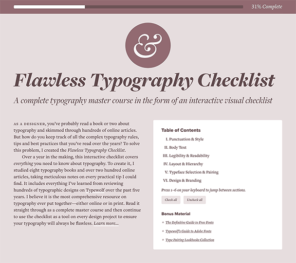](https://www.typewolf.com/checklist)\n\n[Learn More →](https://www.typewolf.com/checklist)\n\n\n\n\n\n","metadata":{"og:site_name":"Typewolf","twitter:site":"@typewolf","ogUrl":"https://www.typewolf.com/resources","twitter:card":"summary","ogTitle":"The Best Typography Resources for 2026 · Typewolf","ogDescription":"A comprehensive collection of the best typography resources from around the web—including the best typography blogs, books, tools and learning resources.","title":"The Best Typography Resources for 2026 · Typewolf","ogImage":"https://www.typewolf.com/assets/img/og/typography-resources.png","referrer":"unsafe-url","og:image":"https://www.typewolf.com/assets/img/og/typography-resources.png","og:type":"website","og:title":"The Best Typography Resources for 2026 · Typewolf","og:url":"https://www.typewolf.com/resources","twitter:title":"The Best Typography Resources for 2026 · Typewolf","description":"A comprehensive collection of the best typography resources from around the web—including the best typography blogs, books, tools and learning resources.","fb:admins":"145260129015613","twitter:description":"A comprehensive collection of the best typography resources from around the web—including the best typography blogs, books, tools and learning resources.","twitter:creator":"@typewolf","twitter:image:src":"https://www.typewolf.com/assets/img/og/typography-resources.png","og:description":"A comprehensive collection of the best typography resources from around the web—including the best typography blogs, books, tools and learning resources.","language":"en","ogSiteName":"Typewolf","twitter:domain":"typewolf.com","viewport":"width=device-width, initial-scale=1.0","scrapeId":"01a10841-f509-75fc-a34a-ff5239e2ab7b","sourceURL":"https://www.typewolf.com/resources","url":"https://www.typewolf.com/resources","statusCode":200,"contentType":"text/html; charset=UTF-8","proxyUsed":"basic","cacheState":"hit","cachedAt":"2026-10-03T17:02:20.350Z","creditsUsed":1}},{"url":"https://www.eleken.co/blog-posts/best-website-design-examples","title":"50 best website design examples for inspiration [2026]","description":"# 50 Best Website Design Examples: A Curated Collection by Designers, for Designers\n## 3. Abetka UA\n### **Takeaway for designers**\nAbetka UA is one of the best website examples with a typography-driven approach.\n\n## **18. Fabric**\n### **Takeaway for designers:**\nFabric's website is a masterclass in balancing bold visual identity with functional and good UX.\n\n## **25. MORAL**\n### **Why this design stands out:**\n1. **Editorial-style typography.** The oversized, high-contrast serif typeface gives the site the feel of a high-end fashion magazine rather than a typical skincare brand.\n4. **Playful text integration.** Small circular cutouts in the typography reveal product images and skin textures, making the layout dynamic.\n5. **Soft, natural color palette.** Cream, black, and muted green tones reinforce the brand’s organic yet luxurious positioning.\n\n### **Takeaway for designers:**\nIt proves that a bold serif typeface, when paired with clean layouts and high-end imagery, can create a luxury brand experience.\n\n## **28. Umbrel**\n### **Takeaway for designers:**\nMinimalist, high-contrast dark mode designs can be incredibly effective when paired with strong typography and accent colors.\n\n## 46. Kovalska\n### **Takeaway for designers:**\nKovalska’s website is a great example of how a minimalist color palette combined with bold typography can create a memorable and high-impact design. If you're working on a brand-focused website, consider using large-scale typography, high contrast colors, and a structured but dynamic text arrangement to make a lasting impression.","position":7,"markdown":"Article\n\nDesign process\n\nupdated on:\n\n27 Jul\n\n,\n\n2026\n\n# 50 Best Website Design Examples: A Curated Collection by Designers, for Designers\n\n40\n\nmin to read\n\n\n\n[\\\\\n\\\\\nDarina Silchenko \\\\\n\\\\\nSenior UI/UX designer](https://www.eleken.co/author/darina-silchenko) [\\\\\n\\\\\nStan Murash\\\\\n\\\\\nWriter](https://www.eleken.co/author/stanislava-murashchenko)\n\nTable of contents\n\n- [1\\. UNITED24 Rebuild Map](https://www.eleken.co/blog-posts/best-website-design-examples#1-united24-rebuild-map)\n- [2\\. HeyFriends!](https://www.eleken.co/blog-posts/best-website-design-examples#2-heyfriends)\n- [3\\. Abetka UA](https://www.eleken.co/blog-posts/best-website-design-examples#3-abetka-ua)\n- [4\\. B-Egg Farm](https://www.eleken.co/blog-posts/best-website-design-examples#4-b-egg-farm)\n- [5\\. Ellipsus](https://www.eleken.co/blog-posts/best-website-design-examples#5-ellipsus)\n- [6\\. Mona Sans & Hubot Sans (GitHub)](https://www.eleken.co/blog-posts/best-website-design-examples#6-mona-sans-hubot-sans-github)\n- [7\\. Apple Siri](https://www.eleken.co/blog-posts/best-website-design-examples#7-apple-siri)\n- [8\\. Overrrides](https://www.eleken.co/blog-posts/best-website-design-examples#8-overrrides)\n- [9\\. Mode](https://www.eleken.co/blog-posts/best-website-design-examples#9-mode)\n- [10\\. Lusion](https://www.eleken.co/blog-posts/best-website-design-examples#10-lusion)\n- [11\\. The Message to Ukraine (Obys Agency)](https://www.eleken.co/blog-posts/best-website-design-examples#11-the-message-to-ukraine-obys-agency)\n- [12\\. DIKO](https://www.eleken.co/blog-posts/best-website-design-examples#12-diko)\n- [13\\. Ventriloc](https://www.eleken.co/blog-posts/best-website-design-examples#13-ventriloc)\n- [14\\. You Can Be Anything (TFTL Agency)](https://www.eleken.co/blog-posts/best-website-design-examples#14-you-can-be-anything-tftl-agency)\n- [15\\. GRIDS (Obys Agency)](https://www.eleken.co/blog-posts/best-website-design-examples#15-grids-obys-agency)\n- [16\\. Depo Studio](https://www.eleken.co/blog-posts/best-website-design-examples#16-depo-studio)\n- [17\\. Rebellion](https://www.eleken.co/blog-posts/best-website-design-examples#17-rebellion)\n- [18\\. Fabric](https://www.eleken.co/blog-posts/best-website-design-examples#18-fabric)\n- [19\\. Hydra](https://www.eleken.co/blog-posts/best-website-design-examples#19-hydra)\n- [20\\. StoryMakers Project](https://www.eleken.co/blog-posts/best-website-design-examples#20-storymakers-project)\n- [21\\. Auxility](https://www.eleken.co/blog-posts/best-website-design-examples#21-auxility)\n- [22\\. SEBTO](https://www.eleken.co/blog-posts/best-website-design-examples#22-sebto)\n- [23\\. Pebble Life](https://www.eleken.co/blog-posts/best-website-design-examples#23-pebble-life)\n- [24\\. Can't Unsee](https://www.eleken.co/blog-posts/best-website-design-examples#24-cant-unsee)\n- [25\\. MORAL](https://www.eleken.co/blog-posts/best-website-design-examples#25-moral)\n- [26\\. прапор.укр (prapor.ukr)](https://www.eleken.co/blog-posts/best-website-design-examples#26-praporukr)\n- [27\\. Fluent](https://www.eleken.co/blog-posts/best-website-design-examples#27-fluent)\n- [28\\. Umbrel](https://www.eleken.co/blog-posts/best-website-design-examples#28-umbrel)\n- [29\\. Dumy](https://www.eleken.co/blog-posts/best-website-design-examples#29-dumy)\n- [30\\. Enpower Trading](https://www.eleken.co/blog-posts/best-website-design-examples#30-enpower-trading)\n- [31\\. Flayks](https://www.eleken.co/blog-posts/best-website-design-examples#31-flayks)\n- [32\\. The Web Can Do What!?](https://www.eleken.co/blog-posts/best-website-design-examples#32-the-web-can-do-what)\n- [33\\. Crew by Tubik Studio](https://www.eleken.co/blog-posts/best-website-design-examples#33-crew-by-tubik-studio)\n- [34\\. SaveDay](https://www.eleken.co/blog-posts/best-website-design-examples#34-saveday)\n- [35\\. Adidas Arena](https://www.eleken.co/blog-posts/best-website-design-examples#35-adidas-arena)\n- [36\\. Metadrop](https://www.eleken.co/blog-posts/best-website-design-examples#36-metadrop)\n- [37\\. Teenage Engineering](https://www.eleken.co/blog-posts/best-website-design-examples#37-teenage-engineering)\n- [38\\. Art+Tech Report](https://www.eleken.co/blog-posts/best-website-design-examples#38-arttech-report)\n- [39\\. Endless Tools](https://www.eleken.co/blog-posts/best-website-design-examples#39-endless-tools)\n- [40\\. Ethnocare](https://www.eleken.co/blog-posts/best-website-design-examples#40-ethnocare)\n- [41\\. Appwrite](https://www.eleken.co/blog-posts/best-website-design-examples#41-appwrite)\n- [42\\. Artbruno](https://www.eleken.co/blog-posts/best-website-design-examples#42-artbruno)\n- [43\\. Flying Papers](https://www.eleken.co/blog-posts/best-website-design-examples#43-flying-papers)\n- [44\\. Arrow Dynamics](https://www.eleken.co/blog-posts/best-website-design-examples#44-arrow-dynamics)\n- [45\\. Pinnacle Design Lab](https://www.eleken.co/blog-posts/best-website-design-examples#45-pinnacle-design-lab)\n- [46\\. Kovalska](https://www.eleken.co/blog-posts/best-website-design-examples#46-kovalska)\n- [47\\. Tiny Wins](https://www.eleken.co/blog-posts/best-website-design-examples#47-tiny-wins)\n- [48\\. Gemnote](https://www.eleken.co/blog-posts/best-website-design-examples#48-gemnote)\n- [49\\. Stripe Press](https://www.eleken.co/blog-posts/best-website-design-examples#49-stripe-press)\n- [50\\. Pitch](https://www.eleken.co/blog-posts/best-website-design-examples#50-pitch)\n- [Final thoughts on web design](https://www.eleken.co/blog-posts/best-website-design-examples#final-thoughts-on-web-design)\n\n## TL;DR\n\nThis curated list of 50 website design examples shows how top brands and creators use bold typography, immersive visuals, and smart UX to make their sites stand out. Each example comes with quick takeaways you can apply to your own projects.\n\nWhen working on a new website, finding inspiring website design ideas can make all the difference. Whether you're a designer refining your craft, a startup founder looking for fresh ideas, or a product manager searching for UI/UX best practices, seeing great design in action helps spark creativity.\n\nThis collection of best website design examples is not just another random list. It's a handpicked selection curated over the past year by Dmytro Shkliaruk and Darina Silchenko, senior UI/UX designers and UI mentors at Eleken. Though at [Eleken](https://eleken.co/), we mostly [design complex web apps](https://www.eleken.co/web-app-design) and SaaS products rather than standalone marketing websites. But that’s exactly why we pay so much attention to great website design: the same principles that make these sites clear, engaging, and high-converting are the ones we apply to dashboards, onboarding flows, and in-app experiences.\n\nThis collection reflects that product-designer perspective on web design. The examples showcase outstanding web design principles, innovative layouts, and UX strategies that make a real impact. From bold typography choices to seamless interactive elements, these websites offer valuable insights for anyone aiming to create best website design that will be both beautiful and functional.\n\nIn this article, we'll explore a variety of well-designed websites, from minimalist interfaces, to immersive storytelling, to high-converting landing pages, and experimental interactive experiences. Each web design example comes with a brief explanation of what makes a good website design, so you can walk away with actionable ideas for your next project.\n\nLet's dive in.\n\n## 1\\. UNITED24 Rebuild Map\n\n\n\n**🔗** [**Visit website**](https://u24.gov.ua/uk/rebuild/map)\n\n### Why this design stands out\n\n1. **Dark UI with high contrast** The website uses a dark-themed map with neon green highlights, creating a visually striking contrast. This aesthetic not only enhances readability but also makes key data points stand out.\n2. **Data visualization for transparency** Instead of static content, the site dynamically maps reconstruction projects across Ukraine. Site visitors can easily switch between map view and list view, making navigation intuitive.\n3. **Minimalist yet informative UI** The interface is clean and functional, with essential information presented upfront. The UI elements, such as the donation button and project filters, are easy to access without overwhelming the user.\n4. **Strategic branding** The UNITED24 logo is bold and placed prominently, reinforcing trust and credibility. The presence of real-time statistics on donations strengthens transparency and engagement.\n5. **Mobile-friendly and responsive** The interactive elements are well-optimized for different screen sizes, ensuring a smooth experience across desktop and mobile devices.\n\n### Takeaway for designers\n\nThis website is a perfect example of **data-driven design** that balances aesthetically pleasing look with functionality. If you're working on an interactive platform that involves maps, donations, or social initiatives, UNITED24 Rebuild Map is an excellent reference.\n\n## 2\\. HeyFriends!\n\n\n\n**🔗** [**Visit website**](https://www.heyfriends.studio/)\n\n### Why this design stands out\n\n1. **Bold, engaging typography** The homepage headline uses a large, heavy sans-serif font that instantly grabs attention. The word _\"effortless\"_ is highlighted with a subtle hand-drawn circle, making the message more relatable and dynamic.\n2. **Friendly and playful aesthetic** The site embraces hand-drawn elements and organic shapes, reinforcing a sense of creativity and approachability. This is especially effective for a service aimed at content creators.\n3. **Clever use of whitespace** The clean, minimal background ensures that every design element stands out, making the content easy to scan and digest.\n4. **Effective call-to-action buttons** The contrast between the primary and secondary CTA buttons (\"Get Started Now!\" in dark green and \"View Pricing\" in a soft outline) helps guide the user’s next step without overwhelming them.\n5. **Illustrative storytelling** The homepage uses a playful, hand-drawn illustration of a person overwhelmed with video production tasks. This visual immediately resonates with the audience’s pain points, making the brand’s value proposition clear.\n\n### **Takeaway for designers**\n\nHeyFriends! is one of the great website design examples to showcase how visual storytelling, bold [typography design](https://www.eleken.co/blog-posts/typography-design), and interactive elements can create an inviting user experience. If you're designing for creator-focused platforms, this site demonstrates how to combine playfulness with clarity for maximum impact.\n\n## 3\\. Abetka UA\n\n\n\n**🔗** [**Visit website**](https://abetkaua.com/en/)\n\n### Why this design stands out\n\n1. **Typographic storytelling** This website is a visual tribute to Ukrainian identity through typography. The bold, geometric custom typeface not only serves an aesthetic function but also acts as an interactive element that draws the target audience into the cultural and historical significance of the letters.\n2. **Engaging interactive elements** Each letter is paired with historical and cultural figures, adding an educational storytelling layer to the design. The floating, draggable letter cards create a museum-like experience, making learning about typography and history more engaging.\n3. **Striking color contrast** The deep blue background combined with black, white, and yellow highlights ensures that text and images pop, maintaining high readability and a visually cohesive theme.\n4. **Minimalist yet bold layout** The homepage embraces a grid-based design with ample whitespace, allowing the oversized typography and imagery to take center stage without feeling cluttered.\n5. **Cultural immersion through design** The project is more than just a typography showcase – it’s a historical and artistic exploration. By integrating Ukrainian history into the visual experience, it successfully blends graphic design with cultural storytelling.\n\n### **Takeaway for designers**\n\nAbetka UA is one of the best website examples with a typography-driven approach. It shows how typefaces can be more than just fonts – they can be interactive, educational, and deeply meaningful. If you're designing a thematic, history-based, or cultural project, this site is a fantastic reference for balancing education with aesthetics.\n\n## 4\\. B-Egg Farm\n\n\n\n**🔗** [**Visit website**](https://www.b-egg.farm/)\n\n### Why this design stands out\n\n1. **Branded, product-first aesthetic** The homepage immediately showcases the product packaging, which seamlessly integrates with the web design. The dripping egg yolk motif extends from the packaging onto the website layout, reinforcing brand identity.\n2. **Creative typography choices** The site plays with two distinct typefaces:\n\n\n - Bold, uppercase sans-serif for clarity and strong messaging.\n - Handwritten script for an artisanal, organic feel.\n\n This mix conveys a sense of modernity with a handcrafted touch, making the product feel both innovative and personal.\n3. **Engaging visual textures** The cutout text effect (with food imagery inside the typography) adds depth and a tactile feel, making the design more immersive.\n4. **Playful illustrations** The black-and-white hand-drawn chicken illustrations add a humorous, friendly touch, balancing the professional layout with a fun personality.\n5. **Well-structured information hierarchy** Despite its creative website elements, this example keeps essential details (like product benefits and storage conditions) clearly structured and easy to read. Icons, bullet points, and highlights ensure smooth navigation.\n\n### **Takeaway for designers**\n\nB-Egg Farm belongs to the cool website designs where product branding and web design can work together to create a cohesive experience. If you're designing an e-commerce or food-related website, this site demonstrates how to use packaging as a design theme, playful typography, and engaging visuals to build a strong brand presence.\n\n## 5\\. Ellipsus\n\n\n\n**🔗** [**Visit website**](https://ellipsus.com/#introduction)\n\n### Why this design stands out\n\n1. **Elegant, editorial typography** The site’s use of a serif font with high contrast and delicate curves immediately evokes a sense of craftsmanship and creativity—perfect for a writing-focused tool. The contrast between the classic typography and modern UI elements gives it a premium, sophisticated look.\n2. **Dark mode hero section** The homepage greets visitors with a dark background and glowing white serif text, creating a high-end, cinematic feel. This contrast draws site visitors in while reinforcing focus and clarity, much like a well-structured piece of writing.\n3. **Handwritten annotation effects** Throughout the site, elements like underlines, circles, and highlights mimic a writer’s editing marks, making the design feel personal, crafted, and intuitive.\n4. **Illustrative storytelling** The soft hand-drawn elements, such as floating paper cranes and sketched book stacks, add a sense of warmth and creativity while subtly reinforcing the theme of writing as an art form.\n5. **Intentional whitespace and hierarchy** The spacious, well-structured layout makes it easy to digest information, mirroring the balance between form and function—just like good writing.\n\n### Takeaway for designers\n\nEllipsus is an excellent reference for typography-driven website designs that blends editorial aesthetics with interactive elements. If you're working on a creative tool, writing app, or artistic brand, this site shows how to combine classic and modern design elements for a unique, engaging experience.\n\n## 6\\. Mona Sans & Hubot Sans (GitHub)\n\n\n\n**🔗** [**Visit website**](https://github.com/mona-sans)\n\n### Why this design stands out\n\n1. **Cinematic typography-driven hero section** The homepage features massive, bold text that commands attention. The stacked type with gradient lighting gives the page a 3D cinematic effect, making it feel futuristic and high-impact.\n2. **Strong brand integration** The design leans into GitHub’s futuristic branding, with their signature Mona the Octocat and Hubot characters in a dynamic, glowing composition. The imagery makes the page feel more than just a typography showcase—it’s an experience.\n3. **Dark mode aesthetic with neon contrast** The deep blue gradient background and glowing highlights create a high-tech, immersive feel, reinforcing the modern and adaptable nature of the fonts.\n4. **Seamless blend of typography and visuals** The fonts themselves are the stars of the show—their weight, style, and versatility are demonstrated right in the design, making the site both functional and promotional.\n5. **Subtle yet effective interactivity** The page includes scroll-based animations and dynamic lighting effects, giving it a polished, high-production-value feel while keeping the user experience smooth and intuitive.\n\n### Takeaway for designers\n\nThis is yet another excellent example of web design inspiration, showing that typography-focused branding pages can be made visually compelling. If you're looking for examples of websites for a product launch, a tech brand, or a font showcase, this site shows how to merge strong branding, bold type, and futuristic visuals into a cohesive storytelling experience.\n\n## 7\\. Apple Siri\n\n\n\n**🔗** [**Visit website**](https://www.apple.com/siri/)\n\n### Why this design stands out\n\n1. **Minimalist, product-first design** Apple’s signature clean, white background allows the vibrant product visuals and typography to stand out. The lack of distractions ensures an immediate focus on Siri’s branding and integration across Apple devices.\n2. **Gradient-rich typography for branding** The word \"Siri\" uses a fluid gradient that mirrors the color scheme of Siri’s interface, creating a strong visual connection between branding and functionality.\n3. **Seamless product ecosystem display** Instead of showing Siri as a standalone service, the page integrates it within iPhones, Apple Watches, AirPods, and Apple TV remotes, reinforcing Apple's ecosystem-based user experience.\n4. **Dynamic layout and fluid animations** The scrolling experience is smooth and interactive, with subtle motion effects that make the visuals feel alive and responsive, mirroring Apple's hardware and software synergy.\n5. **Cohesive brand identity** The page aligns perfectly with Apple’s broader design language—sharp typography, high-end product imagery, and intuitive interaction patterns. Everything feels premium, polished, and effortless.\n\n### Takeaway for designers\n\nApple Siri's page is one of the top website designs when it comes to minimalist UX/UI design that emphasizes brand consistency, simplicity, and interactivity. If you're designing a product-focused home page, this site is a perfect reference for letting visuals and typography do the storytelling without unnecessary clutter.\n\n## 8\\. Overrrides\n\n\n\n**🔗** [**Visit website**](https://overrrides.com/)\n\n### Why this design stands out\n\n1. **Retro-futuristic hacker aesthetic** The site embraces a low-tech, early-internet aesthetic, with a black terminal-style interface, neon pixelated fonts, and an overall cyberpunk vibe that feels both nostalgic and modern.\n2. **Interactive component showcase** Instead of just displaying its offerings, Overrrides lets users interact with different Framer components. Elements like hover effects, keyboard inputs, and right-click triggers showcase the functional capabilities of the library in real time.\n3. **Bold, high-contrast typography** The use of bright yellow monospaced text on a black background mimics an old-school command-line interface, reinforcing the developer-centric appeal.\n4. **Dynamic, modular grid layout** The page is structured like a dashboard, making it easy to navigate different features while keeping a playful, experimental feel.\n5. **Nostalgic VHS-style animations** The intro video, with its 80s VHS distortion effect, adds an extra layer of personality, setting the tone for a fun, tech-savvy, and slightly rebellious brand identity.\n\n### Takeaway for designers\n\nOverrrides is one of the great website designs for leaning into niche aesthetics while maintaining functionality and usability. If you’re designing a developer tool, UI component library, or an interactive showcase, this site proves that embracing a unique visual theme can create an unforgettable user experience.\n\n## 9\\. Mode\n\n\n\n**🔗** [**Visit website**](https://mode.com/)\n\n### Why this design stands out\n\n1. **Retro-modern typography** The website features a playful, slightly irregular serif font, which gives it a human, approachable feel. Combined with its large size and unconventional layout, the typography grabs attention while maintaining readability.\n2. **Vibrant color palette** The use of deep greens and neon lime accents creates a bold yet sophisticated contrast. The bright elements help direct focus to key messaging, making the site visually engaging.\n3. **Modular layout with organic shapes** Instead of rigid sections, the page utilizes soft-rounded boxes and speech-bubble-like containers, creating a more fluid and dynamic reading experience.\n4. **Balanced use of visuals and data** The design seamlessly integrates photography, charts, and typography, reinforcing Mode’s identity as a business intelligence platform that’s both analytical and user-friendly.\n5. **Well-structured call-to-actions (CTAs)** The \"Try for free\" button in bright green contrasts perfectly with the darker background, ensuring it's highly visible and encourages interaction.\n\n### **Takeaway for designers**\n\nMode's site belongs to good web design examples when it comes to making a data-heavy SaaS platform feel fresh and engaging. If you're creating a [SaaS application design](https://www.eleken.co/blog-posts/application-interface-design-examples-how-top-companies-design-their-apps-uis), working for B2B tech, or analytics, this site proves that bold typography, vibrant contrast, and fluid layouts can break the mold of traditional enterprise design.\n\n## 10\\. Lusion\n\n\n\n**🔗** [**Visit website**](https://lusion.co/)\n\n### Why this design stands out\n\n1. **High-end, immersive 3D visuals** Lusion’s website feels like an interactive digital art piece. The use of real-time 3D elements, fluid animations, and dynamic lighting effects makes the experience highly engaging and visually striking.\n2. **Minimalist UI with futuristic elegance** The soft gray background paired with bold black typography and subtle shadows gives the site a sleek, modern aesthetic. Despite its complexity, the design feels clean and spacious.\n3. **Seamless scrolling experience** The smooth page transitions and micro-interactions create a feeling of depth and motion, guiding users effortlessly through the content.\n4. **Typography that complements the visuals** The site uses a modern sans-serif typeface, which is both sharp and legible, ensuring that the text doesn’t compete with the highly dynamic 3D elements.\n5. **Strong emphasis on visual storytelling** Instead of overwhelming users with text, Lusion lets its featured work speak for itself, using large, immersive visuals to showcase their expertise.\n\n### **Takeaway for designers**\n\nLusion is a benchmark for interactive webpage designs. If you're working on a portfolio, creative agency site, or experience-driven brand, this is a prime example of how to merge cutting-edge web technologies with sleek design for an unforgettable user journey.\n\n## 11\\. The Message to Ukraine (Obys Agency)\n\n\n\n**🔗** [**Visit website**](https://themessagetoukraine.obys.agency/)\n\n### Why this design stands out\n\n1. **Experimental typography as storytelling** The site’s expressive, kinetic typography combines multiple font styles in an artistic, almost handwritten manner. This blends personal expression with structured content, making the text feel alive and emotional.\n2. **Split-screen layout for immersive browsing** The website is divided into two interactive sections:\n\n\n - The left side features dynamic text that morphs and shifts.\n - The right side presents historical images and information about Ukrainian cities, culture, and population statistics.\n\n This dual experience allows users to read and visually explore simultaneously.\n3. **Vintage-inspired visual storytelling** The grainy, textured images with sepia-tone overlays give the site a historical document feel, reinforcing its role as a tribute to Ukraine’s heritage.\n4. **Fluid interactions and parallax effects** The design responds to mouse movement and scrolling, making each transition feel seamless and intuitive. The staggered appearance of text and images enhances the narrative-driven experience.\n5. **Elegant use of negative space** Despite its bold typography and visuals, the site maintains a minimalist, airy layout, ensuring readability and ease of navigation.\n\n### Takeaway for designers\n\nThis site belongs to stunning web pages designs that use typography and layout to evoke emotion and tell a story. If you're working on historical, artistic, or cultural projects, it demonstrates how design can transcend functionality to become an immersive experience.\n\n## 12\\. DIKO\n\n\n\n**🔗** [**Visit website**](https://www.diko.co/)\n\n#### **Why this design stands out**\n\n1. **Maximalist and chaotic in the best way** DIKO’s website is a bold, energetic explosion of color, typography, and motion. It rejects minimalism in favor of an intentionally messy, rebellious aesthetic.\n2. **Oversized typography with personality** The use of gigantic, hand-drawn style text creates an almost zine-like punk energy. The typography interacts with elements dynamically, making the site feel alive and unpredictable.\n3. **Interactive and unconventional navigation**\n\n\n - The homepage features a giant \"DIKO\" that moves and distorts as users scroll.\n - Flies crawl across the screen, adding an unpolished, raw feel.\n - Instead of traditional menus, navigation elements are scattered across the screen, blending into the design.\n4. **Mixed media aesthetic**\n\n\n - Retro-style grainy videos\n - Brutalist 3D elements\n - Glitchy, distorted images\n - Flashing neon and grid-like patterns\n\n This collage of textures and styles feels more like an experimental art project than a typical brand agency website.\n5. **Defies corporate norms** DIKO’s site is a statement against sterile, cookie-cutter web design. The use of offbeat humor, clashing elements, and unexpected details reinforces its anti-establishment personality.\n\n### **Takeaway for designers**\n\nDIKO proves that \"ugly\" design can be beautiful if executed with intention. If you're working on a brand with a rebellious, artistic, or countercultural identity, this is a perfect example of how to turn chaos into an experience.\n\n## 13\\. Ventriloc\n\n\n\n🔗 [Visit website](https://ventriloc.ca/en/)\n\n#### **Why this design stands out**\n\n1. A sophisticated, data-driven aesthetic\n\n\n - Instead of the typical sterile, high-tech look, Ventriloc uses rich, earthy tones with elegant typography.\n - Deep brown and vibrant orange create a sense of warmth, reliability, and premium service.\n2. **Typography that blends authority with refinement**\n\n\n - A mix of bold serif fonts for emphasis and modern sans-serif text for clarity.\n - The serif typography in the hero section gives a high-end, editorial feel, making data consulting seem less transactional and more strategic.\n3. **Interactive dashboard-style visuals**\n\n\n - Instead of static numbers, dynamic charts and analytics are woven into the design.\n - The Visits Report section feels like a real-time analytics dashboard, reinforcing the brand’s data-driven expertise.\n - The background uses curved lines that subtly suggest movement and data flow.\n4. **Minimalist navigation with strong CTAs**\n\n\n - A no-clutter header, keeping user attention on the content.\n - Clear, well-placed CTAs like \"Let’s work together\" and \"Contact us\" guide visitors seamlessly.\n - Subtle hover effects and microinteractions enhance engagement without distractions.\n5. **A structured layout that feels premium**\n\n\n - The site avoids traditional grid layouts in favor of a flowing, organic composition.\n - Reports and data visualizations blend into the content instead of feeling like external widgets.\n - A balance between aesthetic appeal and business credibility makes it stand out in the analytics space.\n\n#### **Takeaway for designers**\n\nVentriloc proves that data-heavy websites don’t have to be cold and technical. Through careful typography choices, warm color palettes, and an integrated data presentation, it creates an experience that is both trustworthy and visually engaging.\n\n## 14\\. You Can Be Anything (TFTL Agency)\n\n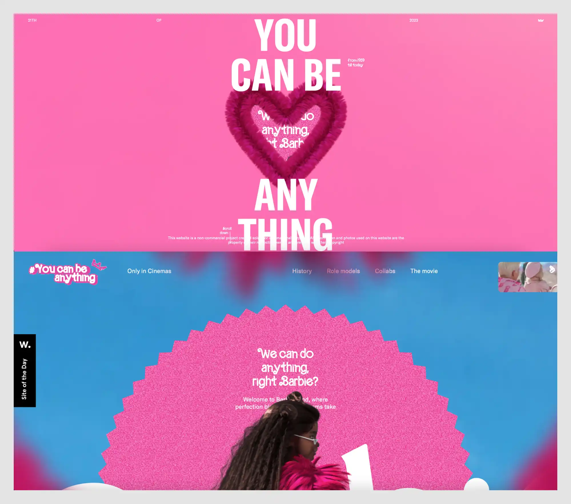\n\n🔗 [Visit website](https://youcanbeanything.tftl.agency/)\n\n### **Why this design stands out**\n\n1. **Fully embraces Barbiecore aesthetics**\n\n\n - The entire website is an explosion of pink, glitter, and femininity, reflecting Barbie’s legacy and cultural impact.\n - The playful, maximalist design mirrors the toy brand’s identity while modernizing it for the web.\n2. **Immersive, interactive 3D elements**\n\n\n - The homepage features a fluffy, textured heart pulsating with animated text inside it.\n - As users scroll, elements move dynamically, maintaining a lively, engaging experience.\n3. **Typography that breaks conventions**\n\n\n - Bold, oversized sans-serif text interacts with the environment, sometimes stretching, rotating, or bending.\n - Text is occasionally pixelated or glitched, adding a retro-digital feel.\n4. **Blending nostalgia with digital innovation**\n\n\n - References Barbie’s history from 1959 to today, blending past and present.\n - The site design feels both like an old-school toy commercial and a modern interactive experience.\n5. **Dynamic scrolling experience**\n\n\n - Sections feel like a digital scrapbook, with layered text, textures, and animated transitions.\n - As users move through the site, different Barbie dolls and thematic elements appear in motion.\n6. **A masterclass in brand consistency**\n\n\n - Every detail, from the motion effects to the color palette, is meticulously aligned with Barbie’s universe.\n - The use of sparkle textures, bubblegum gradients, and handwritten-style fonts ties everything together.\n\n### **Takeaway for designers**\n\nThis site proves that a strong brand identity can translate seamlessly into web design. It’s a perfect example of how to create an immersive, nostalgic-yet-modern experience that fully embodies the essence of a brand.\n\n## 15\\. GRIDS (Obys Agency)\n\n\n\n🔗 [Visit website](https://grids.obys.agency/)\n\n### Why this design stands out:\n\n1. **Educational and experimental approach to design**\n\n\n - The site serves as an educational tool, showcasing different types of grids in web design.\n - Users can toggle between grid structures and \"crazy mode\" for a more dynamic experience.\n2. **Highly structured yet chaotic layout**\n\n\n - The design itself embodies the principles it teaches, using exaggerated typography and extreme grid compositions.\n - Text and images deliberately break grids, illustrating the balance between structure and creativity.\n3. **Minimalist yet striking color scheme**\n\n\n - Uses a bold yellow and black palette, with an option to switch to grayscale.\n - High contrast ensures clarity while maintaining an experimental aesthetic.\n4. **Interactive learning experience**\n\n\n - Users can see grids in action, reinforcing the importance of composition in design.\n - The \"Crazy Mode\" distorts elements to demonstrate what happens when grids are ignored.\n5. **Typography as a design element**\n\n\n - Huge, overlapping letters emphasize the power of grids in structuring content.\n - Deliberate distortions and misalignments illustrate how grids can be manipulated for effect.\n\n### Takeaway for designers:\n\nGRIDS is both a functional tool and an artistic statement, proving that structure and chaos can coexist beautifully. It’s a must-visit for anyone interested in advanced layout techniques.\n\n## 16\\. Depo Studio\n\n\n\n🔗 [Visit website](https://www.depo.studio/)\n\n### Why this design stands out:\n\n1. **Modular, grid-based layout**\n\n\n - The homepage is structured like a collage of tiles, each containing different elements.\n - As users scroll, tiles shift dynamically, creating a flexible, interactive experience.\n2. **Minimalist yet high-impact typography**\n\n\n - The design leans heavily on bold, sans-serif typography with carefully chosen color highlights.\n - Strategic use of blue and black text on white backgrounds makes key words pop.\n3. **Clean, brutalist-inspired aesthetics**\n\n\n - The site embraces a raw, grid-based approach that prioritizes function over decoration.\n - Simple geometric elements and solid color blocks reinforce a utilitarian yet stylish feel.\n4. **Playful use of error states and interactive elements**\n\n\n - Even the 404 page is incorporated into the aesthetic, with a bright pink tile featuring handwritten-style typography.\n - Hover effects, movement-based interactions, and an unconventional menu layout make browsing engaging.\n5. **Balanced contrast of corporate and experimental**\n\n\n - The website maintains a balance between structured professionalism and creative expression.\n - This makes it appealing to both business clients and experimental designers looking for design inspiration.\n\n### Takeaway for designers:\n\nDepo Studio showcases how a grid-based layout can feel dynamic rather than rigid. By mixing clean design with unexpected movement and interactions, it demonstrates how minimalism can still be playful and engaging.\n\n## **17\\. Rebellion**\n\n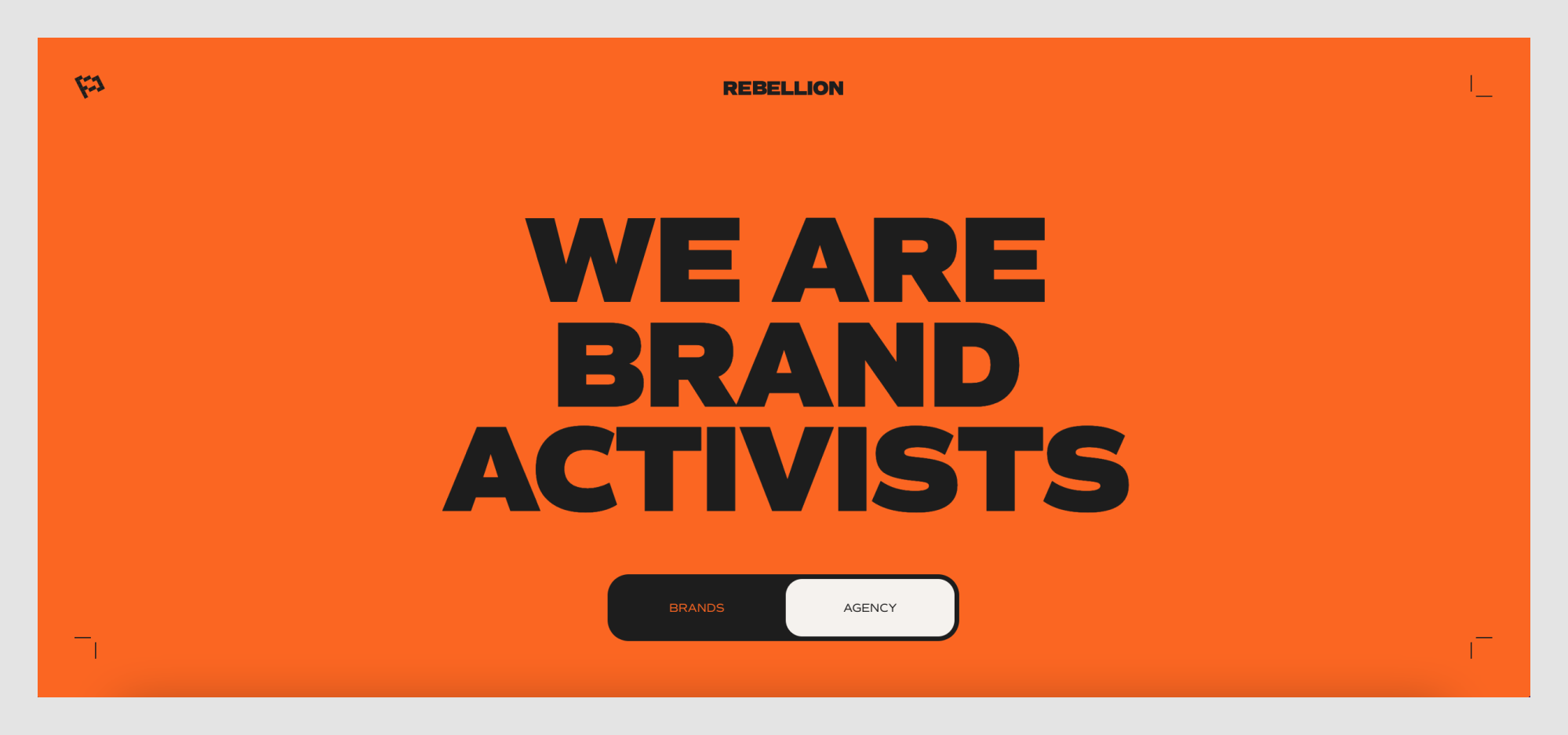\n\n🔗 [Visit website](https://rblln.fr/en/agence)\n\n### **Why this design stands out:**\n\n1. **High-impact color scheme**\n\n\n - A striking orange background dominates the homepage, instantly grabbing attention.\n - Black and white elements contrast sharply, reinforcing a bold, no-nonsense brand identity.\n2. **Massive, statement-making typography**\n\n\n - The oversized, all-caps sans-serif type makes a loud, confident impression.\n - Words like \"BRAND ACTIVISTS\" reinforce the agency’s rebellious, disruptive positioning.\n3. **Minimal but strong visual hierarchy**\n\n\n - The homepage is stripped down to essentials, ensuring focus on the message.\n - A simple, bold toggle (BRANDS \\| AGENCY) lets users choose their experience, making navigation effortless.\n4. **Subtle yet effective interactive elements**\n\n\n - Small animated details, like the corner brackets, create a dynamic feel.\n - The toggle button feels like a physical switch, adding a sense of engagement.\n5. **A visual identity that aligns with the brand’s ethos**\n\n\n - The aggressive, activist-style branding is reinforced through its bold, unapologetic design.\n - Everything about the website conveys energy, movement, and defiance.\n\n### **Takeaway for designers:**\n\nRebellion’s site proves that minimalism doesn’t have to be quiet. By combining high-impact color, bold typography, and a clear brand identity, it creates an experience that feels both powerful and intentional. If you're designing for a brand with a disruptive, activist-driven ethos, this is a perfect reference.\n\n## **18\\. Fabric**\n\n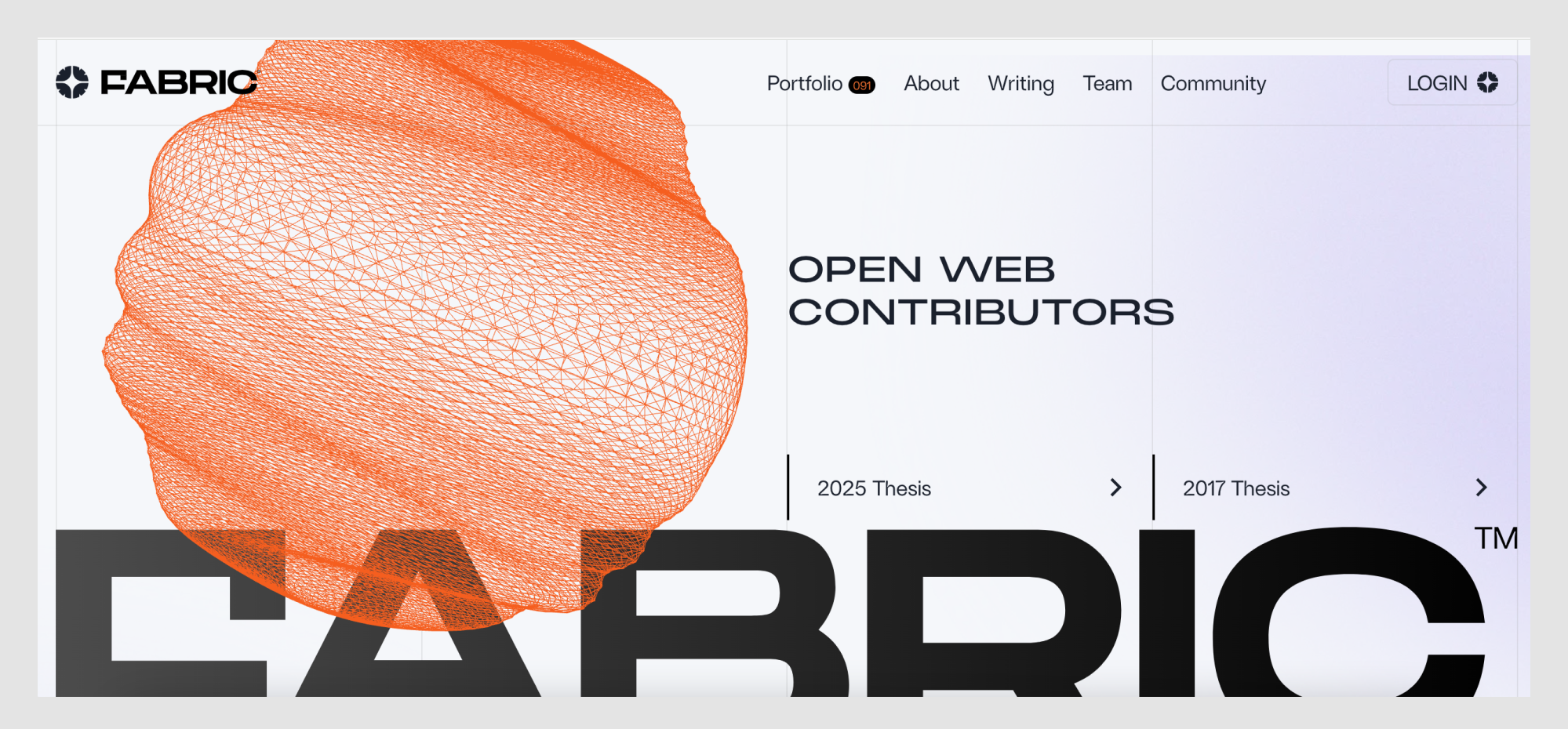\n\n🔗 [Visit website](https://www.fabric.vc/)\n\n### **Why this design stands out:**\n\n1. **Striking generative design elements**\n\n\n - A dynamic, wireframe-like 3D shape dominates the homepage, reinforcing Fabric’s focus on innovation.\n - The orange mesh structure feels organic yet tech-forward, symbolizing interconnectedness and web evolution.\n2. **Strong typographic hierarchy**\n\n\n - The mix of extra-large, bold sans-serif text and sleek, futuristic fonts creates contrast and clarity.\n - The word “FABRIC” partially fades behind elements, adding a layered, immersive effect.\n3. **Minimal but sophisticated navigation**\n\n\n - The menu is clean, with a subtle but effective use of micro-interactions.\n - The structured layout prioritizes content accessibility while maintaining a high-end aesthetic.\n4. **Subtle use of gradients and motion**\n\n\n - Light gradients and interactive animations give the site a smooth, polished feel.\n - Scrolling effects reinforce a sense of depth without overwhelming the experience.\n5. **A perfect fusion of tech and art**\n\n\n - The entire design balances futuristic tech aesthetics with artistic composition, making it feel both functional and inspiring.\n - The blend of hard geometric structures and fluid navigation mirrors the venture capital firm’s vision of an evolving, decentralized web.\n\n### **Takeaway for designers:**\n\nFabric's website is a masterclass in balancing bold visual identity with functional and good UX. If you're working on a site for a tech-driven or innovation-focused brand, this is a great example of how to blend interactivity, motion, and structured content into a seamless experience.\n\n## **19\\. Hydra**\n\n\n\n🔗 [Visit website](https://www.hydra.so/)\n\n### **Why this design stands out:**\n\n1. **Playful yet technical branding**\n\n\n - The homepage features a meme-worthy duck character wearing sunglasses, instantly setting a lighthearted but confident tone.\n - The blend of ancient architecture and modern tech references adds a layer of unexpected contrast.\n2. **Bold, high-contrast color scheme**\n\n\n - The vibrant orange background dominates the design, ensuring strong brand recognition.\n - Black outlines and simple typography create a retro, almost print-like aesthetic.\n3. **Minimalist yet quirky typography**\n\n\n - A straightforward sans-serif font keeps things clean, while the inclusion of emojis and speech bubbles makes it more conversational.\n - The layout embraces white space, making the text easy to scan while still feeling bold.\n4. **Memes and gamification as engagement tools**\n\n\n - The speech bubble from the duck (“apps that fly 🦆🚀”) makes the content fun and shareable.\n - Small gaming-inspired icons in the navigation reinforce the playful theme while subtly hinting at Hydra's capabilities.\n5. **Clever use of microcopy and interaction cues**\n\n\n - The email sign-up field is framed as an essential entry point to “build faster apps,” giving a clear value proposition.\n - The banner at the top (\"DuckDB-Powered Postgres takes flight!\") leans into the duck theme while keeping things informative.\n\n### **Takeaway for designers:**\n\nHydra is an excellent example of how branding can be both technical and humorous without feeling unprofessional. If you're designing for a developer-focused or SaaS product, embracing a unique, personality-driven aesthetic can help differentiate the brand while keeping engagement high.\n\nFor more [examples of SaaS landing pages](https://www.eleken.co/blog-posts/saas-landing-page-examples-get-inspired-and-discover-how-to-boost-conversion), check out this post!\n\n## **20\\. StoryMakers Project**\n\n\n\n🔗 [Visit website](https://storymakersproject.com/)\n\n### **Why this design stands out:**\n\n1. **Vibrant, collage-inspired visuals**\n\n\n - The design mixes photography, cut-out elements, and hand-drawn shapes, creating a playful and dynamic aesthetic.\n - Bright, contrasting colors (pink, orange, teal, and purple) enhance visual interest and engagement.\n2. **Layered storytelling approach**\n\n\n - The website reflects the theme of storytelling with overlapping images, patterns, and typography that feel like a modern scrapbook.\n - The use of black-and-white photography combined with bold color accents adds depth and contrast.\n3. **Bold typography with personality**\n\n\n - Large, blocky text in high-contrast colors ensures readability while maintaining a sense of fun.\n - The combination of uppercase and lowercase typography emphasizes key points while keeping the tone approachable.\n4. **Structured information hierarchy**\n\n\n - The design uses clearly separated sections with color-coded blocks to guide users through course details.\n - Numbered elements (“4 блоки навчання” and “12 відеоуроків”) make the content feel digestible and easy to navigate.\n5. **Engaging and interactive elements**\n\n\n - The design invites users to explore with visually compelling graphics and an intuitive layout.\n - The mixed-media aesthetic keeps the experience dynamic, encouraging engagement with the course offerings.\n\n### **Takeaway for designers:**\n\nStoryMakers Project demonstrates how to create a visually engaging and story-driven website that feels both artistic and informative. By incorporating layered visuals, bold typography, and structured content, designers can make educational platforms feel exciting and immersive.\n\n## **21\\. Auxility**\n\n\n\n🔗 [Visit website](https://www.auxility.ca/)\n\n### **Why this design stands out:**\n\n1. **Dark, futuristic aesthetic**\n\n\n - The deep black background contrasts with neon-like gradients in green, purple, and yellow.\n - The lighting effects create an almost sci-fi atmosphere, making the site feel modern and high-tech.\n2. **Typography with dynamic contrast**\n\n\n - The mix of bold, futuristic fonts and lighter, minimal text gives the site a clean but innovative look.\n - The use of soft glows and shadow effects makes the text stand out.\n3. **Subtle but effective motion design**\n\n\n - Floating 3D shapes add depth without overwhelming the experience.\n - The background gradients and light beams shift slightly as users scroll, reinforcing the feeling of modern efficiency.\n4. **Strategic call-to-action placement**\n\n\n - \"Let's talk\" buttons appear in multiple places with a neon glow, guiding the user toward engagement.\n - Each section introduces a key service or industry (fintech, healthcare) with a clear CTA.\n5. **Strong industry positioning**\n\n\n - The site communicates credibility through tech-driven visuals, data-focused copy, and a structured service breakdown.\n - It appeals directly to fintech and healthcare industries, making its niche expertise clear.\n\n### **Takeaway for designers:**\n\nAuxility's website is an excellent reference for those designing for B2B tech, fintech, or AI-driven companies. The dark UI with glowing neon highlights creates an ultra-modern look while keeping readability and usability at the core. If you’re designing for high-tech or research-driven industries, using a combination of dark aesthetics, subtle motion, and bold typography can create a sense of authority and innovation.\n\n## **22\\. SEBTO**\n\n\n\n🔗 [Visit website](https://www.sebto.media/)\n\n### **Why this design stands out:**\n\n1. **Minimalist, high-contrast aesthetic**\n\n\n - The website uses a black-and-white foundation with sharp accents of orange for key elements.\n - The stark contrast enhances readability and creates a strong editorial feel.\n2. **Magazine-like layout**\n\n\n - SEBTO's design mimics a modern online magazine, with a focus on well-structured typography and negative space.\n - The layout prioritizes text-driven content, reinforcing the site's journalistic identity.\n3. **Collage-style visuals**\n\n\n - The imagery combines vintage-style cutouts with contemporary digital graphics, making the site feel bold and unconventional.\n - This mixed-media approach adds depth to the brand's identity, balancing nostalgia with modernity.\n4. **Elegant typography with personality**\n\n\n - The use of serif fonts for headlines contrasts with sans-serif body text, creating a refined yet accessible reading experience.\n - The orange headlines break up the monochrome design, drawing attention to featured content.\n5. **Community-driven interaction**\n\n\n - The prominent Patreon button encourages user engagement and support, reinforcing its independent media status.\n - A structured content approach ensures users can quickly navigate between articles, special projects, and podcasts.\n\n### **Takeaway for designers:**\n\nSEBTO demonstrates how an independent media platform can use a bold yet minimalist design to establish credibility. The careful balance of strong typography, high contrast, and collage-style visuals makes it a great reference for editorial websites. If you're designing for journalism, cultural projects, or independent media, this structured yet expressive approach is worth studying.\n\n## **23\\. Pebble Life**\n\n\n\n🔗 [Visit website](https://pebblelife.com/)\n\n### **Why this design stands out:**\n\n1. **Cinematic first impression**\n\n\n - The homepage features a high-resolution, full-screen video showcasing the Pebble trailer in scenic landscapes.\n - The immersive visuals immediately communicate the product’s luxury and innovation.\n2. **Minimalist yet bold typography**\n\n\n - Oversized, modern sans-serif typography gives the site a sleek, futuristic feel.\n - The text interacts with images dynamically, sometimes being overlaid or partially obscured for depth.\n3. **Fluid and engaging scrolling experience**\n\n\n - Smooth, parallax-like transitions guide users through the product story.\n - Animated elements make the experience feel more interactive without overwhelming the design.\n4. **Nature-meets-technology aesthetic**\n\n\n - A neutral, earthy color palette complements the high-tech black glass elements of the trailer.\n - This combination reinforces the brand’s mission of blending outdoor adventure with smart technology.\n5. **Intuitive call-to-action placement**\n\n\n - The \"Build\" button in the top right encourages users to explore customization options seamlessly.\n - Scroll prompts and interactive previews keep the experience engaging and action-driven.\n\n### **Takeaway for designers:**\n\nPebble Life is a masterclass in blending product storytelling with high-end visuals. If you’re working on a luxury or tech product, you can take inspiration here or partner with one of the leading [UX agencies](https://www.eleken.co/blog-posts/best-ux-agencies) to bring that story to life in a seamless digital experience.\n\n## **24\\. Can't Unsee**\n\n\n\n🔗 [Visit website](https://cantunsee.space/)\n\n### **Why this design stands out:**\n\n1. **Gamified approach to design education**\n\n\n - The website is structured as an interactive game where users spot UI inconsistencies.\n - A progress bar and coin counter add an element of challenge and engagement.\n2. **Retro gaming aesthetic**\n\n\n - The neon, glitchy text logo evokes classic arcade games.\n - Pixel-style typography and bright, contrasting colors reinforce the nostalgic vibe.\n3. **Simple yet effective UI**\n\n\n - Dark background allows the game elements to stand out.\n - Clean card layout ensures the visual comparisons remain the focal point.\n4. **Fun yet educational concept**\n\n\n - Helps designers train their eye for detail in an entertaining format.\n - Reinforces the importance of pixel-perfect UI execution.\n5. **Microinteractions for enhanced engagement**\n\n\n - The interface includes subtle animations when users make selections.\n - Immediate feedback keeps players engaged and learning.\n\n### **Takeaway for designers:**\n\nCan’t Unsee turns UX/UI learning into an addictive game. If you’re designing an educational tool, consider how gamification and interactive feedback can create engagement, or borrow insights from a [UX research agency](https://www.eleken.co/blog-posts/ux-research-agency) that specializes in usability testing.\n\n## **25\\. MORAL**\n\n\n\n🔗 [Visit website](https://moral-skin.com/)\n\n### **Why this design stands out:**\n\n1. **Editorial-style typography.** The oversized, high-contrast serif typeface gives the site the feel of a high-end fashion magazine rather than a typical skincare brand.\n2. **Cinematic product presentation.** The full-screen imagery, close-ups of dewy skin, and artistic compositions make the product feel aspirational.\n3. **Minimalist yet impactful layout.** The site embraces negative space, allowing each element—text, images, and product shots—to breathe.\n4. **Playful text integration.** Small circular cutouts in the typography reveal product images and skin textures, making the layout dynamic.\n5. **Soft, natural color palette.** Cream, black, and muted green tones reinforce the brand’s organic yet luxurious positioning.\n\n### **Takeaway for designers:**\n\nMORAL’s website is an example of how typography can serve as the primary design element. It proves that a bold serif typeface, when paired with clean layouts and high-end imagery, can create a luxury brand experience. If you're designing for beauty, wellness, or fashion, consider letting typography lead the visual identity.\n\n## **26\\. прапор.укр (prapor.ukr)**\n\n\n\n🔗 [Visit website](https://www.xn--80a2abbdd.xn--j1amh/)\n\n### **Why this design stands out:**\n\n1. **Bold and authoritative color presentation** The website establishes an official, almost governmental tone with its strong use of Pantone-certified blue and yellow, the official colors of the Ukrainian flag.\n2. **Minimalistic yet informative layout** Instead of overwhelming users with text, the site keeps information concise and to the point, reinforcing the credibility of the presented color standards.\n3. **Engaging interactivity** Users can copy HEX and CMYK values directly, ensuring practical use for designers, government institutions, and organizations needing accurate flag colors.\n4. **A patriotic and culturally significant theme** The website ties its visuals to real-world examples of Ukrainian flags in use, reinforcing its importance.\n\n### **Takeaway for designers:**\n\nA well-designed informational website doesn’t need complexity—it needs clarity. This project proves that even a single-purpose website can be visually appealing and functionally impactful when executed with precision.\n\n## **27\\. Fluent**\n\n\n\n🔗 [Visit website](https://www.fluent.health/)\n\n### **Why this design stands out:**\n\n1. **Elegant dark mode interface** The dark background with glowing blue and green gradients creates a futuristic, calming atmosphere—ideal for a medical tech product focused on reducing doctor burnout.\n2. **Conversational UI approach** The interface mimics a doctor-patient chat, making it instantly relatable and intuitive for healthcare professionals. The floating text bubbles reinforce the concept of natural speech transcription.\n3. **Strong call-to-action with a clear value proposition**\"It’s time to look up\" is a compelling message, emphasizing how Fluent helps doctors focus on patients instead of taking notes.\n4. **Smooth integration of AI-driven content** The way Fluent showcases an AI-generated medical summary gives users an immediate sense of the tool’s capabilities. The “Copy” button adds practicality.\n\n### **Takeaway for designers:**\n\nMedical tech design should balance professionalism with approachability. Fluent achieves this by blending a sleek aesthetic with human-centric UI elements, ensuring usability while evoking trust.\n\n## **28\\. Umbrel**\n\n\n\n🔗 [Visit website](https://umbrel.com/?country=UA)\n\n### **Why this design stands out:**\n\n1. **Futuristic dark mode UI** The dark aesthetic with neon purple accents gives Umbrel a sleek, cutting-edge feel, reinforcing its positioning as a modern, privacy-focused alternative to mainstream cloud storage.\n2. **Typography-driven impact** The bold tagline, \"Your cloud. In your home.\" makes a powerful statement, with the gradient effect on \"home\" emphasizing its core value proposition—local, private storage.\n3. **Blurred-glass effect for contrast** The card design with soft blur (on the left panel) mimics real-life UI elements, creating an almost \"OS-like\" feel that makes the website experience more immersive.\n4. **Well-integrated product showcase** The split-screen layout effectively presents both the announcement for UmbrelOS 1.4 and a direct preview of its file management system, keeping users engaged.\n\n### **Takeaway for designers:**\n\nMinimalist, high-contrast dark mode designs can be incredibly effective when paired with strong typography and accent colors. Umbrel successfully balances a futuristic, tech-driven aesthetic with user-friendly UI elements.\n\n## 29\\. Dumy\n\n\n\n🔗 [Visit website](https://dumy.com.ua/)\n\n### Why this design stands out\n\n1. **Playful visual identity** The website embraces a bold and whimsical aesthetic, with a hand-drawn blue cat illustration serving as a central visual element. This adds personality and makes the site feel friendly and unique.\n2. **Experimental typography** The oversized Cyrillic text interacts dynamically with the design, blending into the background while still maintaining readability. The use of pink and black type enhances contrast and adds a modern twist.\n3. **Layered, collage-like compositions** The combination of large text, illustrations, and colored backgrounds creates a scrapbook-inspired aesthetic, reinforcing the brand’s creativity and artistic approach.\n4. **Vibrant, unexpected color choices** Instead of traditional muted tones, the site uses bold, high-contrast hues like electric blue, pastel pink, and bright yellow. These colors enhance the site's playful and unconventional feel.\n5. **Minimalist layout with interactive storytelling** Despite its visually rich elements, the site maintains a clean, easy-to-navigate structure. The transitions and hover effects make exploring the content engaging without feeling overwhelming.\n\n### Takeaway for designers\n\nDumy is an excellent example of how a brand can embrace quirky, unconventional design while maintaining clarity and usability. If you're working on a creative agency or cultural project, this site proves that playful visuals, bold typography, and interactive elements can create an engaging, memorable experience.\n\n## 30\\. Enpower Trading\n\n\n\n🔗 [Visit website](https://enpowertrading.co.za/)\n\n### Why this design stands out:\n\n1. **Subtle, dynamic background texture** The website uses a soft, fog-like texture in the background, giving it a refined, futuristic feel while maintaining readability. The subtle motion effect adds depth and elegance.\n2. **High-contrast typography** The bold black typography against the neutral background creates a striking visual impact, ensuring clarity while making a strong statement.\n3. **Minimalist but engaging UI** The interface is clean and structured, with intuitive navigation and a well-balanced content layout. Elements are neatly spaced, creating a sense of order and professionalism.\n4. **Interactive data visualization** The site incorporates animated graphs and charts that dynamically present energy usage trends. These visual elements help make complex data digestible and engaging.\n5. **Monochrome meets selective color** The design predominantly features a monochrome aesthetic with occasional pops of color (such as orange highlights), reinforcing a high-tech, data-driven identity.\n\n### Takeaway for designers:\n\nEnpower Trading’s website demonstrates how energy and finance-related platforms can balance functionality with visual appeal. The combination of restrained typography, subtle animations, and interactive charts makes the design both professional and engaging. This site is a strong reference for anyone working on data-heavy interfaces that need to remain accessible and visually appealing.\n\n## **31\\. Flayks**\n\n\n\n🔗 [Visit website](https://flayks.com/)\n\n### **Why this design stands out:**\n\n1. **Bold, oversized typography** The site utilizes massive, high-impact letters that dominate the screen, creating a strong visual hierarchy and an ultra-modern aesthetic.\n2. **Unconventional color palette** Deep green, coral pink, and glossy aqua blue create a striking contrast, making the design feel fresh, daring, and highly memorable.\n3. **Layered, interactive elements** The overlapping images, dynamic text, and motion effects make the site feel alive, engaging visitors with a sense of movement and depth.\n4. **Experimental branding** The combination of playful, fluid typography and edgy, bold sans-serif fonts reflects a contemporary, rebellious approach to digital identity.\n5. **Cinematic photography integration** Large, high-energy images blend seamlessly into the layout, reinforcing the site's creative, editorial-like feel while keeping users visually engaged.\n\n### **Takeaway for designers:**\n\nFlayks demonstrates how pushing boundaries with typography, layering, and unexpected color choices can create a visually unforgettable experience. This site is a prime reference for designers looking to craft a portfolio or brand identity that feels dynamic, stylish, and artistically bold.\n\n## **32\\. The Web Can Do What!?**\n\n\n\n🔗 [Visit website](https://thewebshowcase.withgoogle.com/)\n\n### **Why this design stands out:**\n\n1. **Immersive card-based storytelling** The website presents information through interactive 3D cards, making content consumption feel playful and dynamic.\n2. **Bold, primary color palette** A striking mix of blue, yellow, and red enhances visual impact while maintaining a recognizable Google aesthetic.\n3. **Smooth and engaging animations** Each interaction flows seamlessly with transitions that reinforce the concept of a fluid, interactive web experience.\n4. **Layered depth and motion effects** The use of shadows, perspective shifts, and floating elements creates a sense of depth, making the content feel more tangible.\n5. **Encourages exploration with intuitive navigation** Users can progress through the experience by flipping cards, tapping buttons, and triggering animations, making the learning process feel intuitive and engaging.\n\n### **Takeaway for designers:**\n\nThe Web Can Do What!? is a masterclass in using interactivity and motion to enhance storytelling. It demonstrates how designers can use card-based layouts, dynamic transitions, and vibrant colors to create an engaging, educational web experience that feels both fun and functional.\n\n## 33\\. Crew by Tubik Studio\n\n\n\n🔗 [Visit website](https://crew.tubikstudio.com/)\n\n### Why this design stands out:\n\n1. **Hand-drawn, expressive illustrations** The site features bold, exaggerated character illustrations with high-contrast colors and dynamic compositions, creating a strong visual identity.\n2. **Playful animation and interactivity** Users are welcomed with an animated \"Enter\" button, setting the tone for an engaging and immersive experience. Elements like characters and text shift subtly as the user navigates.\n3. **Vibrant and unconventional color palette** The website avoids traditional corporate colors, instead opting for punchy, high-contrast combinations of red, yellow, blue, and pink, reinforcing its artistic identity.\n4. **Creative typography and hierarchy** The use of bold, high-contrast sans-serif type ensures readability while maintaining a strong, expressive presence. The layout mixes structured and freeform elements, making the design feel fresh and dynamic.\n5. **Seamless navigation through storytelling** Rather than relying on a standard menu, the site encourages exploration through scrolling interactions that unfold different team members' profiles in a visually engaging way.\n\n### Takeaway for designers:\n\nCrew by Tubik Studio is a great example of how a digital agency can use illustration, animation, and non-traditional design elements to create a unique, memorable brand experience. This approach is perfect for creative industries looking to stand out with a fun, personality-driven website.\n\n## 34\\. SaveDay\n\n\n\n🔗 [Visit website](https://www.save.day/)\n\n### **Why this design stands out:**\n\n1. **Bold typography for impact** The homepage features extra-large, high-contrast typography that grabs attention instantly. The black text on a white background enhances readability and visual clarity.\n2. **Minimalist UI with strong hierarchy** The design embraces white space, making the content feel structured and easy to navigate. The clear hierarchy ensures users quickly understand the product's value proposition.\n3. **Seamless Chrome integration** The interface is optimized for Chrome users, with direct installation buttons, reinforcing its function as a browser extension.\n4. **Grid-based visual storytelling** The interface showcases a Pinterest-like grid for saving and organizing bookmarks, making the experience feel intuitive and familiar to users.\n5. **Strategic use of color and branding** Yellow and black accents highlight key CTAs, guiding users toward the installation process while maintaining a modern and polished aesthetic.\n\n### **Takeaway for designers:**\n\nSaveDay's is a well-designed website that shows how to communicate a product's purpose through bold design choices. The combination of large typography, a clean grid layout, and a focused color scheme enhances usability while keeping the interface visually engaging. Designers working on SaaS tools or extensions can take inspiration from its streamlined approach to onboarding and user engagement.\n\n## 35\\. Adidas Arena\n\n\n\n🔗 [Visit website](https://www.adidasarena.com/)\n\n### **Why this design stands out:**\n\n1. **Dynamic typography and layout** The site uses oversized, high-impact typography that interacts with other elements, creating a bold and immersive experience. The mix of outlined and filled text adds depth and energy.\n2. **Collage-style visual composition** Elements like tilted images, layered graphics, and floating text blocks mimic a digital collage, reinforcing the urban and sporty aesthetic of Adidas Arena.\n3. **Technical and editorial contrast** The combination of hand-drawn wireframe illustrations and high-quality sports photography bridges the gap between technical architecture and real-world excitement.\n4. **Interactive navigation and micro-animations** Scroll prompts, hover effects, and subtle animations guide users through the experience while maintaining engagement. The interface feels fluid and responsive.\n5. **Branded color and bold CTA integration** The use of Adidas' black-and-white brand identity is enhanced by striking orange CTA buttons, ensuring clear user direction without disrupting the design harmony.\n\n### **Takeaway for designers:**\n\nAdidas Arena blends energetic branding with technical precision, creating an engaging digital experience that shows how [popular web design companies](https://www.eleken.co/blog-posts/popular-web-design-companies) can use motion, interaction, and visual storytelling in experiential projects. The mix of structured layouts with collage-like elements makes it ideal for sports-related websites. Designers can draw ideas from its strong typography, layered visuals, and dynamic interaction cues to create compelling, immersive digital storytelling.\n\n## 36\\. Metadrop\n\n\n\n🔗 [Visit website](https://metadrop.com/)\n\n### **Why this design stands out:**\n\n1. **Futuristic and high-contrast aesthetic** The site employs a dark mode interface with neon-inspired gradients, creating a sleek and modern look that aligns with the Web3 and crypto space.\n2. **Dynamic track-based UI** The homepage features animated, racing-style progress bars that visually represent different crypto projects, reinforcing the platform’s gamified and competitive nature.\n3. **Interactive elements and live engagement** Real-time user interactions are displayed on the homepage, with avatars and transaction data moving across the screen, making the experience feel lively and community-driven.\n4. **Minimal yet bold typography** The clean, sans-serif typography contrasts sharply against the dark background, ensuring clarity and readability while maintaining a futuristic aesthetic.\n5. **Seamless onboarding and engagement CTAs** The UI encourages immediate interaction with clear CTAs like “Launch a Coin” and “Connect,” making it easy for users to engage with the platform right away.\n\n### **Takeaway for designers:**\n\nMetadrop is a strong example of how motion design and real-time interactivity can enhance user engagement. The combination of neon gradients, dynamic progress bars, and live user activity creates an immersive and visually compelling experience. Designers working on fintech, gaming, or crypto projects can take inspiration from its high-energy interface and interactive storytelling.\n\n## 37\\. Teenage Engineering\n\n\n\n🔗 [Visit website](https://teenage.engineering/)\n\n### **Why this design stands out:**\n\n1. **Minimalist, high-tech aesthetic** The website embraces a sleek, dark-themed interface with clean typography and a focus on negative space, creating a futuristic and refined look.\n2. **Highly structured yet playful layout** The navigation is visually distinct, using outlined icons and neatly arranged text, making it easy to explore while maintaining a unique design language.\n3. **Striking product presentation** Products are showcased with high-quality imagery, subtle animations, and interactive elements, reinforcing the brand’s dedication to innovation and detail.\n4. **Multilingual and globally accessible** The site incorporates multiple languages seamlessly within the interface, ensuring accessibility for an international audience while keeping the design uncluttered.\n5. **Iconography-driven navigation** Instead of traditional dropdowns, the menu uses minimal icons and wireframe-style illustrations, aligning with the brand’s futuristic and engineering-focused aesthetic.\n\n### **Takeaway for designers:**\n\nTeenage Engineering’s website is an excellent example of how minimalism can be both functional and visually compelling. By balancing structured layouts, bold typography, and a strong brand identity, it creates an immersive, high-tech experience. Designers working on product-focused or futuristic brands can take inspiration from its clean UI, intuitive navigation, and engaging product storytelling.\n\n## 38\\. Art+Tech Report\n\n\n\n🔗 [Visit website](https://www.arttechreport.com/)\n\n### **Why this design stands out:**\n\n1. **Bold, futuristic typography** The site employs a combination of blocky sans-serif and elegant serif typefaces, creating a striking contrast that reflects the blend of art and technology.\n2. **Dynamic, modular layout** The grid-based structure with floating elements adds a sense of movement, making the design feel dynamic and engaging without overwhelming the user.\n3. **Monochromatic blue aesthetic** A single, vibrant blue color dominates the design, reinforcing the futuristic and digital theme while ensuring visual consistency.\n4. **Interactive elements with depth** Buttons, text, and content blocks have subtle shadows and layering effects, creating an illusion of depth and enhancing user interaction.\n5. **Minimalist but high-impact UI** Despite its bold visuals, the site remains clean and navigable, proving that experimental design can still maintain usability.\n\n### **Takeaway for designers:**\n\nArt+Tech Report showcases how a bold, monochromatic approach combined with creative typography and an interactive layout can create a memorable experience. Designers looking to craft digital-first, futuristic interfaces can draw inspiration from its structured yet fluid aesthetic.\n\n## 39\\. Endless Tools\n\n\n\n🔗 [Visit website](https://endlesstools.io/)\n\n### **Why this design stands out:**\n\n1. **Sleek dark mode aesthetic** The high-contrast black background enhances the vibrancy of the showcased 3D elements, making the interface feel premium and immersive.\n2. **Realistic 3D interface presentation** The website mimics the experience of using the tool itself, displaying a rendered workspace with floating UI elements that create an engaging and interactive feel.\n3. **Minimalist, high-impact typography** The use of clean sans-serif type, paired with bold headings and generous whitespace, ensures clarity and effortless readability.\n4. **Subtle lighting effects** A soft light glare effect across the top of the interface enhances realism, giving the design a polished and tactile appearance.\n5. **Interactive feel without overwhelming animations** The site remains highly interactive, but transitions and hover effects are smooth, avoiding excessive motion that could distract from the core content.\n\n### **Takeaway for designers:**\n\nEndless Tools demonstrates how a well-crafted dark theme combined with interactive, UI-focused design can create an engaging experience. This approach is ideal for digital tools, software showcases, and futuristic web projects.\n\n## 40\\. Ethnocare\n\n\n\n🔗 [Visit website](https://ethnocare.ca/)\n\n### **Why this design stands out:**\n\n1. **High-contrast, bold typography** The oversized, capitalized text creates a strong visual hierarchy and ensures readability against the dark background.\n2. **Dynamic 3D product visualization** The floating and rotating 3D model of the product adds depth and interactivity, making the design feel more immersive.\n3. **Minimalist dark mode aesthetic** The sleek black background with bright white and cyan typography enhances contrast and creates a modern, premium feel.\n4. **Subtle motion effects** The text and product animation guide the user's focus naturally, improving engagement without overwhelming the interface.\n5. **Clear product storytelling** The page uses concise, impactful messaging to communicate the product’s value, focusing on its key innovation: the air expansion system.\n\n### **Takeaway for designers:**\n\nEthnocare's website is a great example of how high-contrast design, interactive 3D elements, and minimalist aesthetics can work together to create a memorable and engaging product showcase. If you're designing for a high-tech or premium brand, this approach demonstrates how to balance sophistication with usability.\n\n## 41\\. Appwrite\n\n\n\n🔗 [Visit website](https://appwrite.io/)\n\n### **Why this design stands out:**\n\n1. **Modern dark UI with gradient highlights** The dark background with pink and white gradients creates a sleek, futuristic feel while maintaining readability.\n2. **Bold, engaging typography** The large, high-contrast headline with subtle underlines adds emphasis and guides user attention to key messages.\n3. **Clear, developer-focused messaging** The site instantly communicates its value proposition—helping developers build backends quickly—without unnecessary distractions.\n4. **Strong call-to-action buttons** The prominent \"Get started\" button in vibrant pink contrasts well against the dark background, making it easy to locate and click.\n5. **Open-source credibility** The GitHub star count (45K+ stars) is prominently displayed, reinforcing community trust and adoption.\n\n### **Takeaway for designers:**\n\nAppwrite's design is a great example of how a developer-focused platform can use a dark UI, clear messaging, and strong CTAs to create a compelling home page. If you're designing for a tech audience, consider using bold typography, a clean grid, and high-contrast buttons to improve engagement.\n\n## 42\\. Artbruno\n\n\n\n🔗 [Visit website](https://www.artbruno.ua/)\n\n### **Why this design stands out:**\n\n1. **Minimalist and structured layout** The design follows a clean grid system with well-defined content blocks, making it easy to navigate.\n2. **Neutral color palette with soft contrasts** The use of white, gray, and beige tones creates a calm and elegant atmosphere, complementing the brand’s interior design focus.\n3. **Typography hierarchy for clarity** The large, bold headlines contrast well with the lighter body text, ensuring readability and visual appeal.\n4. **Engaging imagery showcasing real interiors** High-quality images of modern, stylish interiors help establish trust and showcase the company’s design expertise.\n5. **Intuitive navigation with clear call-to-actions** The structured sections, such as \"Кухні\" (Kitchens) and \"Дизайн інтер’єру\" (Interior Design), make it easy for users to find relevant information.\n\n### **Takeaway for designers:**\n\nArtbruno's website demonstrates an excellent job of how a clean, structured layout combined with high-quality imagery can enhance brand credibility. If you're designing for an interior design or furniture studio, consider using soft color schemes, grid-based layouts, and clear navigation to create an inviting and user-friendly experience.\n\n## **43\\. Flying Papers**\n\n\n\n🔗 [Visit website](https://www.flyingpapers.com/)\n\n### **Why this design stands out:**\n\n1. **Bold typography for a strong brand identity**\n\n\n - The site uses massive, impactful fonts that dominate the screen, creating a unique and recognizable presence.\n2. **Playful branding with illustrated characters**\n\n\n - Custom cartoon-style characters add personality and make the site feel fun and engaging.\n3. **Dynamic, interactive elements**\n\n\n - Smooth animations and scrolling transitions keep users engaged and encourage exploration.\n4. **Vibrant color scheme**\n\n\n - The combination of bold yellows, purples, and reds enhances the energetic and youthful aesthetic.\n5. **Seamless user experience**\n\n\n - Even the age verification screen is visually integrated into the branding, maintaining consistency throughout the journey.\n\n### **Takeaway for designers:**\n\nFlying Papers’ website showcases how oversized typography, strong color contrasts, and animated elements can create an immersive, playful experience. If you're designing a brand with a bold and unconventional identity, consider using exaggerated fonts, interactive visuals, and character-driven storytelling to make a lasting impression.\n\n## **44\\. Arrow Dynamics**\n\n\n\n🔗 [Visit website](https://arrowdynamics.dev/)\n\n### **Why this design stands out:**\n\n1. **Futuristic, tech-inspired aesthetic**\n\n\n - The dark UI, neon green accents, and sleek typography create a high-tech, cyberpunk feel.\n2. **Highly interactive elements**\n\n\n - The website mimics an instrument panel with functional buttons, dials, and meters, reinforcing the product’s dynamic nature.\n3. **Custom animation-driven experience**\n\n\n - Smooth micro-interactions and motion effects enhance the experience, making the site feel fluid and engaging.\n4. **Typography contrast for readability**\n\n\n - The combination of serif and sans-serif fonts adds a refined, modern touch while maintaining clarity.\n5. **Gamified navigation**\n\n\n - The interface invites exploration with interactive components that make the browsing experience playful and intuitive.\n\n### **Takeaway for designers:**\n\nArrow Dynamics’ website demonstrates how a futuristic design, immersive interactivity, and bold typography can create a visually stunning and engaging experience. If you're designing for a tech or creative audience, consider using dark themes, micro-interactions, and experimental UI elements to make the experience feel more immersive.\n\n## **45\\. Pinnacle Design Lab**\n\n\n\n🔗 [Visit website](https://www.pinnacledesignlab.com/)\n\n### **Why this design stands out:**\n\n1. **Industrial, tech-forward aesthetic**\n\n\n - The dark, textured background combined with a monospaced, mechanical-looking typeface evokes a futuristic, cyber-industrial vibe.\n2. **High-contrast typography for impact**\n\n\n - The bold, uppercase letters in icy blue and orange create a striking visual hierarchy, ensuring key messages stand out.\n3. **Grid-based layout with a structured feel**\n\n\n - The fine gridlines subtly reinforce a sense of precision, aligning with the brand’s streamlined design approach.\n4. **Minimal yet powerful call-to-action**\n\n\n - A simple button, \"Find Your Plan,\" is placed strategically in a light color for contrast, making it easy to locate and click.\n5. **Tech-style UI elements for a futuristic feel**\n\n\n - Boxed navigation, outlined buttons, and subtle animations contribute to an immersive, digital dashboard-like experience.\n\n### **Takeaway for designers:**\n\nPinnacle Design Lab showcases how a dark, industrial-inspired UI can create a high-tech, authoritative brand presence. If you're designing for a SaaS, tech, or engineering-focused brand, consider using structured layouts, high-contrast typography, and subtle gridlines to communicate precision and innovation.\n\n## 46\\. Kovalska\n\n\n\n🔗 [Visit website](https://mylife.kovalska.com/)\n\n### **Why this design stands out:**\n\n1. **Bold and striking typography**\n\n\n - The large, uppercase red text creates a strong brand presence, immediately drawing attention.\n - The mix of italic and bold styles in the text sections adds dynamism to the layout.\n2. **Minimalist yet impactful color scheme**\n\n\n - The use of red, black, and white ensures a high contrast, reinforcing the brand’s identity and making content easy to read.\n3. **Dynamic and unconventional text layout**\n\n\n - The angled, staggered text blocks create a sense of movement and excitement, making the site feel more engaging and energetic.\n4. **Strong brand identity**\n\n\n - Kovalska’s distinctive logo and branding are seamlessly integrated into the design, reinforcing the company’s authority and credibility.\n5. **Modern and bold aesthetic**\n\n\n - The website embraces a clean but daring design approach, avoiding unnecessary elements while keeping the visuals striking.\n\n### **Takeaway for designers:**\n\nKovalska’s website is a great example of how a minimalist color palette combined with bold typography can create a memorable and high-impact design. If you're working on a brand-focused website, consider using large-scale typography, high contrast colors, and a structured but dynamic text arrangement to make a lasting impression.\n\n## 47\\. Tiny Wins\n\n\n\n🔗 [Visit website](https://tinywins.com/)\n\n### Why this design stands out:\n\n1. **High-impact black-and-white contrast**\n\n\n - The predominantly black background with stark white text creates a bold, high-end look.\n2. **Minimal yet playful design elements**\n\n\n - Subtle pops of pink, hand-drawn icons, and smooth animations add a fun, creative feel.\n3. **Strong focus on case studies**\n\n\n - The homepage quickly highlights projects for major brands, showing credibility through work rather than excessive copy.\n4. **Refined typography and hierarchy**\n\n\n - A mix of bold sans-serif headlines and smaller, elegant subtext ensures a clean and readable experience.\n5. **Smooth scrolling interactions**\n\n\n - Fluid animations and micro-interactions make navigating the site feel effortless and engaging.\n\n### Takeaway for designers:\n\nTiny Wins demonstrates how a creative agency can balance minimalism with personality. If you're building a portfolio or agency site, consider using a monochrome palette with selective accent colors, refined typography, and strategic animations to create a high-end, polished experience.\n\n## 48\\. Gemnote\n\n\n\n🔗 [Visit website](https://www.gemnote.com/)\n\n### Why this design stands out:\n\n1. **Editorial-style typography**\n\n\n - The use of high-contrast serif fonts creates a premium, magazine-like feel, enhancing the brand’s upscale positioning.\n2. **Unique organic image frames**\n\n\n - The irregular, wavy cutouts around images add a playful, handcrafted touch, making the visuals feel dynamic.\n3. **Grid-based yet asymmetrical layout**\n\n\n - While the site follows a structured grid, the varied image sizes and placements create a more fluid and engaging experience.\n4. **Subtle vintage aesthetic**\n\n\n - The combination of cream backgrounds, serif text, and slightly textured images gives the site a nostalgic yet modern appeal.\n5. **Product-forward storytelling**\n\n\n - The layout showcases high-quality merchandise in lifestyle contexts, reinforcing the brand’s focus on premium, well-designed products.\n\n### Takeaway for designers:\n\nGemnote’s site demonstrates how an e-commerce platform can elevate its brand identity through typography, framing, and layout. If you’re designing for a product-based brand, consider blending editorial-style design with organic visuals to create a refined yet engaging experience.\n\n## 49\\. Stripe Press\n\n\n\n🔗 [Visit website](https://press.stripe.com/)\n\n### Why this design stands out:\n\n1. **Immersive 3D book showcase** The homepage features **floating, rotating book covers** that respond to scrolling, creating an interactive, tactile experience.\n2. **Dark, cinematic aesthetic** The black background with minimal UI allows the vibrant book covers to take center stage, evoking a premium, gallery-like feel.\n3. **Elegant editorial typography** A mix of **classic serif fonts for book descriptions** and **sleek sans-serifs for navigation** enhances readability while reinforcing a literary, high-end brand image.\n4. **Vertical navigation with progress indicators** A **left-aligned timeline-style menu** provides a smooth, intuitive browsing experience while subtly guiding users through the catalog.\n5. **Color-coded book sections** Each book page features **a unique background color matching the book cover**, reinforcing strong branding and creating visual cohesion.\n\n### Takeaway for designers:\n\nStripe Press demonstrates how **digital interfaces can mimic real-world interactions**, making an online bookstore feel as engaging as a physical one. If you’re designing an editorial or e-commerce experience, **consider integrating dynamic visuals, minimalist navigation, and immersive scrolling interactions** to create a premium and intuitive browsing experience.\n\nSaaS Typography Design: How to Choose the Right Fonts - YouTube\n\nTap to unmute\n\n[SaaS Typography Design: How to Choose the Right Fonts](https://www.youtube.com/watch?v=_P7YejCiPgs) [Eleken](https://www.youtube.com/channel/UCbtfLuJnWVoxU03hRXcNixQ)\n\nEleken8.1K subscribers\n\n[Watch on](https://www.youtube.com/watch?v=_P7YejCiPgs)\n\n## 50\\. Pitch\n\n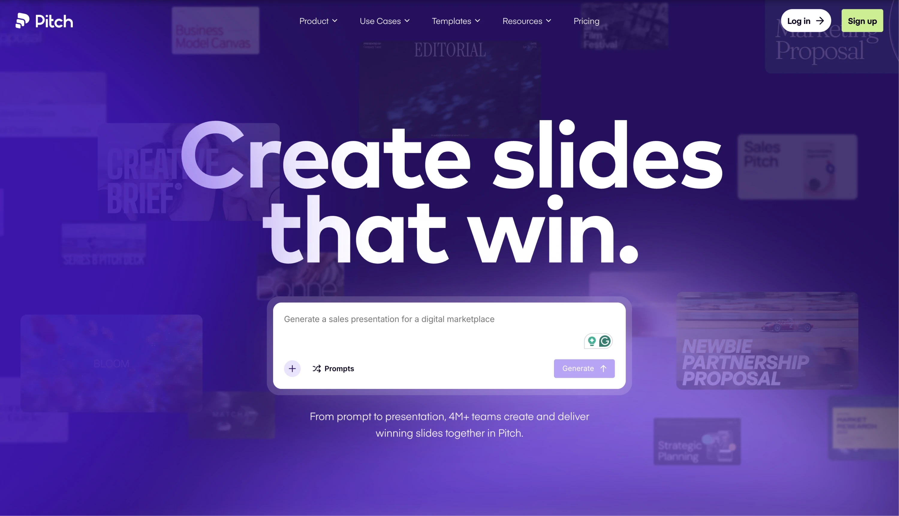\n\n🔗 [Visit website](https://pitch.com/)\n\n### Why this design stands out\n\n1. **The website is an argument for the product**\n\nInstead of explaining what the product can do, Pitch lets the experience speak for itself. The scroll flow, slide-like layouts, and transitions mirror the feeling of building a presentation inside the platform. By the time you reach the CTA, you’ve essentially gone through a presentation yourself.\n\n2. **Scroll-driven storytelling as a core UX principle**\n\nPitch uses scroll as a narrative tool. Each section unfolds like a well-structured deck — one idea at a time — with smooth transitions and layered visuals creating momentum without overwhelming the user.\n\n3. **A vibrant color palette that earns its boldness**\n\nWhile most SaaS websites rely on safe blues and grays, Pitch embraces vibrant purple gradients and rich color. The palette gives the brand energy and personality, while clean layouts keep the experience easy to follow.\n\n4. **Animation as craft, not decoration**\n\nNothing moves just for decoration. Every animation helps guide attention, reinforce hierarchy, or support the story the page is telling, making the experience feel polished and intentional.\n\n5. **A tone that matches the audience**\n\nThe copy is concise, confident, and free of corporate jargon. Combined with precise typography and generous spacing, the brand feels professional without losing its sense of creativity and playfulness.\n\n### Takeaway for designers\n\nPitch is one of the best examples of a SaaS website that practices what it preaches. The homepage doesn't just market a presentation tool; it is one, structured, paced, and designed with the same principles the product is built on. If you're designing for a creative or productivity SaaS, this site is a masterclass in making the marketing experience feel like a preview of the product experience rather than a separate layer on top of it.\n\n## Final thoughts on web design\n\nGreat web design is more than aesthetics — it’s about crafting immersive experiences that engage users, communicate brand identity, and, of course, enhance usability. That’s why [top UI/UX design agencies](https://www.eleken.co/blog-posts/top-ui-ux-design-agencies-recommended-by-industry-experts) focus equally on bold visuals and accessibility, ensuring every detail supports both brand and user. If you need even more examples of responsive and high-converting websites, check out [this article](https://www.eleken.co/blog-posts/web-design-examples-of-usable-responsive-and-high-converting-websites).\n\nAnd if you're looking to elevate not only your SaaS website but the product behind it, Eleken can help. We’re a product design agency focused on [web apps and SaaS](https://www.eleken.co/saas-web-design) since 2015, so we think about marketing pages, sign-up flows, and in-app UX as one continuous experience. [Drop us a line](https://www.eleken.co/contact-us) to see how our designers can turn that experience into a competitive advantage, starting from $4,599/month for a part-time UI/UX designer or $6,599/month for a dedicated full-time professional.\n\nShare\n\n- [](https://www.facebook.com/sharer/sharer.php?u=https:best-website-design-examples \"Share on Facebook\")\n\n- [](https://twitter.com/intent/tweet?url=https:best-website-design-examples \"Share on Twitter\")\n\n- [](https://www.linkedin.com/shareArticle?mini=true&url=https:best-website-design-examples \"Share on LinkedIn\")\n\n\nwritten by:\n\n [Darina Silchenko](https://www.eleken.co/author/darina-silchenko)\n\nSenior UI/UX Designer and UI mentor at Eleken. 5 years experience, former UI teacher at Beetroot Academy. Inspired by bold design decision that pushes boundaries.\n\n[](https://www.linkedin.com/in/darina-silchenko/) [](https://www.behance.net/dashasilchenko)\n\nreviewed by:\n\n [Stan Murash](https://www.eleken.co/author/stanislava-murashchenko)\n\nFormer content writer at Eleken with 8+ years of experience in marketing, design, and SaaS content creation. Collaborated closely with senior UI/UX designers to share insights on SaaS growth, product strategy, and digital experiences.\n\n[](https://www.linkedin.com/in/stan-murash/) [](https://www.eleken.co/blog-posts/best-website-design-examples#)\n\n## Got questions?\n\n- What makes a website design “good”?\n\nA good website design balances aesthetics and functionality. It should be visually appealing, easy to navigate, responsive across devices, and aligned with the brand’s identity.\n\nClear typography, strategic use of color, smooth interactivity, and a logical content structure are key elements.\n\n- How do I choose the right design style for my website?\n\nMinimalist design works well for premium or tech-focused brands, while playful and colorful layouts resonate with creative or youth-oriented projects.\n\nDesign approaches can also vary across markets and industries. For example, a [UX agency in New York](https://www.eleken.co/blog-posts/ux-agency-new-york) may prioritize fast-paced enterprise workflows and conversion-focused experiences, while a [a UX agency in Los Angeles](https://www.eleken.co/blog-posts/ux-agency-los-angeles) might focus more heavily on SaaS scalability and product-led growth. At the same time, a [user experience agency in London](https://www.eleken.co/blog-posts/user-experience-agency-london) or a [UX design agency in San Francisco](https://www.eleken.co/blog-posts/ux-design-agencies-recommended-by-industry-experts) may place stronger emphasis on accessibility, multilingual usability, and privacy-conscious design for international audiences.\n\n- Do I need to follow design trends to create a great website?\n\nNot necessarily. Trends can inspire, but a timeless design rooted in brand clarity, usability, and consistency will usually perform better in the long run.\n\nThe best approach is to borrow modern elements (like micro-interactions or bold typography) while keeping the design of your own website aligned with your brand values.\n\n- Do I need to hire an agency to design my product or app?\n\nNot necessarily. Many teams start by experimenting with in-house ideas and low-fidelity prototypes. But if you want expert guidance, working with a [product design company](https://www.eleken.co/blog-posts/product-design-company) can save you time and help you avoid costly mistakes.\n\nYou can also consider a [mobile app design agency](https://www.eleken.co/blog-posts/mobile-app-design-agency) if your main focus is building a user-friendly app with a smooth interface and strong UX.\n\n- What is an example of a good website design?\n\nA good website design is one that seamlessly blends aesthetics with usability. For example, websites like Apple, UNITED24, or Mode use clear typography, intuitive layouts, consistent branding, and smooth interactions to guide users naturally through the content.\n\nThe strongest designs are visually appealing, easy to navigate, responsive on all devices, and help users accomplish their goals without friction.\n\n- What are the 7 C's of a website?\n\nThe 7 C’s of website design are a classic framework for evaluating the quality of a digital experience:\n\n**Context** (overall look & feel), **Content** (information and visuals), **Community** (user interactions), **Customization** (personalization), **Communication** (messages between user and site), **Connection** (links and integrations), and **Commerce** (transactional capabilities when relevant).\n\n- What are the 5 golden rules of web design?\n\nThe 5 golden rules of web design are:\n\n**1\\. Keep it simple** — reduce visual clutter and make important elements stand out.\n\n**2\\. Maintain visual hierarchy** — guide the user’s eye with size, spacing, and contrast.\n\n**3\\. Be consistent** — unify fonts, colors, and patterns across pages.\n\n**4\\. Design for accessibility** — ensure readability, color contrast, and usability for everyone.\n\n**5\\. Make it responsive** — the experience should work smoothly on all screen sizes.\n\n- What is the 3-second rule in web design?\n\nThe 3-second rule suggests that users decide whether to stay on or leave a website within the first three seconds.\n\nThat means your homepage or landing page should instantly communicate what the site is about, who it's for, and what action the user should take next—supported by fast loading, clear messaging, and strong visual hierarchy.\n\n\n## Explore our blog posts\n\n[\\\\\n\\\\\narticle\\\\\n\\\\\n30 Sep\\\\\n\\\\\n,\\\\\n\\\\\n2026\\\\\n\\\\\n**Micro interactions in UX: Examples and Principles Behind Great Product Design** \\\\\nMicro interactions are the small UI moments that guide users, prevent errors, and make your product feel alive. See real examples and learn how to design them right.](https://www.eleken.co/blog-posts/micro-interactions)\n\n[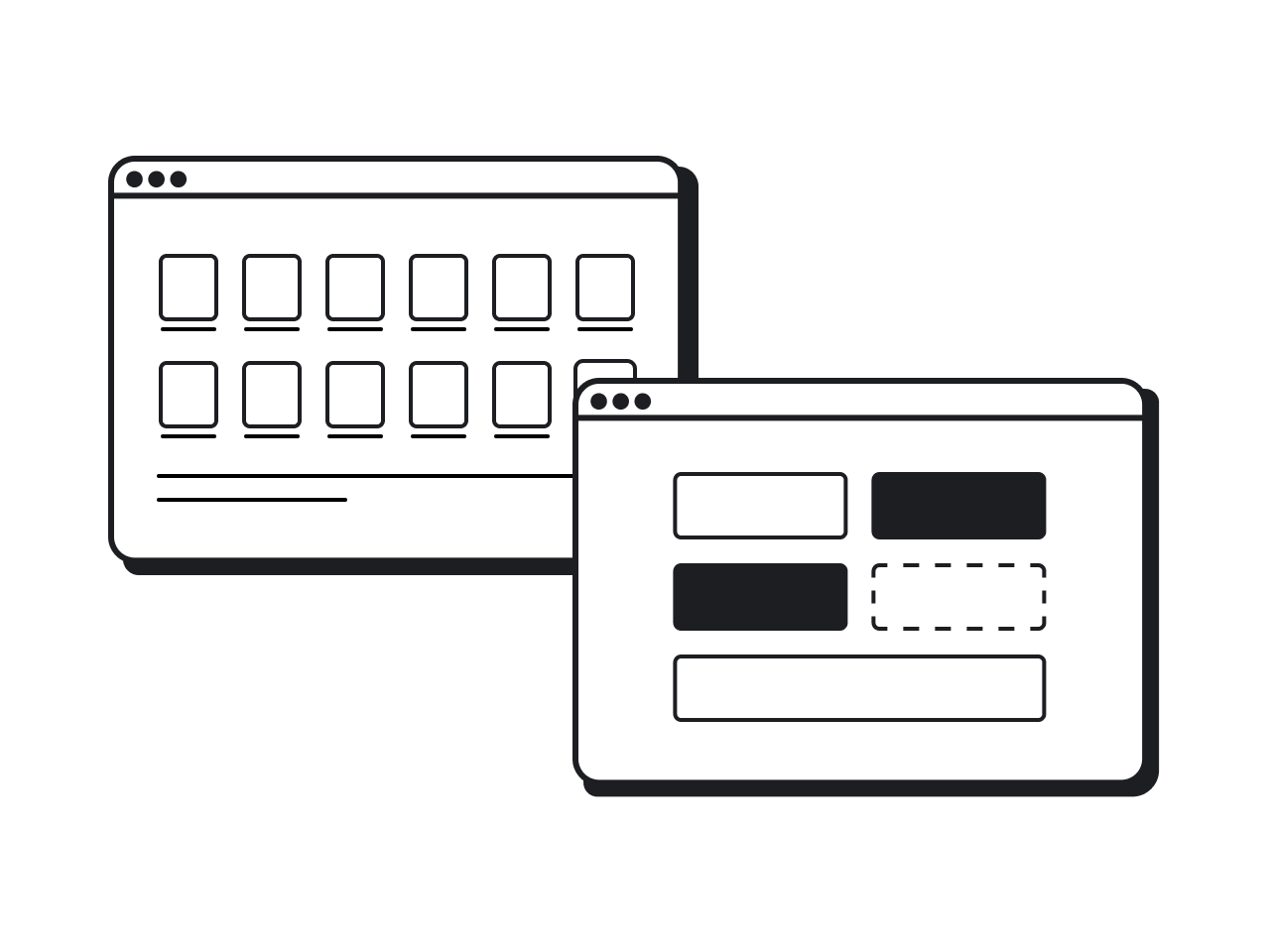\\\\\n\\\\\narticle\\\\\n\\\\\n21 Sep\\\\\n\\\\\n,\\\\\n\\\\\n2026\\\\\n\\\\\n**Design System Vs Component Library: The Decision Guide for Product Teams** \\\\\nDesign system vs component library: the real difference, when a library is enough, and when you need a full system to scale](https://www.eleken.co/blog-posts/design-system-vs-component-library)\n\n[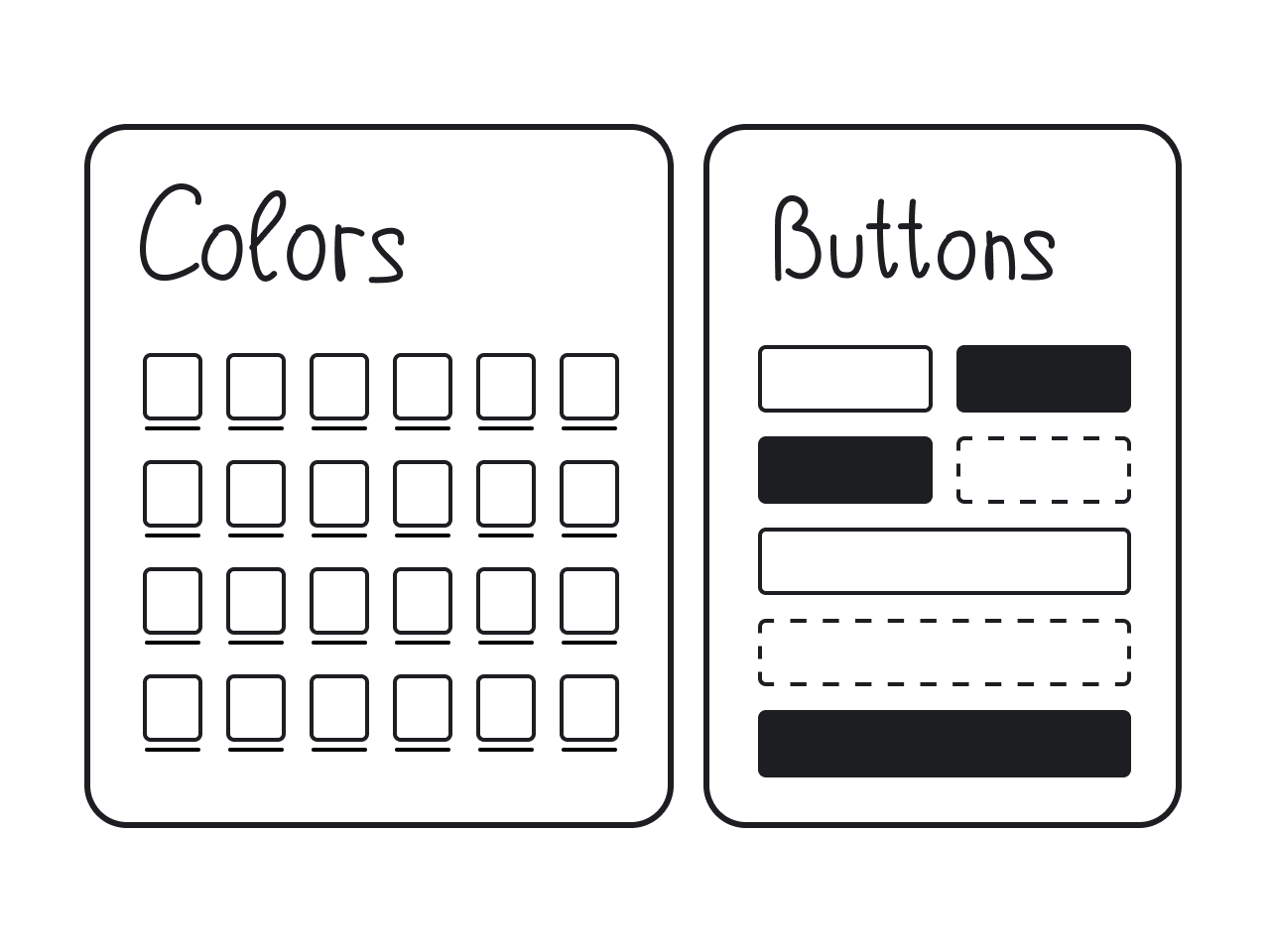\\\\\n\\\\\narticle\\\\\n\\\\\n9 Sep\\\\\n\\\\\n,\\\\\n\\\\\n2026\\\\\n\\\\\n**Understanding UI Kits: A Beginner’s Guide to Streamlining Design** \\\\\nFind out what a UI kit is, how to use it, and which one fits your project. Real examples and expert tips from Eleken’s design team are included.](https://www.eleken.co/blog-posts/what-is-ui-kit)\n\n[\\\\\n\\\\\narticle\\\\\n\\\\\n25 Aug\\\\\n\\\\\n,\\\\\n\\\\\n2026\\\\\n\\\\\n**Figma Design System Best Practices to Scale Design Faster** \\\\\nFigma design system best practices: set up tokens, build the right components first, and avoid design debt to scale your design faster.](https://www.eleken.co/blog-posts/figma-design-system-best-practices)\n\n[\\\\\n\\\\\narticle\\\\\n\\\\\n7 Aug\\\\\n\\\\\n,\\\\\n\\\\\n2026\\\\\n\\\\\n**Design System Guide: What It Is, How to Create One, and Real Examples** \\\\\nLearn how to create a design system that reduces rework, improves collaboration, and helps your team scale design and development.](https://www.eleken.co/blog-posts/design-system)\n\n[\\\\\n\\\\\narticle\\\\\n\\\\\n27 Jul\\\\\n\\\\\n,\\\\\n\\\\\n2026\\\\\n\\\\\n**Badge UI Design: Types, Best Practices, and 20+ Examples** \\\\\nLearn what badge UI components are, how they differ from chips and tags, when to use them, and how to design them accessibly — with over 20 real product examples.](https://www.eleken.co/blog-posts/badge-ui-design)\n\n[\\\\\n\\\\\narticle\\\\\n\\\\\n16 Jul\\\\\n\\\\\n,\\\\\n\\\\\n2026\\\\\n\\\\\n**Snackbar UI: Best Practices, Examples, and When to Use It** \\\\\nExplore snackbar UI best practices, accessibility tips, real examples, and common mistakes to create lightweight, non-blocking user feedback.](https://www.eleken.co/blog-posts/snackbar-ui)\n\n[\\\\\n\\\\\narticle\\\\\n\\\\\n3 Jul\\\\\n\\\\\n,\\\\\n\\\\\n2026\\\\\n\\\\\n**Video player UI 2026: examples for web and mobile apps** \\\\\nDiscover video player UI best practices, common interaction patterns, and real examples that improve playback across web, mobile, and SaaS products.](https://www.eleken.co/blog-posts/video-player-ui)\n\n[\\\\\n\\\\\narticle\\\\\n\\\\\n23 Jun\\\\\n\\\\\n,\\\\\n\\\\\n2026\\\\\n\\\\\n**Dark Mode UI Design: Inspiration, Principles, and Everything In Between** \\\\\nLearn when dark mode fits your product, how to design it properly, and where to find inspiration. Includes real cases from Eleken’s design practice.](https://www.eleken.co/blog-posts/dark-mode-ui)\n\n[\\\\\n\\\\\narticle\\\\\n\\\\\n15 Jun\\\\\n\\\\\n,\\\\\n\\\\\n2026\\\\\n\\\\\n**Breaking Down the Best: SaaS Application Interface Design Examples and Insights from Experts** \\\\\nLooking for references for your application interface design? Read this article to discover the best examples on the market!](https://www.eleken.co/blog-posts/application-interface-design-examples-how-top-companies-design-their-apps-uis)\n\nBy clicking “Accept All”, you agree to the storing of cookies on your device to enhance site navigation, analyze site usage, and assist in our marketing efforts. View our\n[Privacy Policy](https://www.eleken.co/privacy-policy)\nfor more information.\n\n\n[Preferences](https://www.eleken.co/blog-posts/best-website-design-examples#) [Accept necessary](https://www.eleken.co/blog-posts/best-website-design-examples#) [Accept all](https://www.eleken.co/blog-posts/best-website-design-examples#)\n\nPrivacy Preference Center\n\nWhen you visit websites, they may store or retrieve data in your browser. This storage is often necessary for the basic functionality of the website. The storage may be used for marketing, analytics, and personalization of the site, such as storing your preferences.\n\nPrivacy is important to us, so you have the option of disabling certain types of storage that may not be necessary for the basic functioning of the website. Blocking categories may impact your experience on the website.\n\n[Deny all](https://www.eleken.co/blog-posts/best-website-design-examples#) [Accept all cookies](https://www.eleken.co/blog-posts/best-website-design-examples#)\n\nManage Consent Preferences by Category\n\nEssential\n\n**Always Active**\n\nThese items are required to enable basic website functionality.\n\nMarketing\n\nMarketing\n\nThese items are used to deliver advertising that is more relevant to you and your interests. They may also be used to limit the number of times you see an advertisement and measure the effectiveness of advertising campaigns. Advertising networks usually place them with the website operator’s permission.\n\nPersonalization\n\nPersonalization\n\nThese items allow the website to remember choices you make, such as your user name, language, or the region you are in, and provide enhanced, more personal features.\n\nAnalytics\n\nAnalytics\n\nThese items help the website operator understand how its website performs, how visitors interact with the site, and whether there may be technical issues. This storage type usually doesn’t collect information that identifies a visitor.\n\n[Confirm my preferences and close](https://www.eleken.co/blog-posts/best-website-design-examples#)","metadata":{"twitter:card":"summary_large_image","facebook-domain-verification":"io1art9rwuq7x631alwajwzelf6e3v","title":"50 best website design examples for inspiration [2026]","ogImage":"https://cdn.prod.website-files.com/5f16d69f1760cdba99c3ce6e/67add93fbdde11c47e96ff37_image.png","twitter:title":"50 best website design examples for inspiration [2026]","viewport":["width=device-width, initial-scale=1","width=device-width, initial-scale=1"],"language":"en-US","og:type":"website","twitter:description":"Looking for best website design examples to inspire your work? Check out these 50 – from designers, for designers.","google-site-verification":["V3_aGXWAx0_wIFaBvqHUIWFIeMMXLxJf3iqUNAFPlCs","J7nIBJizYNb3a93ruG01jj9Z1whW-5CrFajmdGMCx78"],"ogTitle":"50 best website design examples for inspiration [2026]","og:image":"https://cdn.prod.website-files.com/5f16d69f1760cdba99c3ce6e/67add93fbdde11c47e96ff37_image.png","description":"Looking for best website design examples to inspire your work? Check out these 50 – from designers, for designers.","ogDescription":"Looking for best website design examples to inspire your work? Check out these 50 – from designers, for designers.","og:description":"Looking for best website design examples to inspire your work? Check out these 50 – from designers, for designers.","twitter:image":"https://cdn.prod.website-files.com/5f16d69f1760cdba99c3ce6e/67add93fbdde11c47e96ff37_image.png","og:title":"50 best website design examples for inspiration [2026]","position":["1","2","3","4"],"favicon":"https://cdn.prod.website-files.com/5e8b3356a5a8f5321855bbe7/5f5772b19e21646ddb8bf065_favicon.png","scrapeId":"01a10841-f509-75fc-a34b-014fcaf9e6be","sourceURL":"https://www.eleken.co/blog-posts/best-website-design-examples","url":"https://www.eleken.co/blog-posts/best-website-design-examples","statusCode":200,"contentType":"text/html; charset=utf-8","proxyUsed":"basic","cacheState":"hit","cachedAt":"2026-10-04T12:51:49.638Z","creditsUsed":1}},{"url":"https://hub.fullsail.edu/articles/check-out-these-great-typography-design-websites","title":"Check Out These Great Typography Design Websites - The Hub","description":"# Check Out These Great Typography Design Websites\n[](https://hub.fullsail.edu/articles/grads-on-winning-projects-at-the-76th-primetime-emmy-awards)","position":8,"markdown":"[Skip to Main Content](https://hub.fullsail.edu/articles/check-out-these-great-typography-design-websites#skip-to-main-content)\n\n[The HUB](https://hub.fullsail.edu/)\n\n[How To](https://hub.fullsail.edu/how-to) [Career Information](https://hub.fullsail.edu/career-information) [Tech](https://hub.fullsail.edu/tech) [Pro Advice](https://hub.fullsail.edu/pro-advice) [Full Sail](https://hub.fullsail.edu/full-sail)\n\n[Request Information](https://hello.fullsail.edu/hub_request_info)\n\nFull Sail\n\n# Check Out These Great Typography Design Websites\n\nPublished on Jun 18, 2013 by Amy Cassell\n\nDesigners obsessed with fonts and creating visually-stunning work out of letters already know that you can spend hours (or possibly even days) browsing the Internet for various examples of great typography design. If you're looking for some inspiration, check out **this list of favorites curated by Suzanne Johnson**, [Digital Publishing](http://www.fullsail.edu/degrees/campus/digital-arts-design-bachelors/courses/digital-publishing-GRD-244) Course Director in Full Sail's [Digital Arts & Design](http://www.fullsail.edu/degrees/campus/digital-arts-design-bachelors) program. \"But mind your P's and Q's,\" she says. \"Remember inspiration, not imitation.\"\n\n\n\n**Typography Served.**\"Curated by the pros over at Behance.net, this site is really great for current one-shots of what people are working on and typefaces that are currently trending. You may find that some of these are available for download or purchase. Support your artists; respect the type!\"\n\n\n\n**[I Love Typography.](http://www.ilovetypography.com/)**\"A little more in-depth and educated, this blog has a really great 'Week in Type' feature that highlights the newest of the new from foundries across the U.S. and world. The site also offers the famous The Font Game app, where you can find out if you really know the difference between Ariel and Helvetica.\"\n\n\n\n**[We Love Typography.](http://www.welovetypography.com/)** \"Associated with I Love Typography (mentioned above), this site is great because you can search by color, customize the page grid, and get random inspiration of notable designs utilizing typography or just fonts in general.\"\n\nIf you're more interested into looking at the details of specific typefaces, check out these two typographic games.\n\n**[Kern Type](http://type.method.ac/):** a letter spacing game.\n\n[**Type Connection**](http://www.typeconnection.com/): a \"dating game\" that pairs typefaces based on nuance in character.\n\n[View Full Sail’s Degree Programs](https://www.fullsail.edu/degrees)\n\nRelated Stories\n\n[](https://hub.fullsail.edu/articles/explore-art-and-design-degree-programs-at-full-sail \"Click here to read about Explore Art & Design Degree Programs at Full Sail\")\n\n[Explore Art & Design Degree Programs at Full Sail](https://hub.fullsail.edu/articles/explore-art-and-design-degree-programs-at-full-sail \"Click here to read about Explore Art & Design Degree Programs at Full Sail\")\n\n[](https://hub.fullsail.edu/articles/grads-on-winning-projects-at-the-76th-primetime-emmy-awards \"Click here to read about 73 Grads on Winning Projects at the 76th Primetime Emmy Awards\")\n\n[73 Grads on Winning Projects at the 76th Primetime Emmy Awards](https://hub.fullsail.edu/articles/grads-on-winning-projects-at-the-76th-primetime-emmy-awards \"Click here to read about 73 Grads on Winning Projects at the 76th Primetime Emmy Awards\")\n\nRelated Topics\n\n[Art & Design](https://hub.fullsail.edu/related-topics/art-and-design) [Digital Arts & Design](https://hub.fullsail.edu/related-topics/digital-arts-and-design) [Industry Research](https://hub.fullsail.edu/related-topics/industry-research)\n\nWhether you’re [ready to apply](https://apply.fullsail.edu/) or just want to learn more about Full Sail University, our Admissions Representatives are here to help. [Call us](tel:8002267625) or [request more information](https://hello.fullsail.edu/request_info).\n\n- [Events](https://hub.fullsail.edu/related-topics/events)\n- [Media Design](https://hub.fullsail.edu/related-topics/media-design)\n- [Be Creative](https://hub.fullsail.edu/related-topics/be-creative)\n- [Digital Marketing](https://hub.fullsail.edu/related-topics/digital-marketing)\n- [Facilities](https://hub.fullsail.edu/related-topics/facilities)\n- [Housing](https://hub.fullsail.edu/related-topics/housing)\n- [Student Organizations](https://hub.fullsail.edu/related-topics/student-organizations)\n- [Courses](https://hub.fullsail.edu/related-topics/courses)\n- [Career Development](https://hub.fullsail.edu/related-topics/career-development)\n- [Business Intelligence](https://hub.fullsail.edu/related-topics/business-intelligence)\n- [Financial Aid](https://hub.fullsail.edu/related-topics/financial-aid)\n- [Oscars](https://hub.fullsail.edu/related-topics/oscars)\n- [Educators](https://hub.fullsail.edu/related-topics/educators)\n- [International](https://hub.fullsail.edu/related-topics/international)\n- [Simulation Engineering](https://hub.fullsail.edu/related-topics/simulation-engineering)\n- [Computer Animation](https://hub.fullsail.edu/related-topics/computer-animation)\n- [Artificial Intelligence](https://hub.fullsail.edu/related-topics/artificial-intelligence)\n- [Online](https://hub.fullsail.edu/related-topics/online)\n- [Cloud Technologies](https://hub.fullsail.edu/related-topics/cloud-technologies)\n- [Software Development](https://hub.fullsail.edu/related-topics/software-development)\n- [FSOA](https://hub.fullsail.edu/related-topics/fsoa)\n\nFull Sail University\n\n\nRequest Info\n\n[800.226.7625](tel:8002267625)","metadata":{"viewport":"width=device-width, initial-scale=1","language":"en","title":"Check Out These Great Typography Design Websites - The Hub","description":"Check Out These Great Typography Design Websites","og:title":"Check Out These Great Typography Design Websites","og:type":"website","og:image:type":"image/jpg","og:image":"https://hub.fullsail.edu/assets/ext/share/default-sharing.jpg","ogTitle":"Check Out These Great Typography Design Websites","ogImage":"https://hub.fullsail.edu/assets/ext/share/default-sharing.jpg","favicon":"https://hub.fullsail.edu/favicon.ico","scrapeId":"01a10841-f509-75fc-a34b-053cb70bf498","sourceURL":"https://hub.fullsail.edu/articles/check-out-these-great-typography-design-websites","url":"https://hub.fullsail.edu/articles/check-out-these-great-typography-design-websites","statusCode":200,"contentType":"text/html; charset=utf-8","timezone":"America/New_York","proxyUsed":"basic","cacheState":"miss","indexId":"5cbdc5c6-ff60-454d-8357-5c8cec7934cc","creditsUsed":1}},{"url":"https://www.youtube.com/watch?v=eawI-59F4PM","title":"How To Design Typography T-Shirts With Simple Illustrations - YouTube","description":"Start Using Kittl: https://kit.tl/illotypeshirts 👉 Use Graham's Templates Here: https://kit.tl/grahamsdesigns 🎟️ Use Promo Code ...","position":9,"markdown":"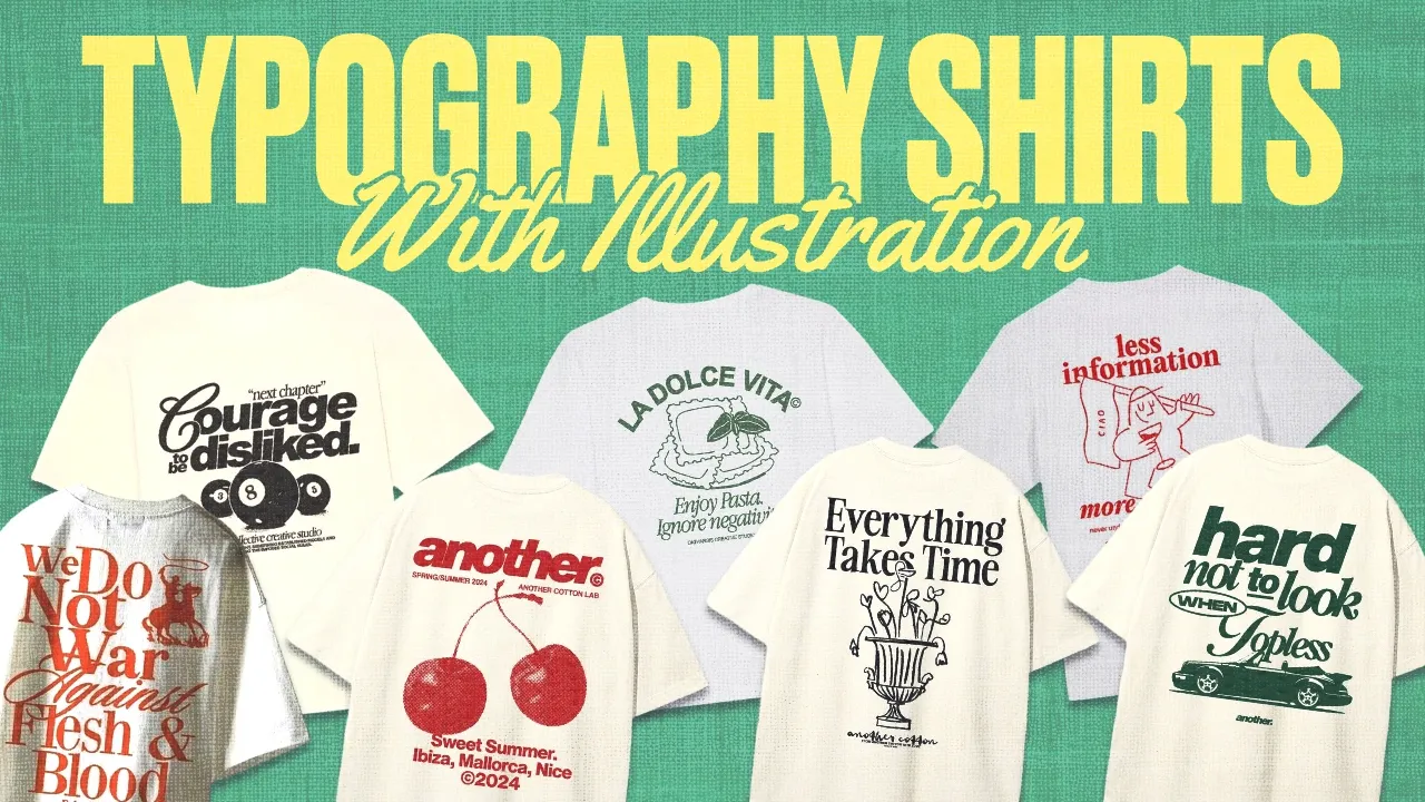\n# [How To Design Typography T-Shirts With Simple Illustrations](https://www.youtube.com/watch?v=eawI-59F4PM)\n\n**Visibility**: Public\n**Uploaded by**: [Kittl](https://www.youtube.com/@Kittldesign)\n**Uploaded at**: 2024-12-31\n**Published at**: \n**Length**: 31:22\n**Views**: 158491\n**Likes**: 5367\n**Category**: Howto & Style\n\n## Description\n\n```\n👉 Start Using Kittl: https://kit.tl/illotypeshirts\n👉 Use Graham's Templates Here: https://kit.tl/grahamsdesigns\n🎟️ Use Promo Code KITTLONYT25 To Get 25% Off A Pro Subscription!*\n\nIn this video, Graham is walking you through more typography t-shirt designs, but this time there are illustrations involved! Not all luxury and streetwear style t-shirts only have text. Some of them have super simple or threshold style illustrations on them to help express the theme even further and more vividly. So make sure you watch all of the way through to get a good idea for what you can do with your next t-shirt design. Be sure to check out these other helpful details below.👇\n\n🎟️ *Promo Code Details\nPromo Codes apply to first time subscribers only. 25% Coupon code will apply to either monthly or yearly plans for the first time payment only. (Either your first month, or first full year).\n\n🎥 Checkout these Kittl tutorials next:\n↪︎Kittl AI Version 2 Is Insane! https://youtu.be/sF2a-sx-leg?si=KkJ9vy9HwbsR4xPH\n↪︎This 1 Minimal Shirt Keeps Selling: https://youtu.be/bu4RvaM2bEc?si=52DHtuq83YA-PD6k\n\n👥Join the Kittl Discord Group!\n↪︎https://kit.tl/discord\n\n🕰️ Timestamps For This Video:\n0:00 Making Typography Shirts With Illustrations\n1:15 Reviewing Different Shirt Styles\n5:00 Making T-Shirt Number 1\n12:00 Making T-Shirt Number 2\n16:00 Making T-Shirt Number 3\n21:00 Making T-Shirt Number 4\n26:00 Making T-Shirt Number 5\n28:30 Making T-Shirt Number 6\n30:15 Final Thoughts\n\n📱 Follow Kittl On Social:\nhttps://www.instagram.com/kittldesign\nhttps://www.tiktok.com/@kittldesign\nhttps://www.facebook.com/kittldesign\nhttps://www.pinterest.com/kittldesign\nhttps://www.twitter.com/kittldesign\nhttps://www.kittl.com\n\n🔴 Subscribe to @Kittl \n↪︎https://www.youtube.com/kittldesign\n\nThank you so much for using our platform, and for watching this video. Don't forget to subscribe and follow along with the tutorial on the channel.\n\nIf there is anything I missed, or if you have more questions, drop a comment below and we will respond asap! Let me know more tutorial ideas as well!\n\n#kittl #tshirtdesign #typography\n```\n\n## Transcript\n\nso it's it's basically just a well-known\nfact now that the only thing that I'm\ngood for is making typography based\nt-shirt\ndesigns breaking news he sucks at\neverything else he finally admitted it\nwell that's what we're going to do today\nwe're going to do some more typography\nbased t-shirt designs and and I'm going\nto I'm going to stretch my abilities\nhere a little bit there are a couple\nillustrations what say what yes it is\nnot only text this time we've got a\ncouple of different illustrations this\none is from a very very well-known brand\nso please please don't just go and copy\nthat and publish it I might get in\ntrouble I I don't want to get in trouble\nplease please don't make me get in\ntrouble but I've gone to the Holy Grail\nof all inspiration sites once again\nPinterest I love Pinterest if I could\nwork for never mind but I found six new\ndesigns and the type on these are maybe\na little bit different than some in the\npast I don't even know how many I've\ndone like\nseven no six seven between five and\nseven videos I've done of these\ntypography t-shirt things and a lot of\nthe designs are repetitive and we're\nwell on our way to recreating every\nt-shirt design that's ever been\npublished on Pinterest and to continue\ntowards that goal we're going to do\nthese six let's have a look here so\nwe've got some very clean serif font\naction going on little illustration\nlittle coffee thing I've not really seen\none of of those is pretty retro this\njust very clean sand serif spread out\ntype this very luxury based looks like a\ncomfort colors shirt with a DTG print\nvery standard but you can make things\nlook very luxurious depending upon the\ndesign in the print I mean a comfort\ncolor shirt is not very expensive DTG is\nvery cheap form of printing so you can\nmake things look really high dollar you\ncould charge $78 for that shirt and the\nright person with the right eyes and the\nright average ising would buy it so let\nthat be a testament to you to achieve\nyour\n[Music]\ndreams this one sporty and rich is\ndefinitely a very very well-known\nminimal kind of design in clothing\ncompany yeah there stuff looks great and\nthey've looked like they've got kind of\na Collegiate font going on this probably\njust like a varsity font which we've got\na couple of in KD and then some very\nthin a little bit some somewhere in\nbetween a condensed and a regular sand\nsiif it's not quite condensed but it is\na little taller than normal and then is\nthis not necessarily an illustration ah\nbut a threshold effect and so basically\nthreshold is where you're telling it to\nbasically take your image and turn it\ninto complete black and white No Gray at\nall it's just black and white and\ndepending upon where you adjust that\nslider it's going to adjust how much\ngray turns to black and how kind of\nBlobby the effect effect looks we don't\nhave a threshold effect in K but I am\ngoing to show you a way to achieve that\ncuz it's very easy you can very easily\ndo it we've got some very interesting\ntype layout here this looks to be two\nfonts I can kind of decipher what kind\nof script font that is down there it's\nvery grainy this is not a very high\nresolution image but nonetheless we can\nget the type layout and it's interesting\nthat this is like you look at this and\nyou probably put it on an artboard and\nit does seem centered right but it feels\ngood to the eye because of the way that\nthe type is laid out in these brakes\nright here this brake is mirrored here\nthis brake is mirrored there and it just\nlooks good right and if something's kind\nof unbalanced but it still looks good it\nlooks good A lot of t-shirts have\ndesigns here on the right chest and\nthere's nothing on the left chest and\nthat's like uncentered no it looks good\nso you can dispute that pretty easily\nand then we've got another very very\nclassic I know this is not babis new but\nit looks like babis new like just a kind\nof a semic condensed font we have a new\nscript font cuz we partnered with\nmonotype recently that looks exactly\nlike that so we will be using that 100%\nfor sure there's no use in in dragging\nout the uh post Thanksgiving work\nscaries so we're going to dive in all\nright so what I love to do is get an\nactual just cutout of a T-shirt and put\nit on my artboard so that I can design\non it without having to design and then\nput it on a macka up it just makes the\nwhole process kind of faster and rules\nout things immediately that aren't going\nto work because of placement or it\ndoesn't sit right or something may look\ncool on the artboard but it looks like\ncrap on the T-shirt right and so we're\ngoing to avoid that it's going to save\ntime so I'm going to go grab a picture\nof a t-shirt that we can remove the\nbackground from and we're just going to\nuse that for every\ndesign oh are you recording yeah I am\nDrew has a ride with a rotisserie\nchicken yeah awesome so we've got our\nblank white T-shirt I'm just going to\nchange the color of this artboard so\nthat we can distinguish from the shirt a\nlittle better and it's not super high\nquality PNG t-shirt but it'll still kind\nof give us the the look and feel of what\nwe're going for so I am going to\nrightclick and lock this in place and\nthen get started with some text so I'm\ngoing to hit T drag my text over onto\nthe shirt and then this looks very very\nclose to instrument serif so I'm going\nto grab that I'm also lap topping it\ntoday I'm on a laptop normally I have my\ncomputer hooked up to a monitor and I\nhave my keyboard my mouse and this\ndoesn't even need to be here right now\ncuz I'm not even using it but that's to\ngive you no excuses right I'm on a\nlaptop you don't need to have your\nmonitor and the keyboard and the mouse\nyou could do this go to Starbucks and\njust make t-shirts cool I'm going to\nclose the letter spacing on that quite a\nbit if you've watched the other videos\nif I'm ever using in strument serif or\nreally any saraon I like to close the\nletter spacing quite a bit just it gives\nit that kind of '90s luxury feel just to\nnot have that text spaced out cool so\nI'm going to go for some different type\nhere I might do like coffee Club cool a\ntrick there to size out the text box\nfrom the center and not have it move\nover like this is just to hold option or\nalt uh if you're on a Windows computer\ncomputer first and then size that out\nand that will allow you to size from the\ncenter super helpful so let's Center\nthat right there I'm going to again hold\noption and drag this down to copy that\ntext box give her a little double click\ncommand a to select all the text that\nhelps you not have to kind of click and\ndrag to select all the text makes it way\nfaster and you'll learn these little\nkeyboard shortcuts as you go along let's\njust say member and we're going to size\nthis text up quite a bit it looks like\nit's the widest thing on the design\nwidest not whitest very different cool\nand so something that I've been\nexperimenting with recently is adding if\nthere's not another font weight I've\nbeen liking adding a little bit of an\noutline or a stroke to the text that's\nthe same font weight in the same\ngrouping so that it almost looks like\nthe same weight as the bigger text box\nand I'll explain what I mean when I do\nit so I'm going to go to text shading\nand add this third box make sure that my\ncolor matches there make sure the offset\nis down and then I'm just going to add a\nlittle bit of weight to that just to\nbeef that up and so that looks a lot\nmore balanced to me than without it kind\nof looks a little thin and not connected\nright like like it's not part of the\nsame thing normally you know if the\nsmaller text box is less than half of\nthe height of the biggest text box then\nI'll probably just bump it up a font\nweight like if this is light then I'll\nmake this medium and then it helps it\nkind of give it that weight back to the\ntext Okay so we've got another text box\ndown here and we're just going to go\ngeneric everybody on the collection so\nlet's just put collection there looking\ngreat nice tight text together I might\nadd a little bit of a space just to let\nit breath the Tad looks awesome and this\nis funny down here we've just got I\nthink this is actually a mockup bendido\nmockup does a phenomenal job they're all\nPhotoshop mockups so you'd have to have\nthe Adobe suite to use it but their\nmockups are absolutely insane they're\nreally expensive but they're phenomenal\nthey do a great job and they're just\nvery very high quality they look great\nthat's why this just says t-shirt and\nthen it has the size of the print I\nguess which is which is super duper\nfunny but we're going to copy this font\ndown here and we're going to think of\nsome text to put in this box that's what\nwe're going to do let's do something\ncoffee related medium\nroast I'm not going to roast you a ton\njust just medium and then I'm going to\nput some text on the top left and right\nbefore yep see bendido mock I knew it\nall right you just you see stuff and\nthen you recognize it and you're like Ah\nthat's what it is and this might\nactually legitimately be instrument siif\nbecause of the way that the T kind of\nCurves up on the edges I swear it is I\nwant $5 if I'm right cool so we're going\nto look for a font to put on the sides\nthere kind of looks like a very\ntypewriter analog type font Courier\nmight work and let's go regular and\nagain we're going to close that letter\nspacing quite a bit and we're just going\nto put something in here yeah it's all\ncaps as well like\nofficial Club merch\nand then close that line spacing and\nmake that quite a bit smaller and I'm\njust going to copy that over to the side\nbecause I'm lazy but you can make that\ntwo different text boxes you could make\nit whatever you want now we're going to\nhunt down a illustration to put here I'm\ngoing to check in the elements panel\nfirst if not Duda actually drew a bunch\nof awesome kind of naive sketch\nillustrations and I think something\ncoffee related was in there so so that's\na good fall back if we can't find\nsomething but I don't have to do that\nbecause I found some awesome coffee\nillustrations especially these right\nhere that is just hilarious and I love\nit so we're going to need to size that\nup so just to give our little character\na little bit more room I might bring\nthat bottom text box down and then I can\nbring our character down some more and\nto beef up this illustration cuz it is a\nlittle thin and I want it to a little\nbit more closely match the weight of the\nrest of the shirt I'm going to add a\nborder onto this just a little border\nweight maybe not that much something\nlike two looks really good and so you\ncan see the difference if I take it off\nit's really really thin and I like to\nair on the side of a little bit thicker\nwhen I'm adding uh on stuff to an\nillustration so maybe something like two\nor three three looks great and we're\ngoing to say that that's our t-shirt\nthat's phenomenal you could start a\nwhole Etsy shop just call it coffee club\nand make a bunch of shirts and then\nchange this icon out with a bunch of\ndifferent icons and go to town whichever\nTown you're closest to so that is the\nfirst shirt I love it and I don't know\nif I'm going to be able to top it so I'm\nkind of upset that I did it first but\nwe're going to move on so I'm going to\ncopy and paste my little t-shirt over\nand make the background the same as well\nand then you know what I'm going to go\nahead and copy these over to the other\ncanvases as well so I don't have to keep\ngoing and unlocking this each time\nefficiency cool so this is just a dope\nlittle text based design two lines s\nserif and then it has these text boxes\naround it and we can find something\nawesome to kind of mirror this style so\nthis doesn't seem too difficult we're\njust going to find a nice sand siif text\nand I think our new partnership with\nmonotype and the ability to use\nhelvetica now should make that really\nreally easy who would have known that\nGraham's favorite font was helvetica\nhaha he he makes sense so looks like all\ncaps and we're going to close the letter\nspacing just a little bit there as well\nspace that text out and we're going to\ndo let's do something like health and\nwellness related take care of yourself\nthose lines fall really nice there's not\ntoo much Vari\nbetween the lines where like the top\nline is super long and then the bottom\nline is super small and like you want it\nto kind of be either like here and then\nBoop just a little bit smaller or Boop\nand then a little bit bigger you don't\nwant there to be a ton of difference\nbetween those lines I need to make that\na little bit more condensed and then\nwe're also going to close that line\nspacing as well -10 looks awesome and we\nmight need to bump that font way up a\nlittle bit what's cool about the new\nhelvetica in KD is that it's actually\nthe variable version of helvetica so\ninstead of trying to decide between\nlight and medium or medium and bold you\njust have this little slider and it's\ngoing to give you everything in between\nright so no longer do you have to try to\nfind the right weight between your four\noptions you can just use the slider and\nit'll take care of it for you cool so\nwe're going to make this just a tad\nsmaller and we're going to copy this\ntext box out and then we're going to\nkind of replicate that idea is like\nthose little text boxes are extensions\nof this like ways that you could take\ncare of yourself so we could say like\ntake a walk and then we're going to size\nthat down quite a bit and we're going to\ngo over here drink water of course stop\ndrinking so much soda please stop doing\nit it's not good for you drink a little\nbit more water promise you'll feel\nbetter take a walk drink water\nsay read a book visit with friends and\nwe can do a little bit of variation we\ncan have some on liners some two liners\njust to kind of spread that out some\nvisit your family going bring that over\nhere and something interesting starts to\nhappen where once we have four to eight\nof these we want to like move them\naround to make the placement of it feel\nnice and balanced get some sleep space\nthat out might put that up here and I'm\ngoing to get another TW liner down here\nspend time on your hobby yeah and so\nwe're going to space these out to where\nthis kind of looks the most balanced and\nI I feel like I might need one more text\nbox say slow down cuz everybody be going\na little too fast you know so I'm going\nto put that there I might put this guy\nup here and then we can space these out\naccordingly and that's actually starting\nto look pretty balanced to me bring that\nguy up that a little closer and then\nthis right here space that out and it's\nnot going to be perfect but it's\nsupposed to be a little little wonky and\nthat's okay that looks pretty balanced\nto me there's nice weight all around it\nand so we're going to say that that's\nthe second design and I'm done with it\nI'm moving on I don't need it anymore\nall right third design go ahead and\nchange the color of our artboard again\nso we have another amazing new font in\nKD with our monotype partnership called\nkler Script and it is phenomenal it's\nvery good very good font very luxurious\na little bit thinner than luxurious\nscript and just a little bit more ornate\na little more luxury a little more '90s\nand so it's going to help us achieve\nthat feel and so let's think of some\ntext here we're going to go design Club\nalready super cool I would literally put\nthat on the back of a shirt or the front\nof a shirt and just wear that looks\ngreat but with this design it's not that\neasy so we're going to keep going I'm\ngoing to size that up a tad and copy\nthis down if you've been really paying\nattention you've probably noticed that\nsome of these kind of margin boxes are\npopping up if I hold option this is a\nnew thing that we're trying out hasn't\nlaunched for users yet but essentially\nit's a way to show you how close other\nobjects are to the thing that you have\nselected if you hover over it which is\nit's pretty useful in certain cases so I\nalready know that I'm going to use Aro\nit's a great great great Sansa font I\nknow this font's going to work super\nwell for this cuz I did it for a couple\nother designs again we're going to hit\nthat all caps just makes things really\nnice and easy what I like about this\nfont for this is that the individual\ncharacters are designed in such a way to\nwhere each of them kind of takes up the\nsame amount of space horizontally and so\nit looks very clean very uniform almost\na little bit digital and modern and so\nthat's going to help us achieve that\nkind of new money aesthetic and then\nwe're going to put some more text in\nhere design only great things size that\nup and so we've got a little bit of an\nissue here that I run into regularly\nwhich is if you're using certain words\nthose ligatures like from a g or a j are\ngoing to Sloop down below the text line\nand then make it so that you can't put\ntext there and so each situation kind of\nhas its own way that you can resolve\nthat in this instance I'm going to get a\nlittle bit creative and just do this\nright here best solution eh I don't know\na solution yes so make that a little bit\nsmaller and I think that looks pretty\ncool actually we're going to nudge that\nover a little bit make sure that's\ncentered this is centered as well and\nthen it looks just like more text maybe\na line a little illustration and we're\ngood to go I'm going to bump this up one\nfont weight that looks pretty good and\nwe're going to say graphic design Owners\nClub and then we're going to close that\nline spacing -10 always looks great to\nme it's a great default if you're\nlooking for one and then we're going to\ncopy this down create left align copy\nthat over maybe right align this and\nchange the text on that cure rate is\nabout the same length make sure that\nthose are middle aligned and then it\nlooks like we just need a little shape\nin between to connect those two going to\nuse this line right here and make sure\nthat the colors match group that and\nthen we can tidy it up with this as well\nand we're all centered up and so I may\nneed to bring this down a little bit and\nthen I'm going to ungroup this copy this\ndown and we're almost in 2025 so I'm\ngoing to say established\n2025 make sure that's centered up and\nthen I just need like a little icon here\nand so I'm going to go to my elements\nand I might just use some stars to hit\nthat luxurious feel and that doesn't\nlook bad to me I just need to close the\ngap here and size this up and and this\ndefinitely works better for a back\ndesign for sure I'm also going to make\nthis quite a bit smaller so that it fits\nunder and doesn't compete with that Top\nLine of text so I definitely like this\nmore as a back design than a front\ndesign but you could put it on the front\nif you want to all right moving on to\nthe next one I'm going to lock our\nt-shirt and so this is not as complex as\nit looks and I also get to show you the\ncool trick on how to make things look\nthreshold without actually having a\nthreshold effect which is fun cool so\nwe're going to look for a nice\nCollegiate font so we have a couple in\nhere we have University triot is very\nvery collegate we also have hemisphere\nSands which I like a lot more and I'm\nactually using in one of my new\ncollections not the upcoming one but the\nthird drop which we're not even anywhere\nclose to for on time studio but I'm\nusing it for that and it actually looks\npretty sick so I had recently found this\nfont and love it so we're going to use\nthis and this is super easy to add a\ntransformation and Arch and so that's\none way of doing it you could also put\nit on a circle and I think the way that\nthey did it in this one was more of a\ncircle transformation so it's typing\naround versus kind of lifting the text\nup like this so we're going to do this\ninstead and make that smaller or larger\nwe can make this a back design that'd be\npretty cool and I'm going to space out\nthose letters just a tad so they don't\ntouch each other on that curve got to\nwatch out for that when you're doing\ntext Transformations and we're going to\ngo running or let's say run club that\nlooks great and then here's what we're\ngoing to do we're going to look for a\npicture of a couple of dudes running or\npeople or whatever so here's what we're\ngoing to do we're going to look for a\nimage of a couple people running this\none might work it looks like it might\nhave too many people in it but what we\ncan do is crop this and then we're going\nto see what the background remover does\nwith this first not a good job that's\nokay cuz this is really really hard to\ndistinguish so I'm going to find one\nthat is a little bit more clean cut out\nit is always worth it to invest time to\nfind the right picture to use I promise\nwe're going to see what happens with\nthis one that one's actually pretty good\nso we're just going to straighten that\nout and I promise this is going\nsomewhere I'm going to zoom in get that\neraser tool going for those bits and\npieces that we don't need doesn't need\nto be perfect cuz we are going to be\nvectorizing this so it's going to do a\nlittle bit of its own interpretation\nwe're just getting rid of some of the\nobvious things we'll get rid of this\nright here you can use the left and\nright bracket key to make your brush\nbigger or smaller super helpful and I'm\nnot even sure if erasing this in here is\nnecessary but we're going to do it\nanyway now here's where the threshold\nthing that I was talking about comes in\ncuz you might be thinking like what are\nyou doing that's a stupid picture and\nthis looks bad well it's about to not\nlook bad and I promise we're just going\nto click our picture go over to image\nvectorizer and we're just going to leave\nthis color on one and we're going to see\nwhat happens I have not done this yet\nbut I'm pretty sure this is going to\nlook sick I told you I told you it would\nlook good and you didn't listen to me\nbut that's okay I promise you got to\nlisten to Graham so we're going to size\nthis to where it looks good you could\nalso cover up this text if you don't\nlike that I could just come in here and\nfind some shapes to fit over top of that\nand then when I export my design it'll\njust be all one piece and it wouldn't be\nan issue you could cover up that text\nright there this text right here that's\njust if you don't like it or if if it's\nlike copywritten and says like Nike or\nsomething you might want to cover that\nup now nobody would even know and I\ncould even group these together and if\nyou wanted to make this whole thing one\npiece you could download this selection\nas a PNG repport it and then vectorize\nit again that's just if you didn't want\nto deal with it being a group and be\ndifferent parts that's probably what I\nwould do just to kind of bake it\ntogether and make it a single element\nthat I don't have to have any problems\nwith or fiddle with anymore and I think\nthere's some more text and yeah so let's\nsee what we can look for here text wise\nlet's find a nice we might be able to\nuse helvetica and just use the variable\nversion of it let's do that all caps run\nclub and let's just do running related\ntext\nannual Marathon close the line height\nsize that up and that's actually pretty\nclose to that kind of text I might need\nto actually bring that in some more\nlet's see it's relative to the size of\nthe text so that looks great so maybe we\nwant to put that right here could do\nthat I actually kind of liked it more\ndown on the bottom and what if we just\nmade it one line and then we could just\nsay\n2025 align those group it and align it\nto the artboard make sure that these two\ntext boxes are aligned with each other\nthere we go and I might want to up the\nweight on this just a tad and that looks\ngreat I don't think there's anything\nthat I would change to that great run\nClub shirt utilizing the vectorizer tool\nto make something a threshold looks\nawesome and what you could do to make\nthis even more Illustrated and less\ndetailed is that you could download it\nas a PNG at a lower resolution import it\nand then vectorize it again and it's\ngoing to kind of round out those corners\nand those edges to not look as detailed\nif you wanted to make it look a little\nbit more like an illustration okay two\nmore designs two more we're almost done\nall right so for this one it looks like\nsimilar font style to even that looks\ncool literally just that text on a shirt\nlooks awesome you don't need anything\nelse so I'm going to up the weight on\nthis maybe make this just one text box\nfor now yep let's up the weight on that\nand we've got this kind of misplaced\ntext design and we could do that with\nfour individual text boxes you could do\nit with two text boxes and just add\nspaces in between those letters I'm\ngoing to do it the first way which is to\nmake it four individual text boxes and\nthat way I can reposition them a little\nbit easier outdoor supplying resources\nso this is like kind of a nature type\nthing I'm going to do something that I\nknow Drew would love Mountain get the\nweight down a little bit left align that\nmountain and waterfall and we're going\nto displace that off right here club and\nthen we can just do this right here and\nwe've got some nice distinguished gaps\nin between our text and then we can grab\nall of these group that together and\nCenter this up on our design to be our\nfirst element of text I might need to\nbump the weight back up a little bit\nsomething like that looks good and we\njust got two text boxes and then a\nscript right here so I'm going to\nungroup this and then grab this text box\nright here and size it down and we're\nfrom North Carolina so I'm going to do\nappin I think that's how you spell that\noh it's I in\n[Applause]\nnice looks good we're going to place\nthat right there copy this over and then\nwrite align it 2025 and then we need a\nlittle script for right here\nsomething like Adventurer looks pretty\ngood take hike see the sence and we're\ngoing to place that right here and\ndefinitely a little bit different of a\ntext layout but that's a good thing we\nwant it to be a little bit different and\nlet's try a couple different scripts\nthat one's too thin for sure that one's\ntoo funky I think Adventure looks great\nI think maybe if we just size it down\nsome that looks awesome so I'm going to\ngo with that and say that that design is\nfinished as well got to change my\nartboard background color sorry one last\none this one should not be too difficult\nat all I'm just going to use babis for\nthis and I'm going to say new club cuz\nI'm lazy and I don't want to do anything\nelse put that text together some the\ncloser the text is together the bigger\nyou can make that text box which kind of\ngoes with everything so I'm want to make\nthat text pretty close together so that\nI can make this text box nice and big\nand we're going to go for CER script for\nthis again and I'm just going to put\nsome random text in here size that up\nand if you wanted to beef that text up a\nlittle bit you could add the text\nshading like I like to do just if the\nfont doesn't have another weight and\nit's not giv me enough beef so something\nlike that looks pretty good and I think\nthis text still works for this the\nhelvetica now more condensed setting is\npretty good so I'm going to say KD\ndesign left align that right align this\nBerlin Germany you put Berlin Germany on\nanything it looks pretty cool honestly\nlet's actually save that for the bottom\nso let's put KD design graphic designer\nBerlin Germany Center align that or we\ncould put Berlin\n2022 cuz that's when KD was founded and\nI'm just going to select all of these\nand bring this whole design down some\nthink that looks pretty sick and I'm\ngoing to say that that design is done as\nwell so that is all six designs with\nsome new tips tricks and some other kind\nof things to add to your designer tool\nbelt from this\nvideo that's all for today if this video\nwas helpful drop a comment and let me\nknow make sure that you support the\nchannel by subscribing and liking this\nvideo and share this with a friend if\nyou have friends that you know that are\ndesigners or artists in general they're\nan Etsy seller or they're just wanting\nto make a personalized gift for their\nfriend or get into the world of design\nshoot this video over to them just to\npeque their interest and share KD with\nthem as always we have a promo code for\nyou into the description of this video\nto get a nice beefy percentage off a Pro\nPlan and if you're not ready to\nfinancially commit that is totally okay\nyou can try k out for free today go over\nto k.com and give it a try thanks again\nso much for watching and we'll see you\nin the next video\n[Music]","metadata":{"twitter:player:height":"720","og:image:height":"720","apple-itunes-app":"app-id=544007664, app-argument=https://www.youtube.com/watch?v=eawI-59F4PM&referring_app=com.apple.mobilesafari-smartbanner, affiliate-data=ct=smart_app_banner_polymer&pt=9008","viewport":["width=device-width, initial-scale=1.0, viewport-fit=cover","initial-scale=1, minimum-scale=1, width=device-width"],"regionsAllowed":"AD,AE,AF,AG,AI,AL,AM,AO,AQ,AR,AS,AT,AU,AW,AX,AZ,BA,BB,BD,BE,BF,BG,BH,BI,BJ,BL,BM,BN,BO,BQ,BR,BS,BT,BV,BW,BY,BZ,CA,CC,CD,CF,CG,CH,CI,CK,CL,CM,CN,CO,CR,CU,CV,CW,CX,CY,CZ,DE,DJ,DK,DM,DO,DZ,EC,EE,EG,EH,ER,ES,ET,FI,FJ,FK,FM,FO,FR,GA,GB,GD,GE,GF,GG,GH,GI,GL,GM,GN,GP,GQ,GR,GS,GT,GU,GW,GY,HK,HM,HN,HR,HT,HU,ID,IE,IL,IM,IN,IO,IQ,IR,IS,IT,JE,JM,JO,JP,KE,KG,KH,KI,KM,KN,KP,KR,KW,KY,KZ,LA,LB,LC,LI,LK,LR,LS,LT,LU,LV,LY,MA,MC,MD,ME,MF,MG,MH,MK,ML,MM,MN,MO,MP,MQ,MR,MS,MT,MU,MV,MW,MX,MY,MZ,NA,NC,NE,NF,NG,NI,NL,NO,NP,NR,NU,NZ,OM,PA,PE,PF,PG,PH,PK,PL,PM,PN,PR,PS,PT,PW,PY,QA,RE,RO,RS,RU,RW,SA,SB,SC,SD,SE,SG,SH,SI,SJ,SK,SL,SM,SN,SO,SR,SS,ST,SV,SX,SY,SZ,TC,TD,TF,TG,TH,TJ,TK,TL,TM,TN,TO,TR,TT,TV,TW,TZ,UA,UG,UM,US,UY,UZ,VA,VC,VE,VG,VI,VN,VU,WF,WS,YE,YT,ZA,ZM,ZW","twitter:image":"https://i.ytimg.com/vi/eawI-59F4PM/maxresdefault.jpg","twitter:app:id:iphone":"544007664","position":"1","referrer":"origin-when-cross-origin","isFamilyFriendly":"true","twitter:player:width":"1280","twitter:app:id:googleplay":"com.google.android.youtube","uploadDate":"2024-12-31T09:17:07-08:00","og:site_name":"YouTube","og:image:width":"1280","og:video:width":"1280","twitter:app:url:ipad":"vnd.youtube://www.youtube.com/watch?v=eawI-59F4PM&feature=applinks","userInteractionCount":["5367","158491"],"twitter:app:url:googleplay":"https://www.youtube.com/watch?v=eawI-59F4PM","ogTitle":"How To Design Typography T-Shirts With Simple Illustrations","og:video:height":"720","og:video:type":"text/html","title":"How To Design Typography T-Shirts With Simple Illustrations - YouTube","al:web:url":"http://www.youtube.com/watch?v=eawI-59F4PM&feature=applinks","description":"👉 Start Using Kittl: https://kit.tl/illotypeshirts👉 Use Graham's Templates Here: https://kit.tl/grahamsdesigns🎟️ Use Promo Code KITTLONYT25 To Get 25% Off..., 👉 Start Using Kittl: https://kit.tl/illotypeshirts👉 Use Graham's Templates Here: https://kit.tl/grahamsdesigns🎟️ Use Promo Code KITTLONYT25 To Get 25% Off...","al:ios:app_store_id":"544007664","al:ios:app_name":"YouTube","identifier":"eawI-59F4PM","al:android:url":"vnd.youtube://www.youtube.com/watch?v=eawI-59F4PM&feature=applinks","twitter:url":"https://www.youtube.com/watch?v=eawI-59F4PM","twitter:app:id:ipad":"544007664","og:title":"How To Design Typography T-Shirts With Simple Illustrations","fb:app_id":"87741124305","al:android:package":"com.google.android.youtube","keywords":["kittl, kittl design, kittl tutorial, kittl design tutorial, typography, typography t shirt, text t shirt designs, typography t shirt design, typography t-shirt design, typography t-shirt design tutorial, how to make luxury t shirts, luxury t shirt brand shirts, luxury typography shirt, minimal typography shirt, minimal type shirts, minimal typography, typography merch, typography streetwear, streetwear typography design, illustration t shirt design, trendy t shirt design","kittl,kittl design,kittl tutorial,kittl design tutorial,typography,typography t shirt,text t shirt designs,typography t shirt design,typography t-shirt design,typography t-shirt design tutorial,how to make luxury t shirts,luxury t shirt brand shirts,luxury typography shirt,minimal typography shirt,minimal type shirts,minimal typography,typography merch,typography streetwear,streetwear typography design,illustration t shirt design,trendy t shirt design"],"twitter:app:url:iphone":"vnd.youtube://www.youtube.com/watch?v=eawI-59F4PM&feature=applinks","requiresSubscription":"False","twitter:title":"How To Design Typography T-Shirts With Simple Illustrations","og:url":"https://www.youtube.com/watch?v=eawI-59F4PM","width":["1280","1280"],"ogDescription":"👉 Start Using Kittl: https://kit.tl/illotypeshirts👉 Use Graham's Templates Here: https://kit.tl/grahamsdesigns🎟️ Use Promo Code KITTLONYT25 To Get 25% Off...","genre":"Howto & Style","og:video:tag":["kittl","kittl design","kittl tutorial","kittl design tutorial","typography","typography t shirt","text t shirt designs","typography t shirt design","typography t-shirt design","typography t-shirt design tutorial","how to make luxury t shirts","luxury t shirt brand shirts","luxury typography shirt","minimal typography shirt","minimal type shirts","minimal typography","typography merch","typography streetwear","streetwear typography design","illustration t shirt design","trendy t shirt design"],"ogUrl":"https://www.youtube.com/watch?v=eawI-59F4PM","duration":"PT31M22S","ogSiteName":"YouTube","playerType":"HTML5 Flash","interactionType":["https://schema.org/LikeAction","https://schema.org/WatchAction"],"ogImage":"https://i.ytimg.com/vi/eawI-59F4PM/maxresdefault.jpg","twitter:site":"@youtube","og:description":"👉 Start Using Kittl: https://kit.tl/illotypeshirts👉 Use Graham's Templates Here: https://kit.tl/grahamsdesigns🎟️ Use Promo Code KITTLONYT25 To Get 25% Off...","og:video:url":"https://www.youtube.com/embed/eawI-59F4PM","twitter:player":"https://www.youtube.com/embed/eawI-59F4PM","og:type":"video.other","twitter:app:name:ipad":"YouTube","name":["How To Design Typography T-Shirts With Simple Illustrations","Kittl"],"datePublished":"2024-12-31T09:17:07-08:00","al:ios:url":"vnd.youtube://www.youtube.com/watch?v=eawI-59F4PM&feature=applinks","og:image":"https://i.ytimg.com/vi/eawI-59F4PM/maxresdefault.jpg","theme-color":"rgba(255, 255, 255, 0.98)","twitter:app:name:googleplay":"YouTube","twitter:card":"player","twitter:description":"👉 Start Using Kittl: https://kit.tl/illotypeshirts👉 Use Graham's Templates Here: https://kit.tl/grahamsdesigns🎟️ Use Promo Code KITTLONYT25 To Get 25% Off...","height":["720","720"],"language":"en","al:android:app_name":"YouTube","og:video:secure_url":"https://www.youtube.com/embed/eawI-59F4PM","twitter:app:name:iphone":"YouTube","favicon":"https://www.youtube.com/s/desktop/85a3164d/img/favicon_32x32.png","scrapeId":"01a10841-f509-75fc-a34b-086236a5377c","sourceURL":"https://www.youtube.com/watch?v=eawI-59F4PM","url":"https://www.youtube.com/watch?v=eawI-59F4PM","statusCode":200,"contentType":"text/html; charset=utf-8","timezone":"America/New_York","proxyUsed":"basic","cacheState":"miss","postprocessorsUsed":["youtube"],"indexId":"9ea8cef3-9a50-42b6-85aa-01f82210bab9","creditsUsed":1}},{"url":"https://pangrampangram.com/blogs/journal/fonts-for-luxury-brands","title":"The 5 Best Fonts for Luxury Brands","description":"# The 5 Best Fonts for Luxury Brands\nThe right typeface conveys heritage, craftsmanship, and exclusivity across packaging, branding, and every refined detail.\n\n## [Eiko](https://pangrampangram.com/products/Eiko)\nLuxury typography often draws inspiration from traditional type design, and [Eiko](https://pangrampangram.com/products/Eiko) embraces that heritage with a highly expressive, contemporary character.\n\n## [Pangaia](https://pangrampangram.com/products/Pangaia)\n[Pangaia](https://pangrampangram.com/products/Pangaia) takes a more classical approach to luxury typography. Rather than relying heavily on contemporary references, it reflects a design-conscious return to traditional premium branding.\n\nOur typefaces are designed with precision in mind, giving designers the character and flexibility needed to build sophisticated visual identities.","position":10,"markdown":"[Skip to content](https://pangrampangram.com/blogs/journal/fonts-for-luxury-brands#MainContent)\n\n@@ -1,109 +0,0 @@\ncross\nNo newline at end of file\n\n# The 5 Best Fonts for Luxury Brands\n\nTypography in luxury goods is about precision, restraint, and distinction.\n\n[Design Basics](https://pangrampangram.com/blogs/journal/tagged/design-basics)[Graphic Design](https://pangrampangram.com/blogs/journal/tagged/graphic-design)\n\nSeptember 14, 2026\n\n[Back to The Academy](https://pangrampangram.com/blogs/journal)\n\n\n\nThe right typeface conveys heritage, craftsmanship, and exclusivity across packaging, branding, and every refined detail.\n\nFrom understated logotypes to meticulously spaced packaging copy, every typographic choice contributes to a sense of exclusivity. Unlike trend-driven industries, luxury operates on longevity and consistency. Typography often leans into timeless forms, drawing from classical references while maintaining a contemporary edge. High-contrast serifs, elegant sans serifs, and carefully tuned letterforms help create a visual language that feels both elevated and enduring across packaging, certificates, retail environments, and digital experiences.\n\n\n## [Museum](https://pangrampangram.com/products/museum)\n\n[Museum](https://pangrampangram.com/products/museum) brings a sophisticated balance of classical elegance and contemporary character. Its refined forms make it a strong choice for luxury identities that want to feel established without becoming predictable.Used prominently, Museum can make a wordmark or headline feel instantly recognizable. Used more subtly, it adds refinement to supporting typography and brand communications\n\n\n\n\n\n## [Eiko](https://pangrampangram.com/products/Eiko)\n\nLuxury typography often draws inspiration from traditional type design, and [Eiko](https://pangrampangram.com/products/Eiko) embraces that heritage with a highly expressive, contemporary character. Eiko's distinctive letterforms bring a sense of artistry and drama to branding, making it particularly effective for products where beauty and craftsmanship are central to the brand story. Its details shine at larger sizes, making it especially suited to perfume packaging, fashion campaigns, jewelry, editorial layouts, and luxury wordmarks.\n\n\n\n\n\n\n## [Watch](https://pangrampangram.com/products/Watch)\n\nModern luxury has expanded well beyond traditional fashion houses. Technology, interiors, lifestyle, design, and contemporary fashion brands all increasingly operate within the premium space. Their typography needs to communicate quality while still feeling current. [Watch](https://pangrampangram.com/products/Watch) can provide that balance. Its refined character works across logos, headlines, packaging, digital experiences, campaigns, and retail environments, helping create a consistent visual identity across both physical and digital touchpoints.\n\n\n\n\n\n\n## [Editorial Old](https://pangrampangram.com/products/Editorial-Old)\n\n[Editorial Old](https://pangrampangram.com/products/Editorial-Old) is a natural choice for brands that want to communicate elegance, heritage, and storytelling. Its sophisticated character lends itself to fashion campaigns, beauty branding, fragrance launches, and editorial layouts. It can give a product story the feeling of a carefully art-directed magazine spread, transforming typography into an important part of the brand image.\n\n\n\n\n\n\n## [Pangaia](https://pangrampangram.com/products/Pangaia)\n\n[Pangaia](https://pangrampangram.com/products/Pangaia) takes a more classical approach to luxury typography. Rather than relying heavily on contemporary references, it reflects a design-conscious return to traditional premium branding. Pangaia's character makes it well suited for a new generation of luxury brands looking to keep a traditional feel with a contemporary twist. It can work across packaging, websites, campaigns, retail spaces, and digital experiences while maintaining a clear and recognizable visual language.\n\n\n\n\n\n\nOur typefaces are designed with precision in mind, giving designers the character and flexibility needed to build sophisticated visual identities. Whether you're creating a heritage fashion house, launching a fragrance, designing premium packaging, or redefining modern luxury, we have the right typeface for your needs.\n\n## Try them out!\n\nOur typefaces are primed and ready for you high-end branding. Check out our **[Starter Pack](https://pangrampangram.com/products/fsp)** or get your [**free trials**](https://pangrampangram.com/) and see for yourself!\n\n## More from The Pangram Paper\n\n[View all](https://pangrampangram.com/blogs/journal)\n\n\n\nEducational\n\nGraphic Design\n\n### The Best Fashion Fonts for Apparel and Clothing Brands\n\n[Read More](https://pangrampangram.com/blogs/journal/the-best-fashion-fonts)\n\n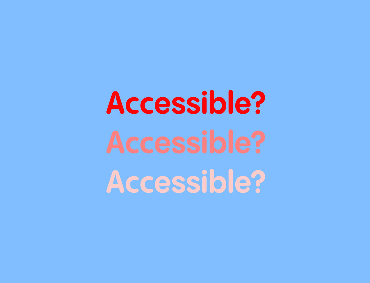\n\nEducational\n\nGraphic Design\n\n### Readable vs Accessible\n\n[Read More](https://pangrampangram.com/blogs/journal/readable-vs-accessible)\n\n\n\nDesign Basics\n\nGraphic Design\n\n### Seeing in Colour\n\n[Read More](https://pangrampangram.com/blogs/journal/seeing-in-colour)\n\n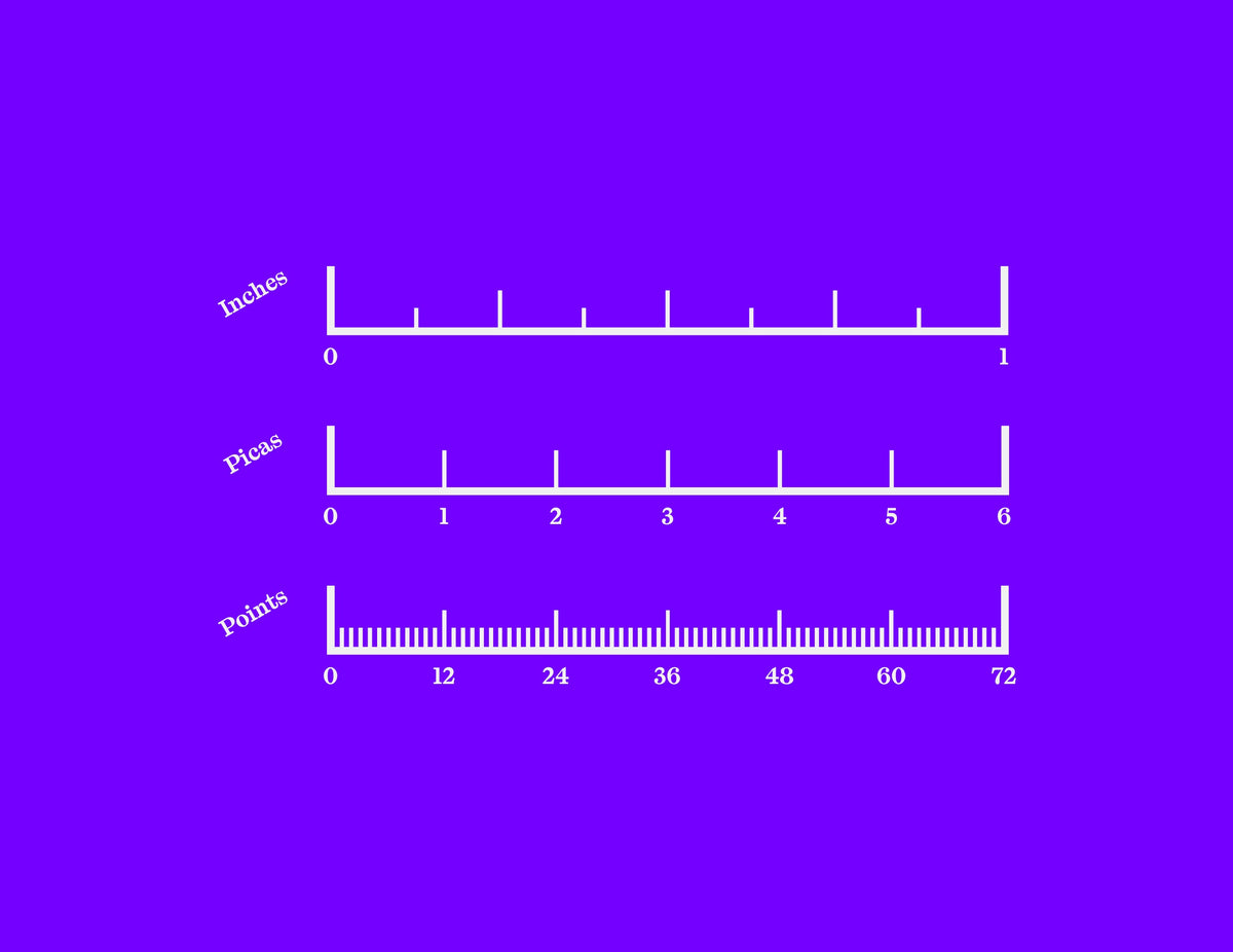\n\nDesign Basics\n\nType Design\n\n### Why's type measured in points?\n\n[Read More](https://pangrampangram.com/blogs/journal/whys-type-measured-in-points)\n\n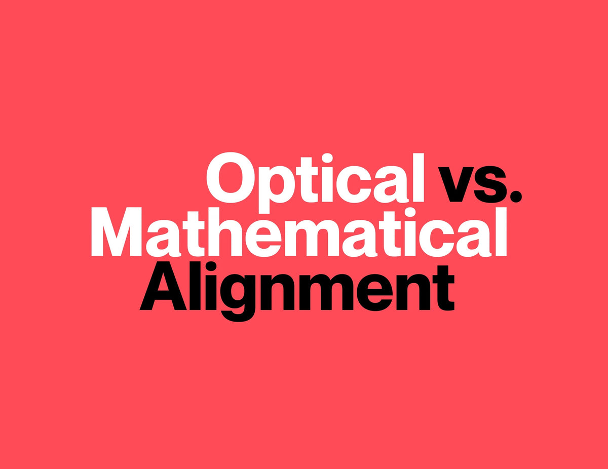\n\nEducational\n\nType Design\n\n### Optical vs. Mathematical Alignment\n\n[Read More](https://pangrampangram.com/blogs/journal/optical-vs-mathematical-alignment)\n\n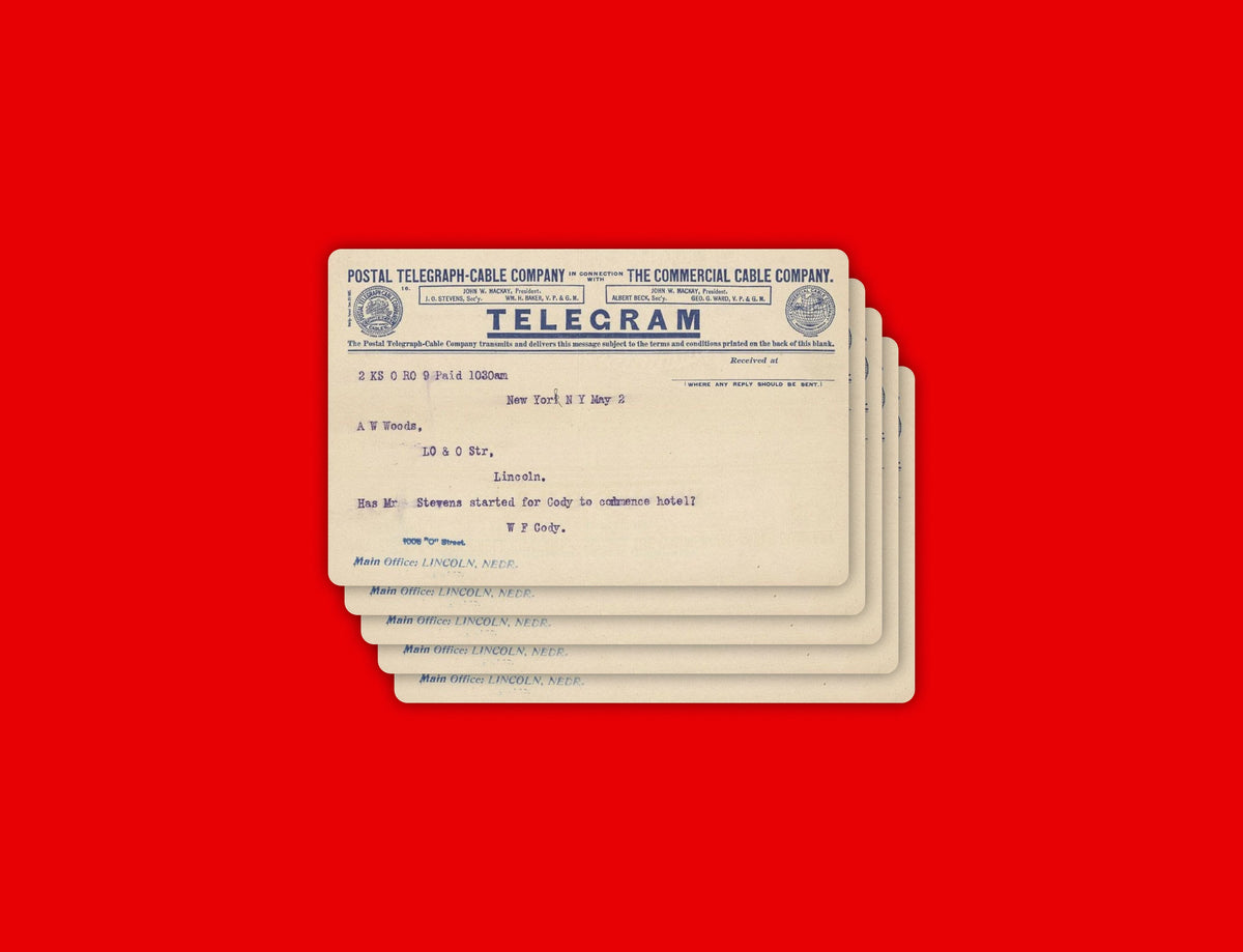\n\nEducational\n\nType Design\n\n### Typewriters and the birth of digital letterspacing\n\n[Read More](https://pangrampangram.com/blogs/journal/typewriters-and-digital-letterspacing)\n\n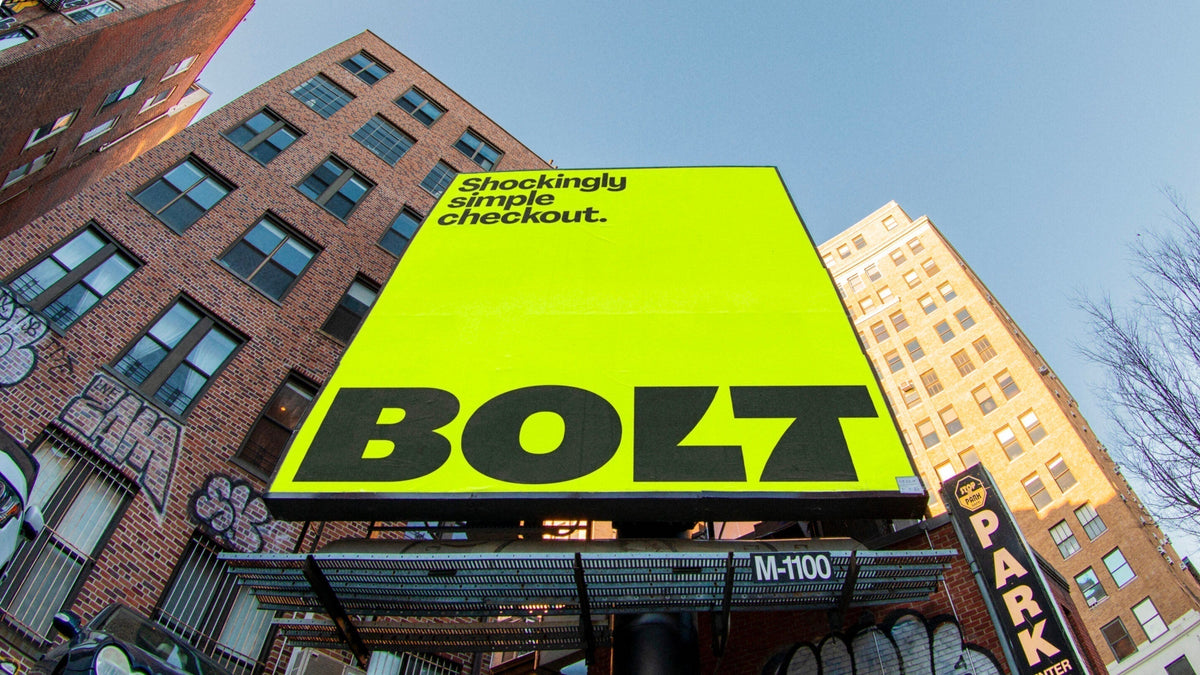\n\nEducational\n\nType Design\n\n### The Best Technology Fonts for Tech and Digital Brands\n\n[Read More](https://pangrampangram.com/blogs/journal/best-digital-fonts)\n\n- Choosing a selection results in a full page refresh.\n- Opens in a new window.\n\npangrampangram.com\n\n# pangrampangram.com is blocked\n\nThis page has been blocked by an extension\n\n- Try disabling your extensions.\n\nERR\\_BLOCKED\\_BY\\_CLIENT\n\nReload\n\n\nThis page has been blocked by an extension\n\n\n\nshop.app\n\n# shop.app is blocked\n\nThis page has been blocked by an extension\n\n- Try disabling your extensions.\n\nERR\\_BLOCKED\\_BY\\_CLIENT\n\nReload\n\n\nThis page has been blocked by an extension\n\n","metadata":{"og:description":"Typography in luxury goods is about precision, restraint, and distinction. The right typeface conveys heritage, craftsmanship, and exclusivity across packaging, branding, and every refined detail. From understated logotypes to meticulously spaced packaging copy, every typographic choice contributes to a sense of exclusivity. Unlike trend-driven industries, luxury operates on longevity and consistency. Typography often leans into timeless forms, drawing from classical references while maintaining a contemporary edge. High-contrast serifs, elegant sans serifs, and carefully tuned letterforms help create a visual language that feels both elevated and enduring across packaging, certificates, retail environments, and digital experiences.","ogUrl":"https://pangrampangram.com/blogs/journal/fonts-for-luxury-brands","twitter:description":"Typography in luxury goods is about precision, restraint, and distinction. The right typeface conveys heritage, craftsmanship, and exclusivity across packaging, branding, and every refined detail. From understated logotypes to meticulously spaced packaging copy, every typographic choice contributes to a sense of exclusivity. Unlike trend-driven industries, luxury operates on longevity and consistency. Typography often leans into timeless forms, drawing from classical references while maintaining a contemporary edge. High-contrast serifs, elegant sans serifs, and carefully tuned letterforms help create a visual language that feels both elevated and enduring across packaging, certificates, retail environments, and digital experiences.","og:image:height":"933","og:image:width":"1400","ogSiteName":"Pangram Pangram Foundry","description":"Typography in luxury goods is about precision, restraint, and distinction. The right typeface conveys heritage, craftsmanship, and exclusivity across packaging, branding, and every refined detail. From understated logotypes to meticulously spaced packaging copy, every typographic choice contributes to a sense of exclusivity. Unlike trend-driven industries, luxury operates on longevity and consistency. Typography often leans into timeless forms, drawing from classical references while maintaining a contemporary edge. High-contrast serifs, elegant sans serifs, and carefully tuned letterforms help create a visual language that feels both elevated and enduring across packaging, certificates, retail environments, and digital experiences.","og:image":"http://pangrampangram.com/cdn/shop/articles/image_54b8fe79-e28a-4e99-bbba-b21d70a4a887.png?v=1789404768","og:url":"https://pangrampangram.com/blogs/journal/fonts-for-luxury-brands","og:title":"The 5 Best Fonts for Luxury Brands","twitter:title":"The 5 Best Fonts for Luxury Brands","shopify-digital-wallet":"/26426578/digital_wallets/dialog","theme-color":["","#fff","#fff"],"ogTitle":"The 5 Best Fonts for Luxury Brands","shopify-s":"6c8f1a20-f0c2-46a1-a135-9fd8f74c8f34","new-cookie-storage-activated":"t","viewport":["width=device-width,initial-scale=1","width=device-width, initial-scale=1.0,\n maximum-scale=1.0, user-scalable=no","width=device-width, initial-scale=1.0,\n maximum-scale=1.0, user-scalable=no"],"ogImage":"http://pangrampangram.com/cdn/shop/articles/image_54b8fe79-e28a-4e99-bbba-b21d70a4a887.png?v=1789404768","og:type":"article","og:site_name":"Pangram Pangram Foundry","ogDescription":"Typography in luxury goods is about precision, restraint, and distinction. The right typeface conveys heritage, craftsmanship, and exclusivity across packaging, branding, and every refined detail. From understated logotypes to meticulously spaced packaging copy, every typographic choice contributes to a sense of exclusivity. Unlike trend-driven industries, luxury operates on longevity and consistency. Typography often leans into timeless forms, drawing from classical references while maintaining a contemporary edge. High-contrast serifs, elegant sans serifs, and carefully tuned letterforms help create a visual language that feels both elevated and enduring across packaging, certificates, retail environments, and digital experiences.","title":"\n The 5 Best Fonts for Luxury Brands\n – Pangram Pangram Foundry","color-scheme":["light dark","light dark"],"shopify-y":"fdb9a994-c811-4898-8eb4-902b19650716","og:image:secure_url":"https://pangrampangram.com/cdn/shop/articles/image_54b8fe79-e28a-4e99-bbba-b21d70a4a887.png?v=1789404768","twitter:card":"summary_large_image","language":"en","favicon":"https://pangrampangram.com/cdn/shop/t/52/assets/favicon.ico?v=168399199572565999111758638063","scrapeId":"01a10841-f509-75fc-a34b-0d6c672b6b75","sourceURL":"https://pangrampangram.com/blogs/journal/fonts-for-luxury-brands","url":"https://pangrampangram.com/blogs/journal/fonts-for-luxury-brands","statusCode":200,"contentType":"text/html; charset=utf-8","timezone":"America/New_York","proxyUsed":"basic","cacheState":"miss","indexId":"337c0675-66e7-491b-93e7-52cff694cfd1","creditsUsed":1}}]},"id":"01a10841-f339-7135-82d6-54eb47f981dc","creditsUsed":12} |